Érvora
2025Logo and identity build for a botanical skincare brand.

- Type
- self-initiated identity and packaging project
- Role
- end-to-end concept and direction
- Year
- 2025
- Disciplines
- Brand Identity, Naming, Logo Design, Visual System, Typography, Packaging Design, Art Direction
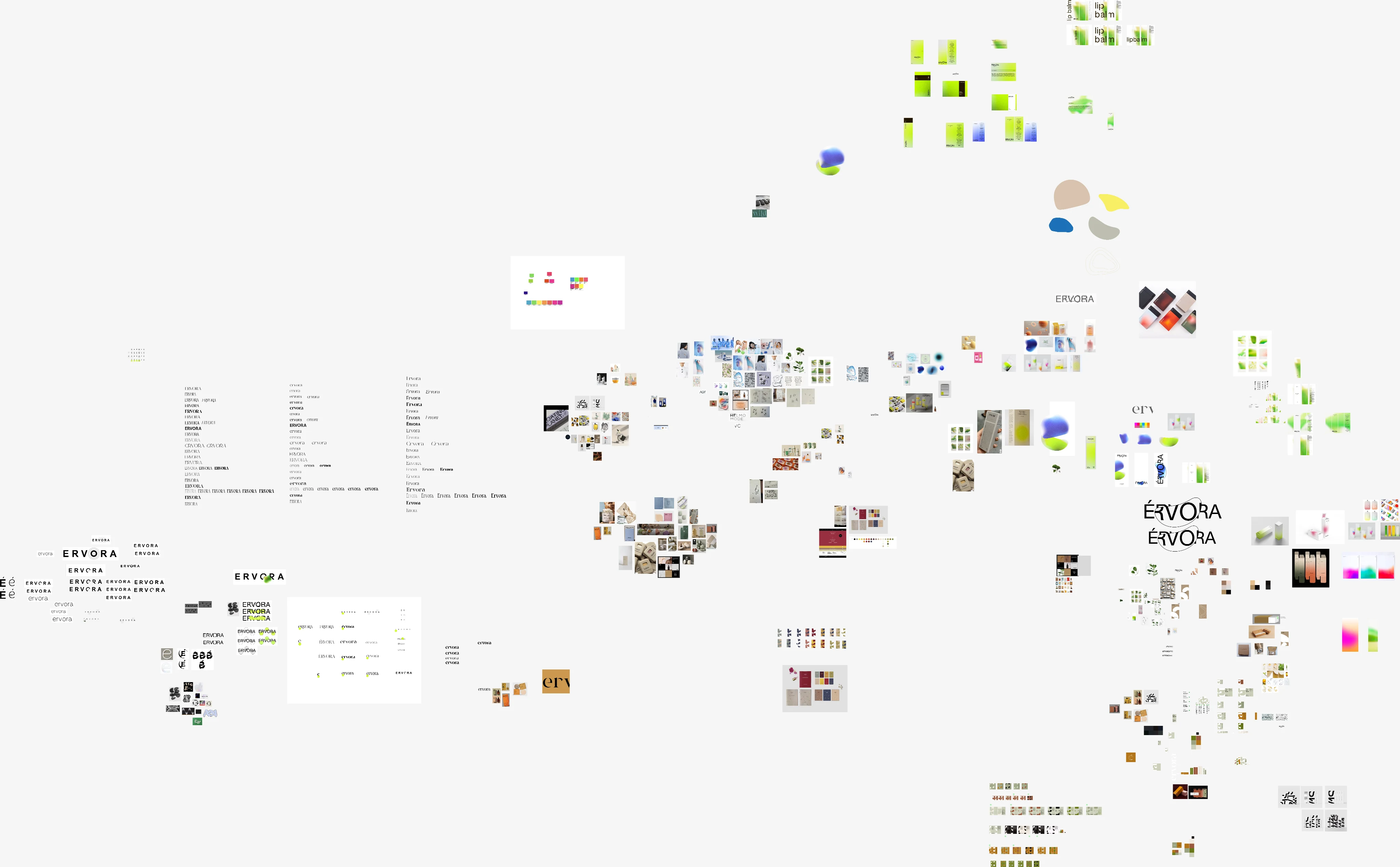
Before reaching the final logo, I drew leaves, drops and monograms. Each one communicated some part of Érvora's world. None of them truly belonged to the brand.
The main element could not sit next to the name. It had to be born inside the word.
The leaf explained the botanical origin in a second, but it pulled the project close to dozens of natural cosmetics. The monogram built on the letter E had elegance, yet it looked like it belonged to a fashion label. The drops worked on the bottles but could not hold a language of their own. That run of attempts made it clear the main element should not sit next to the name. It had to be born inside the word.
Érvora joins erva and árvore into a word with a sound of its own.
Érvora combines erva (herb) and árvore (tree). I wanted a word familiar in Portuguese without describing the product literally. Erva brings it close to the botanical ingredient. Árvore adds structure, permanence and growth. The join creates a sound of its own and avoids names that could belong to any skincare line.
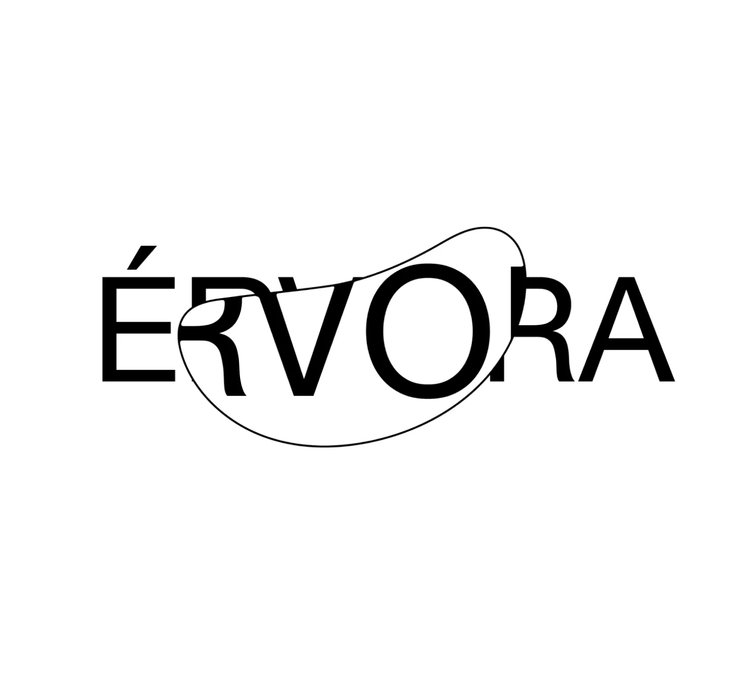
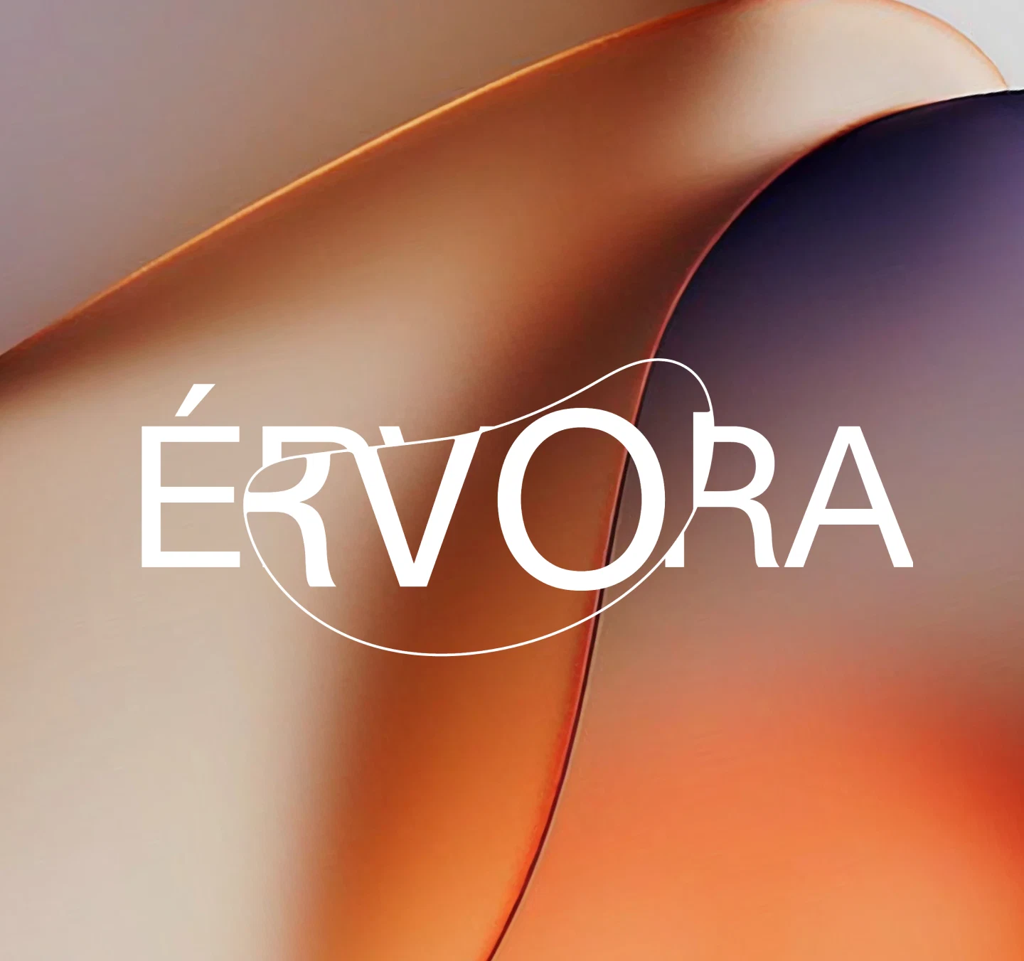
One line enters and leaves the name, and the identity follows it.
The loop appeared while I was testing how the letters connect. It stands for the path between plant, formula, skin and care. The line enters and leaves the name, creates depth and keeps the word connected. Sometimes it recalls the orbit of a body. In other applications it comes close to a seed or the movement of a leaf. I did not try to fix a single reading. The continuity of the gesture mattered more than a literal representation.
The drawing called for small adjustments. I worked the thickness, the slant, the junctions and the negative space until the line had presence without interrupting the reading. Once the balance showed up, the loop stopped being a detail of the logo and started offering decisions for the rest of the identity.

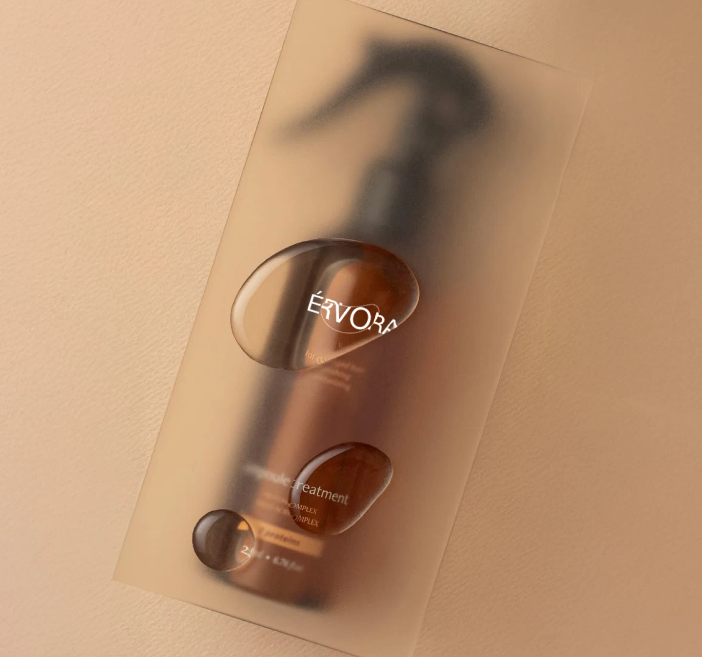
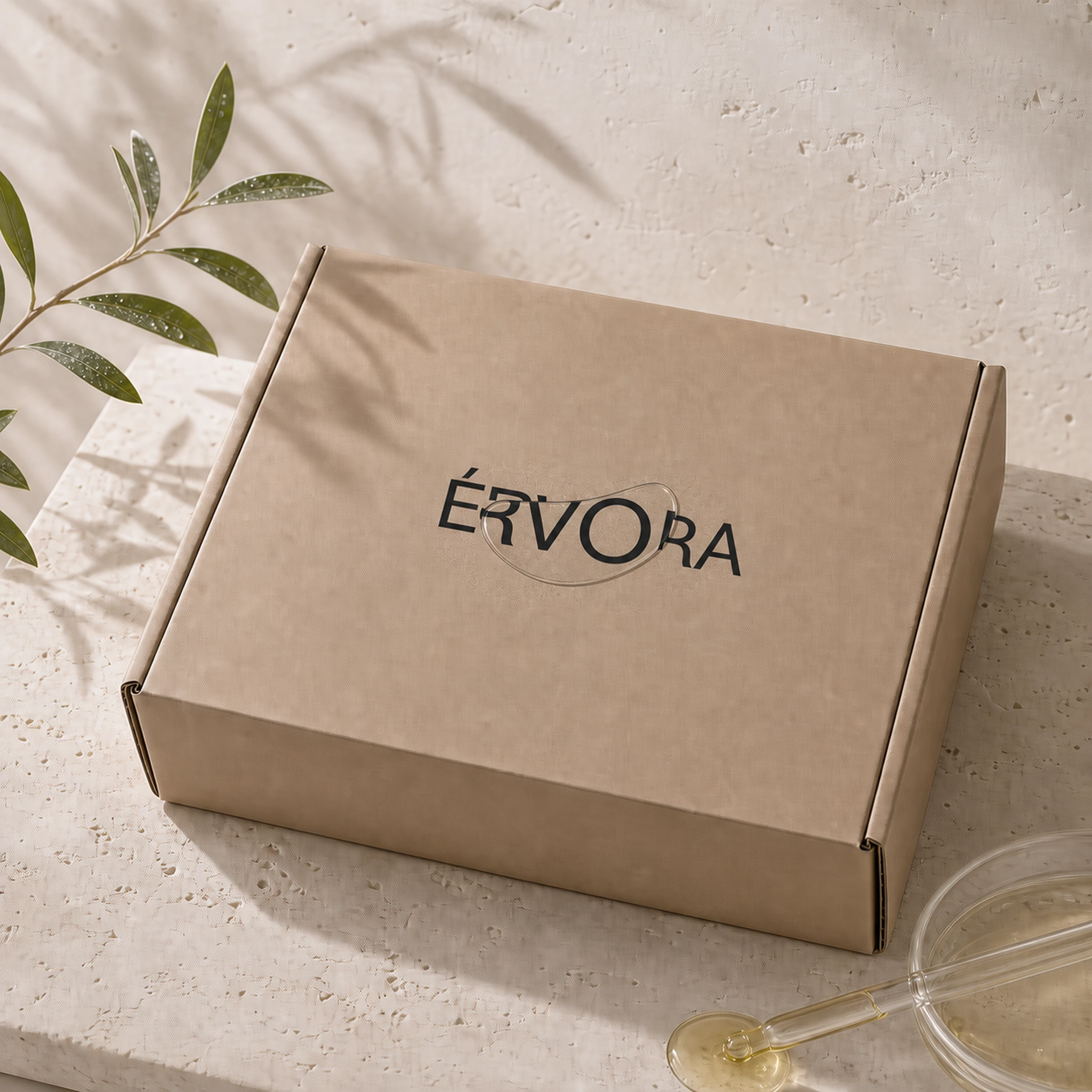
Born from the word, it stays recognizable without repeating the logo.
It turns into a crop, a relief, a frame and movement. It can appear whole or be enlarged until it becomes almost abstract. Because it is born from the word, it stays recognizable without repeating the logo in every application.
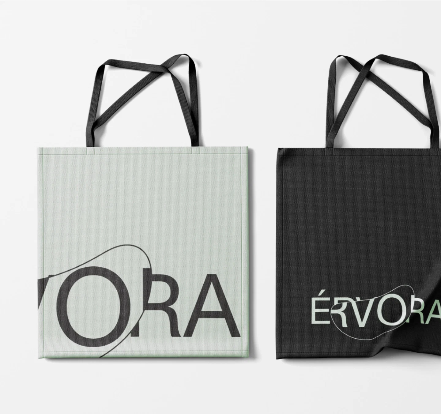
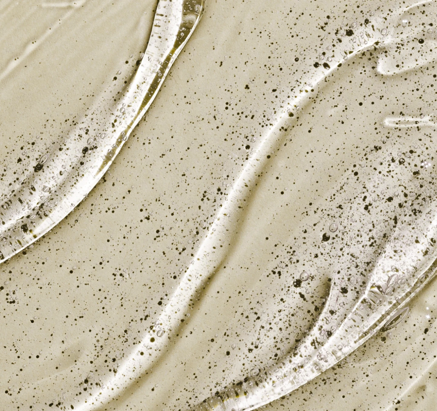

Cream, beige and sage leave room for texture and material.
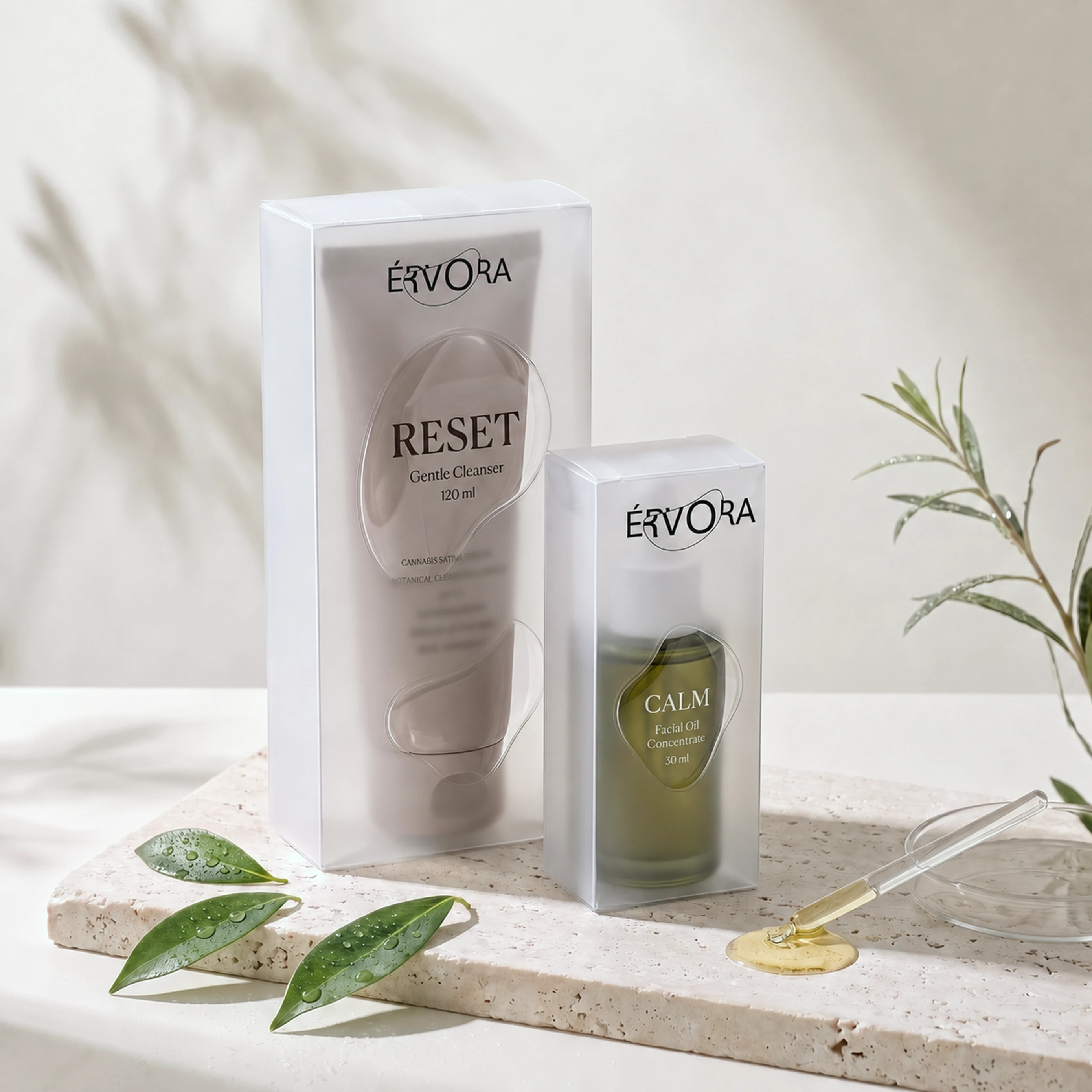
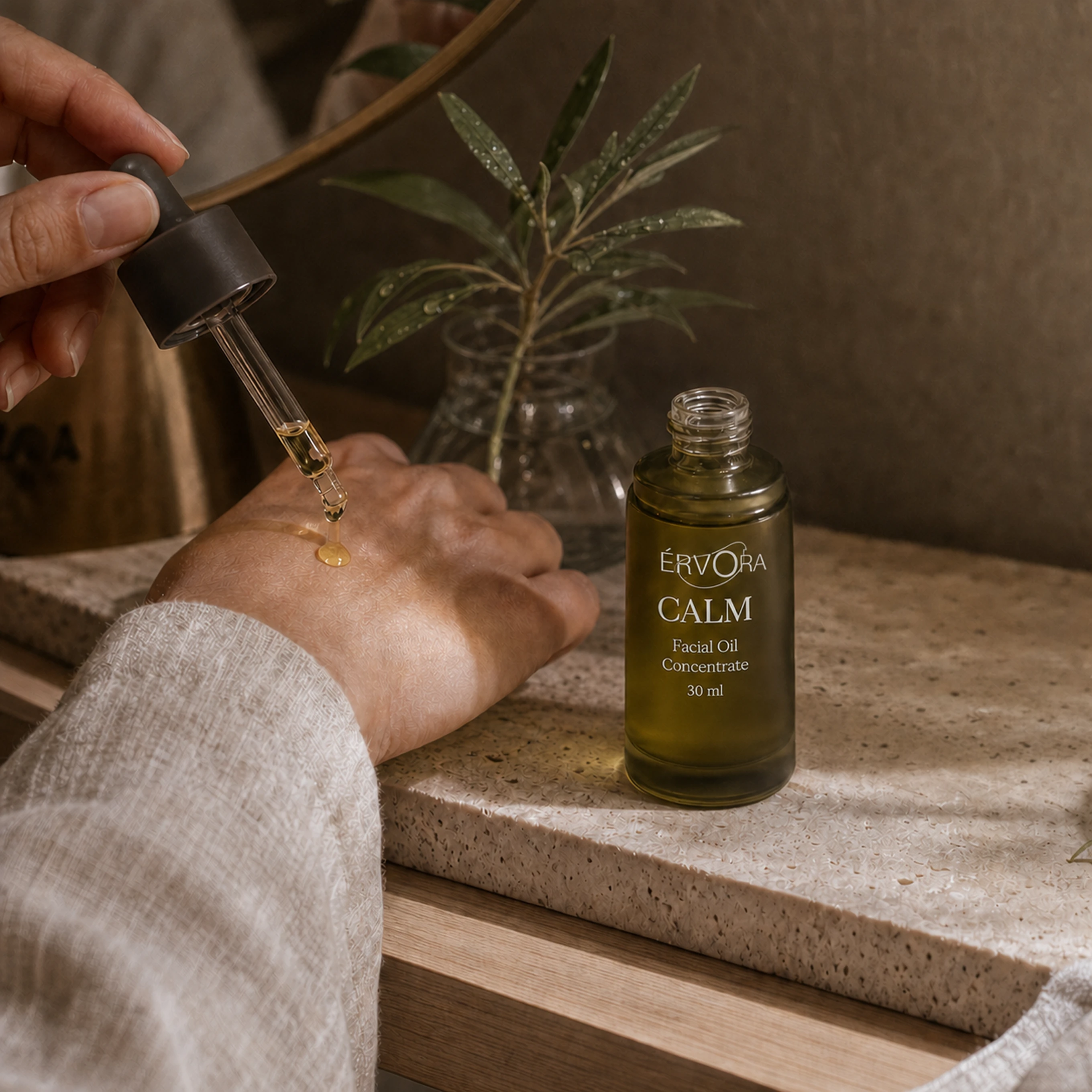
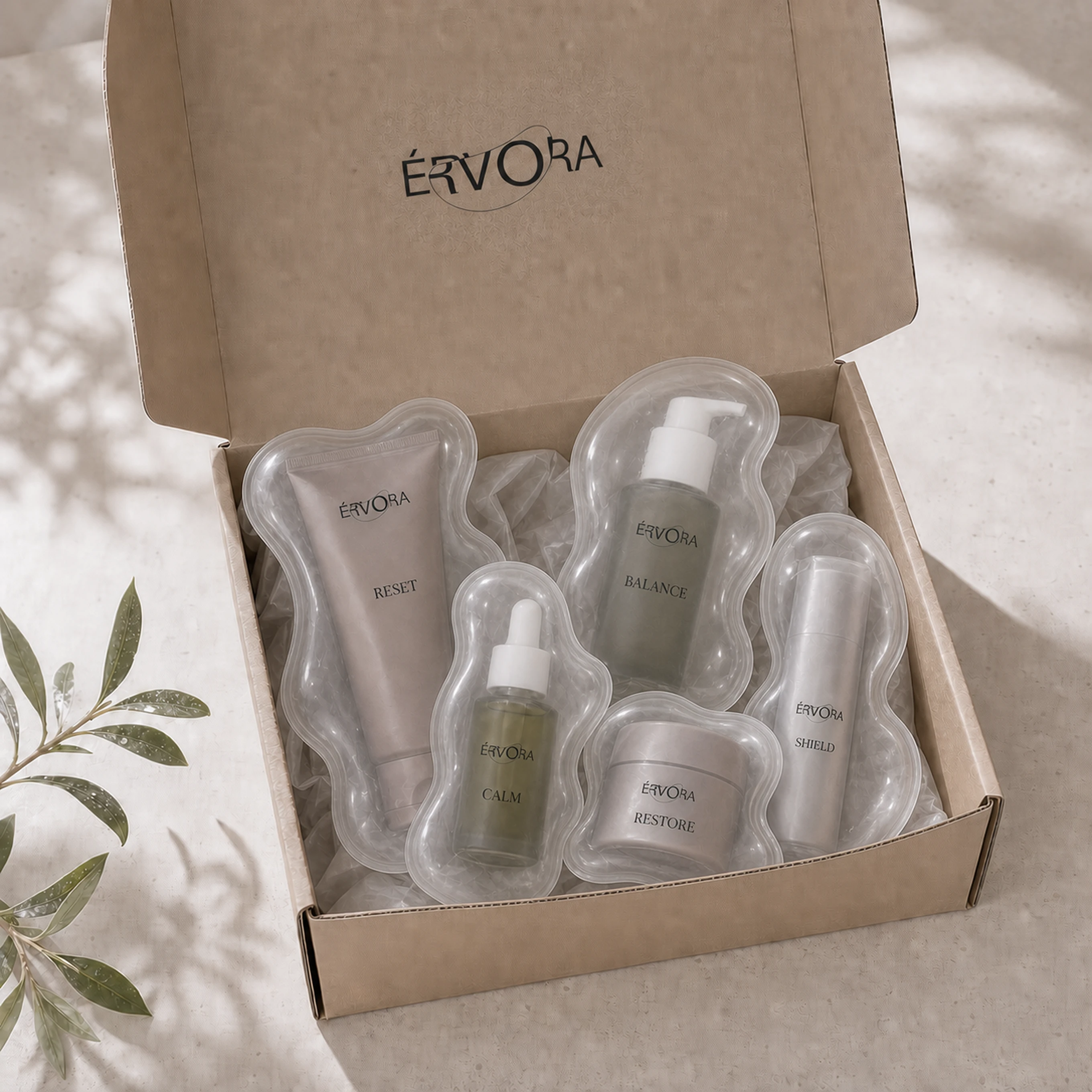
I kept the palette in tones of cream, beige, sage and soft browns. The color leaves room for texture, material and photography. On the packaging, RESET and CALM organize the family without fighting the main name for attention. Tubes, bottles, droppers and the shipping box share a quiet hierarchy, while changes in proportion and finish set each product apart.
The formula uses cannabis sativa seed oil as one of its ingredients. I avoided the recreational references tied to cannabis because the center of the brand is care, plant origin and the transformation of matter. The plant shows up in the content and the product information, not as a visual shortcut in the logo.

The store enlarges the same line that runs through the name.
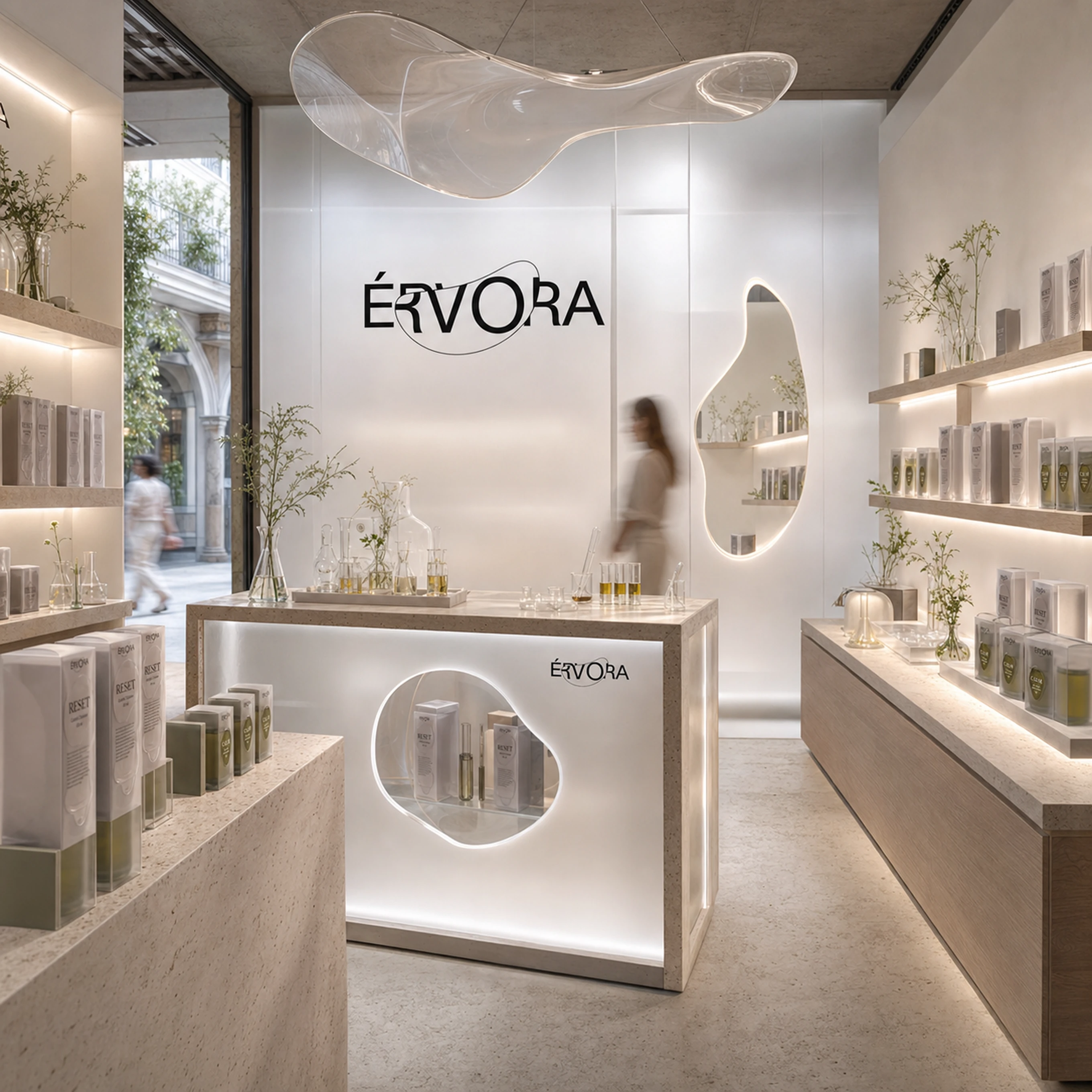
The store is a concept visualization made to test the gesture at physical scale. The organic opening enlarges the same line that runs through the name. Instead of adding a decorative shape to the space, I used the construction of the brand as the starting point for it.
Érvora was not launched commercially. The case records an investigation into naming, brand design and packaging system. Its main strength is economy: a single line changes the word and offers enough material to build the rest of the identity.
Design, art direction and naming by Vitor Altavista.
More Projects