Level Up
2025/2026Identity and brand expression for a sports-fintech.

- Type
- sports-fintech
- Role
- art direction and development of the visual system
- Year
- 2025/2026
- Disciplines
- Art Direction, Brand Identity, Visual System, Campaign Expression, Sports Activation, Digital Brand Expression
Sports brands usually talk about the finish line. Financial brands usually talk about control. For Level Up, neither language worked on its own. The platform had to bring together athletes, sports communities and financial services without looking like a bank dressed in sports imagery.
The moment before the result, when ambition turns into movement.
I found the starting point in the moment before the result. The instant when the athlete walks into the arena, settles into the blocks and gets ready to begin. That is where ambition stops being a promise and turns into movement.
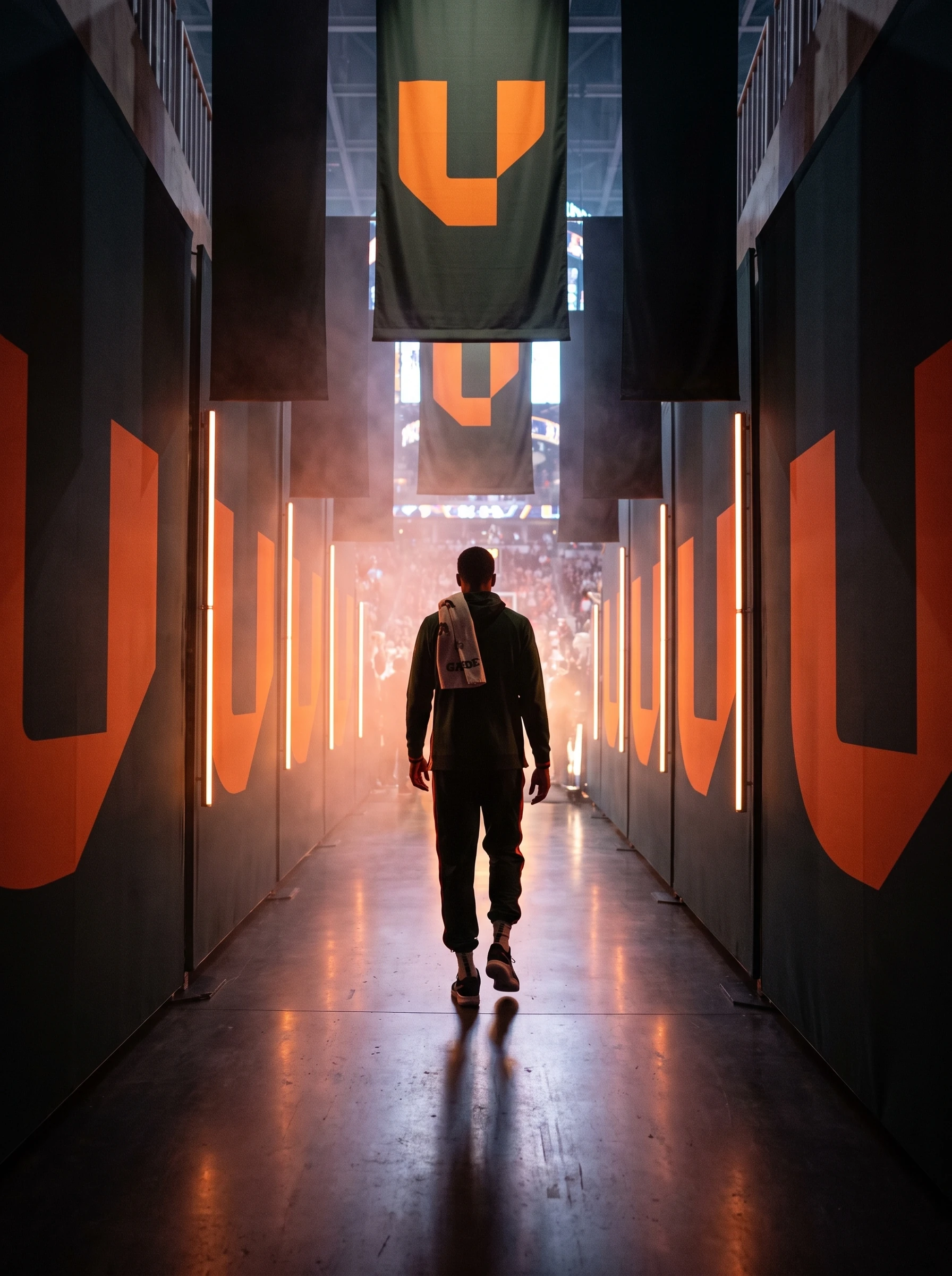

A rising form that can be read as a U, a lane or an opening.
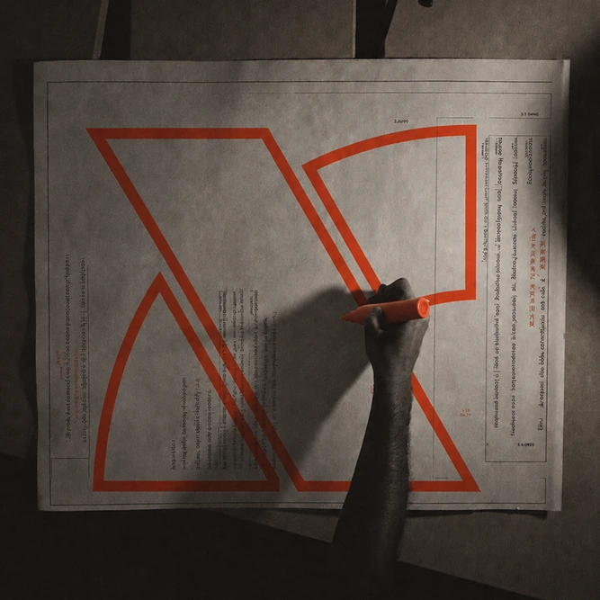
The symbol was built as a rising form, without using a literal arrow. It can be read as a U, a lane, a route or an opening. That ambiguity made the brand more its own and let the drawing move to the ground, to flags, to equipment and to digital compositions.



Black creates structure. Orange works as an impulse.
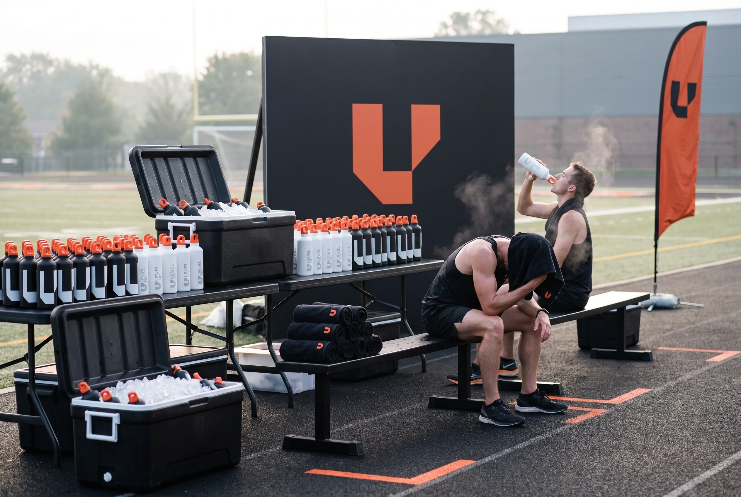
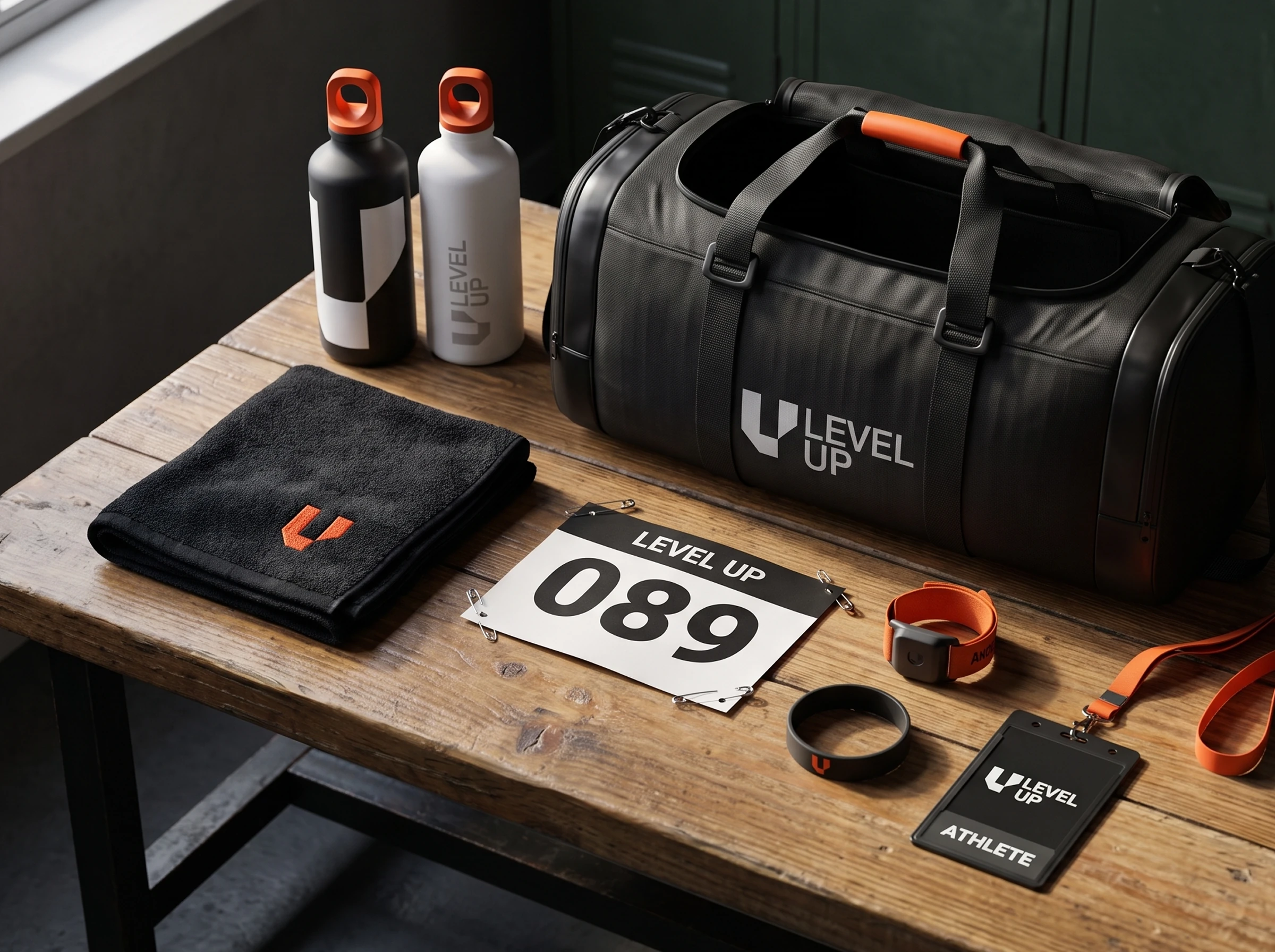
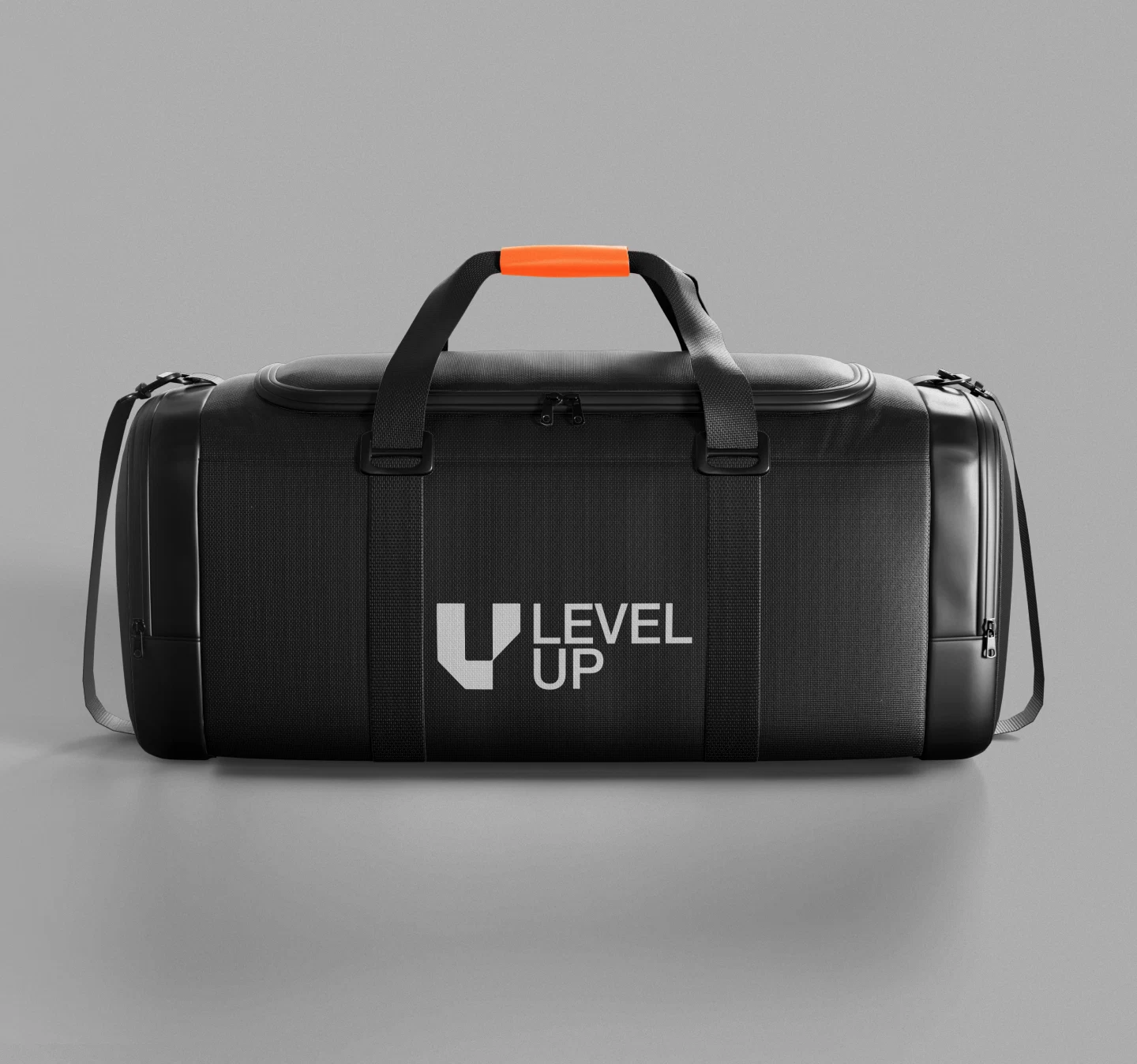
Black creates structure. Orange brings energy and visibility. Instead of filling every piece with color, I used orange as an impulse. It marks the starting point, highlights a passage and guides the action. That relationship shows up in the athlete images, in the activations and in the environments tied to competition.
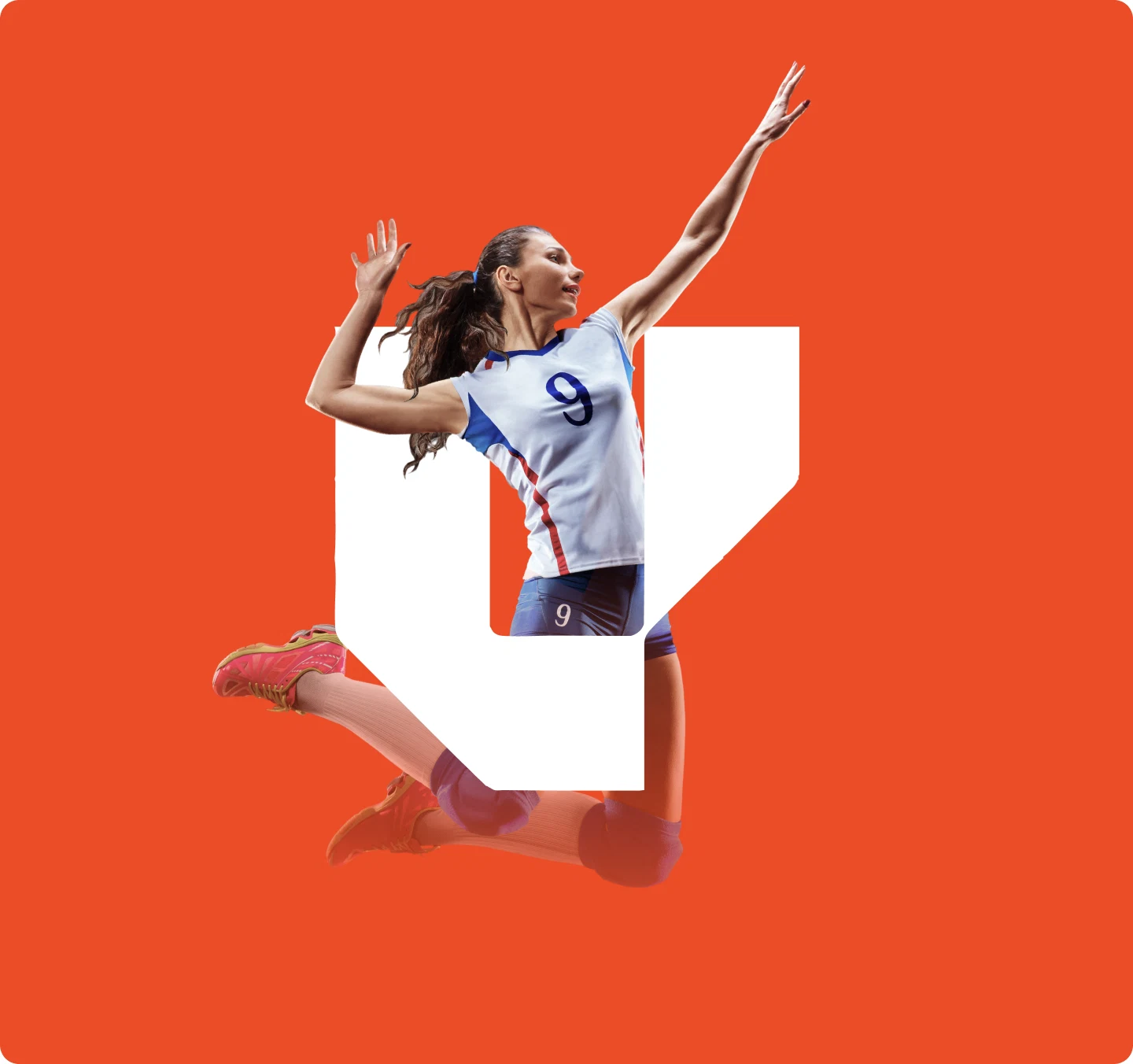
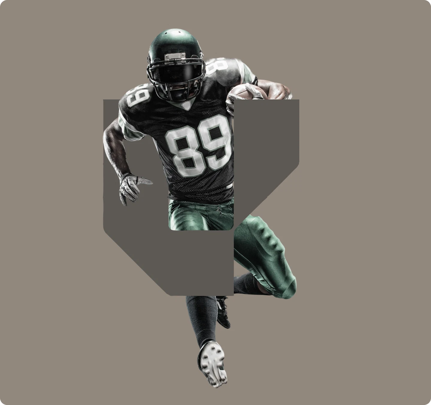
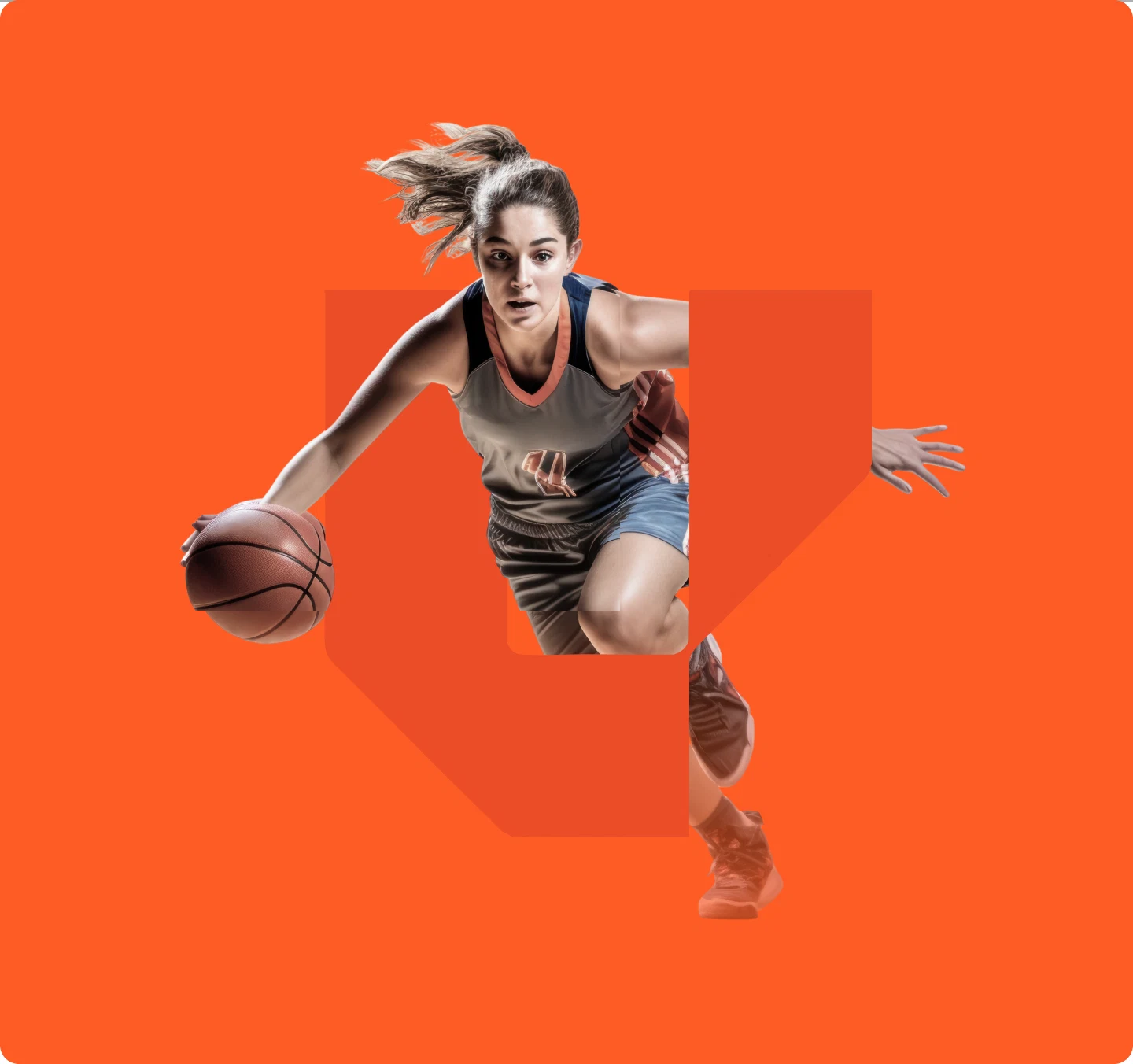

Preparation and focus, not only victory.
In the art direction, I looked for preparation and focus, not only victory. The body, the tension, the tunnel and the track give the brand a real energy. Event and community applications widen that idea. Level Up does not appear only as a service used individually, but as a presence able to occupy the surroundings of the sport.


From the energy of the arena to the presence on screen.
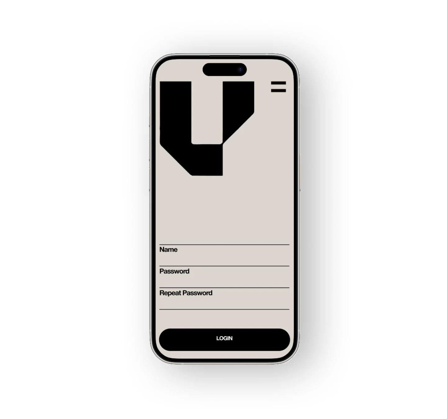
I carried that same rhythm into the digital expression. The brand organizes the experience through contrast, progression and hierarchy. The screens enter the case to show how the system behaves when it has to communicate access, opportunity and progress. The focus is not on product flow or interface. It is on the continuity between the energy of the arena and the presence of the brand on screen.
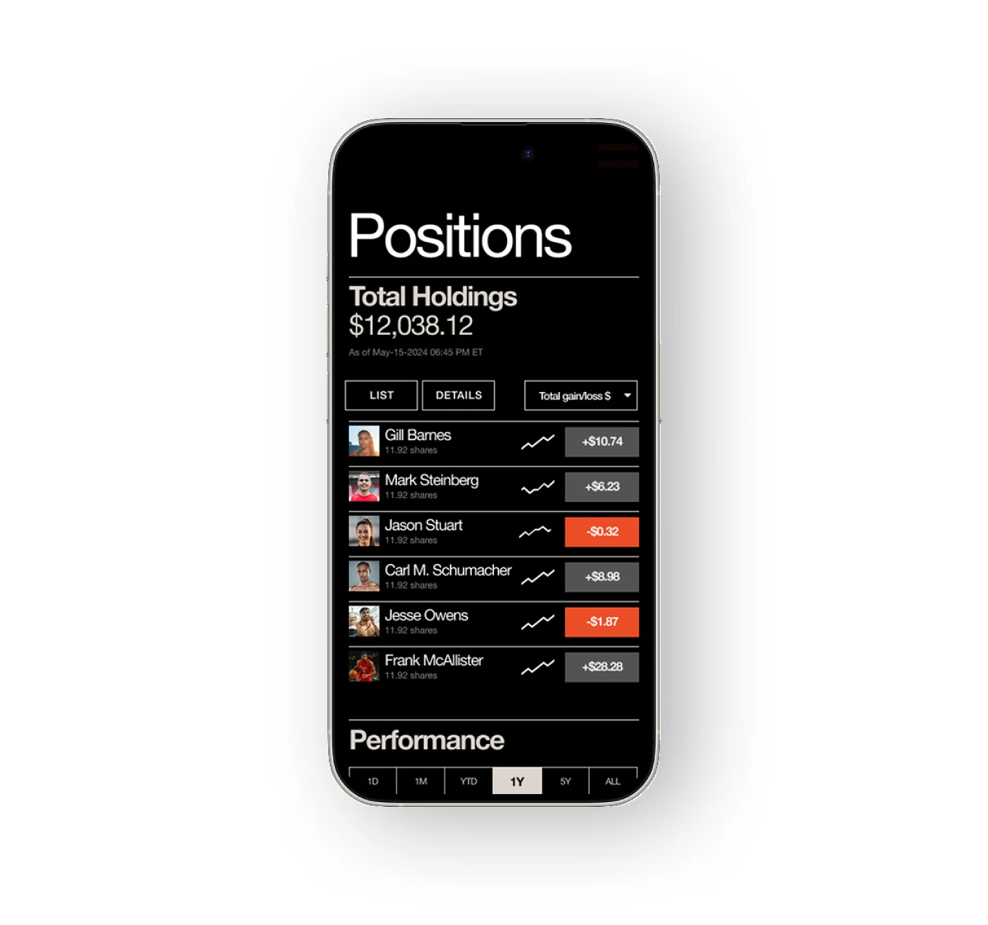
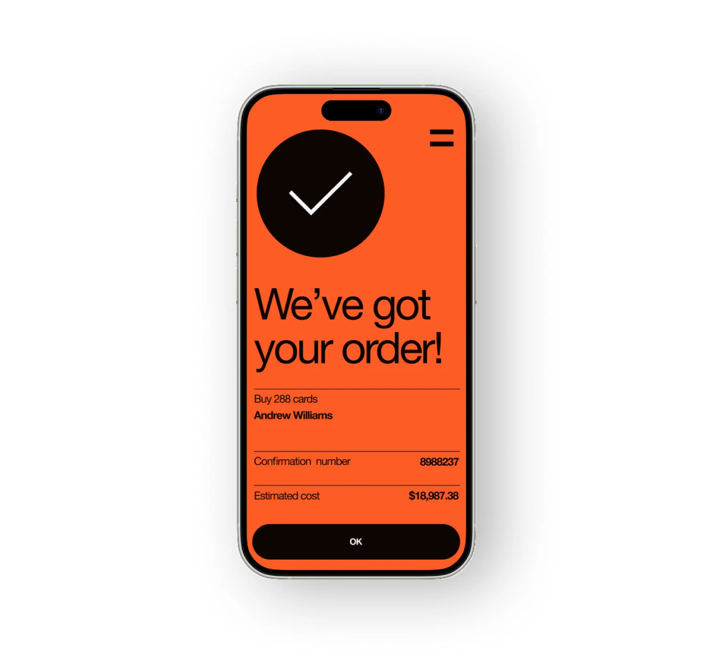
I was responsible for the art direction, visual identity, graphic system and digital expression.
Art direction and visual system by Vitor Altavista.
More Projects