Stablecon '26
2025Art direction and visual system for a conference on stablecoins.
- Type
- event identity
- Role
- art direction and development of the visual system
- Location
- Washington, DC
- Year
- 2025, for the 2026 edition
- Disciplines
- Art Direction, Visual System, Event Identity, Typography, Signage, Digital Brand Expression
Stablecon brings together founders, investors, technology professionals and public sector representatives to discuss stablecoins, digital payments and financial infrastructure. In Washington, the identity had to speak to two audiences that usually work in very different languages.
An identity between institutional trust and a category still taking shape.
If the event looked like a traditional finance conference, it would lose the energy of a category still taking shape. If it took on the excess associated with the crypto world, it would undercut the trust an institutional discussion needs. My work inside AGD Group was to build a system able to hold the space between those two extremes.
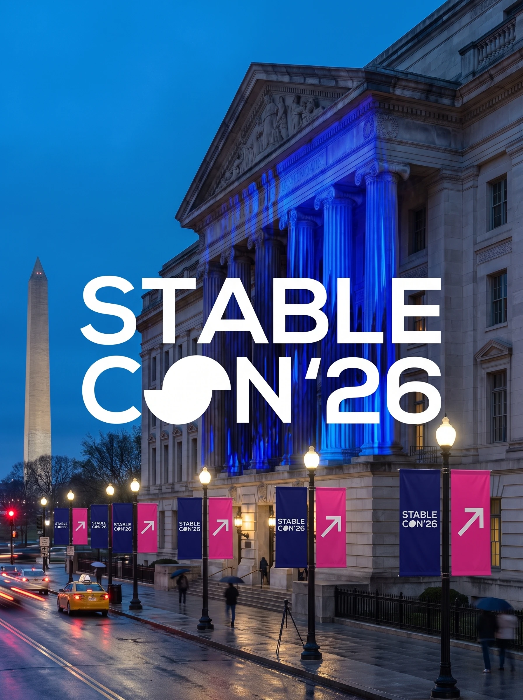
Navy holds the base, magenta sets the change of pace.
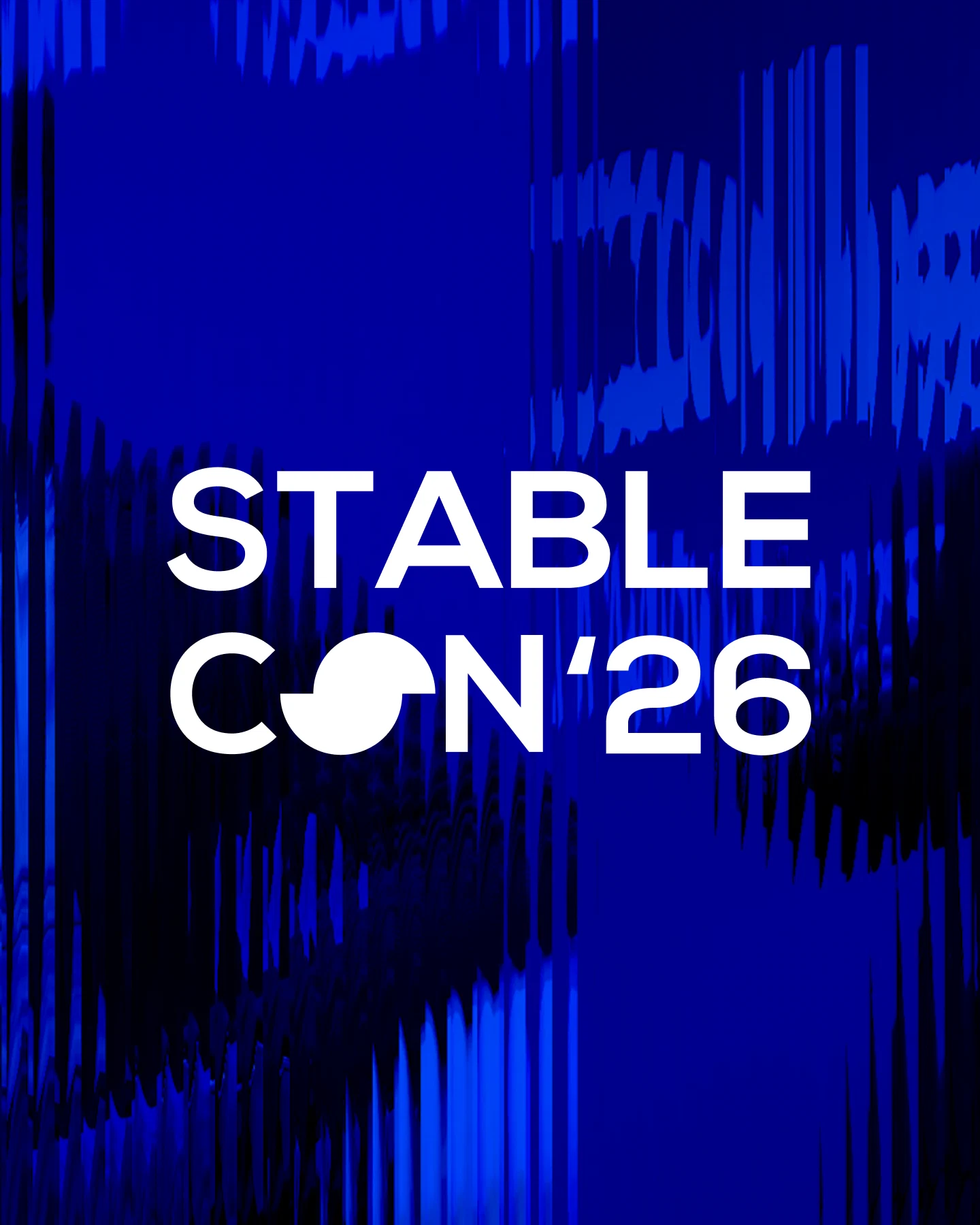
I began by setting a color hierarchy. Navy forms the base and brings stability to the pieces carrying more information. An open blue widens the digital presence. Magenta shows up at specific points, guiding routes, highlighting headlines and creating a change of pace.
That split mattered because a recognizable color combination would not resolve the event on its own. Schedule, rooms, speakers, badges, sponsors and content had to coexist without fighting for attention the whole time.

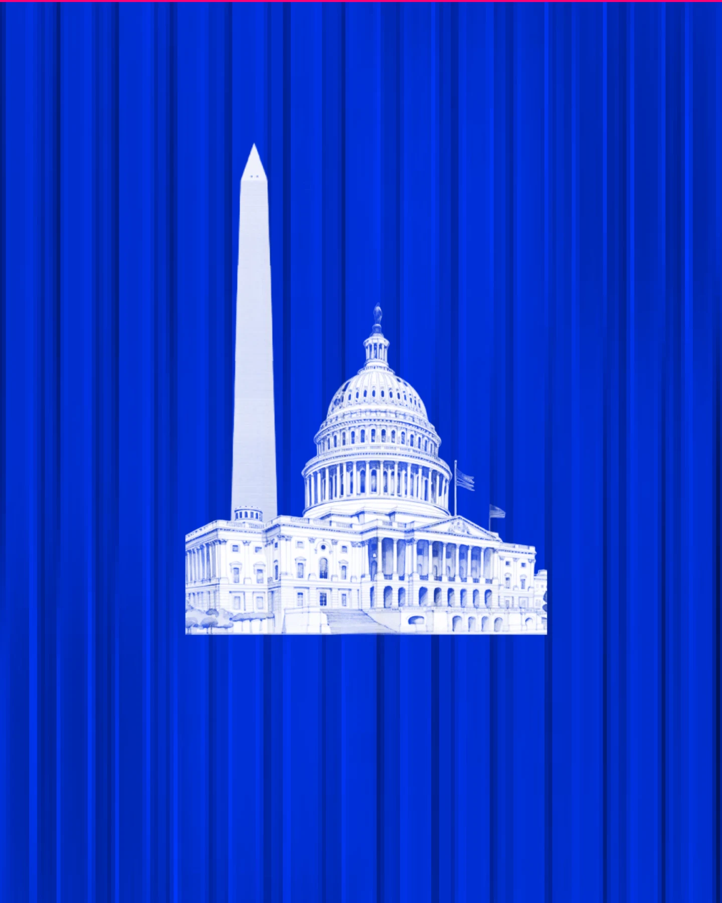
The symbol became an editorial tool, not only a signature.
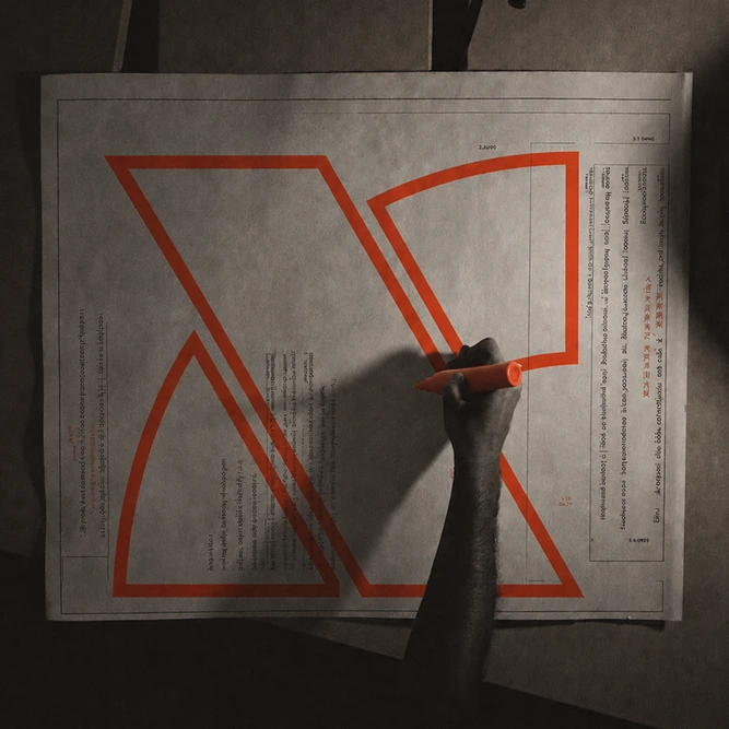
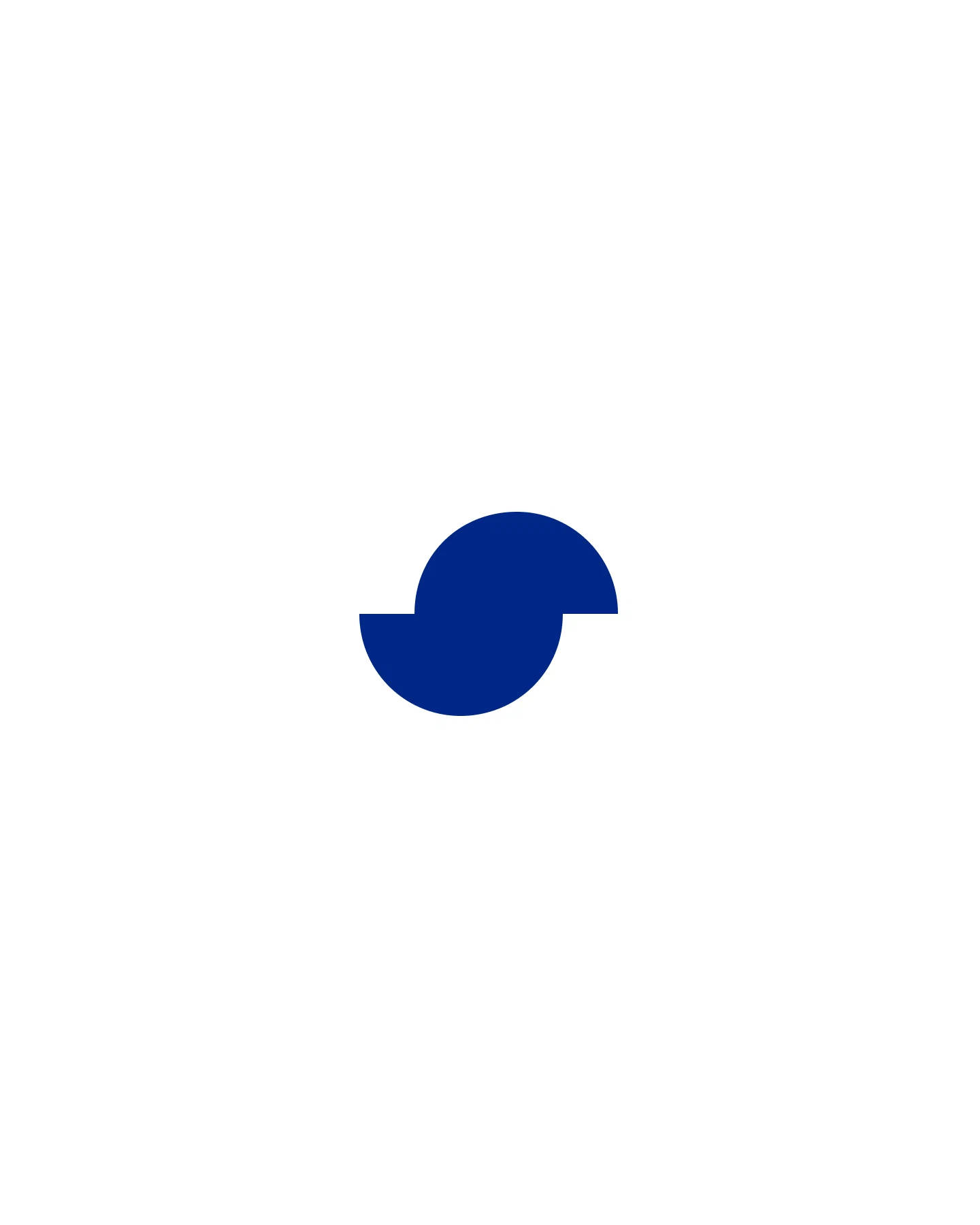
The symbol gathers stability, circulation and conversation. Its rounded shape suggests a coin or a unit of value. The opening keeps it from looking static. Depending on the application, the drawing also recalls a comma, a quotation mark or a speech bubble, bringing the financial world closer to the conference's role as a space for debate.
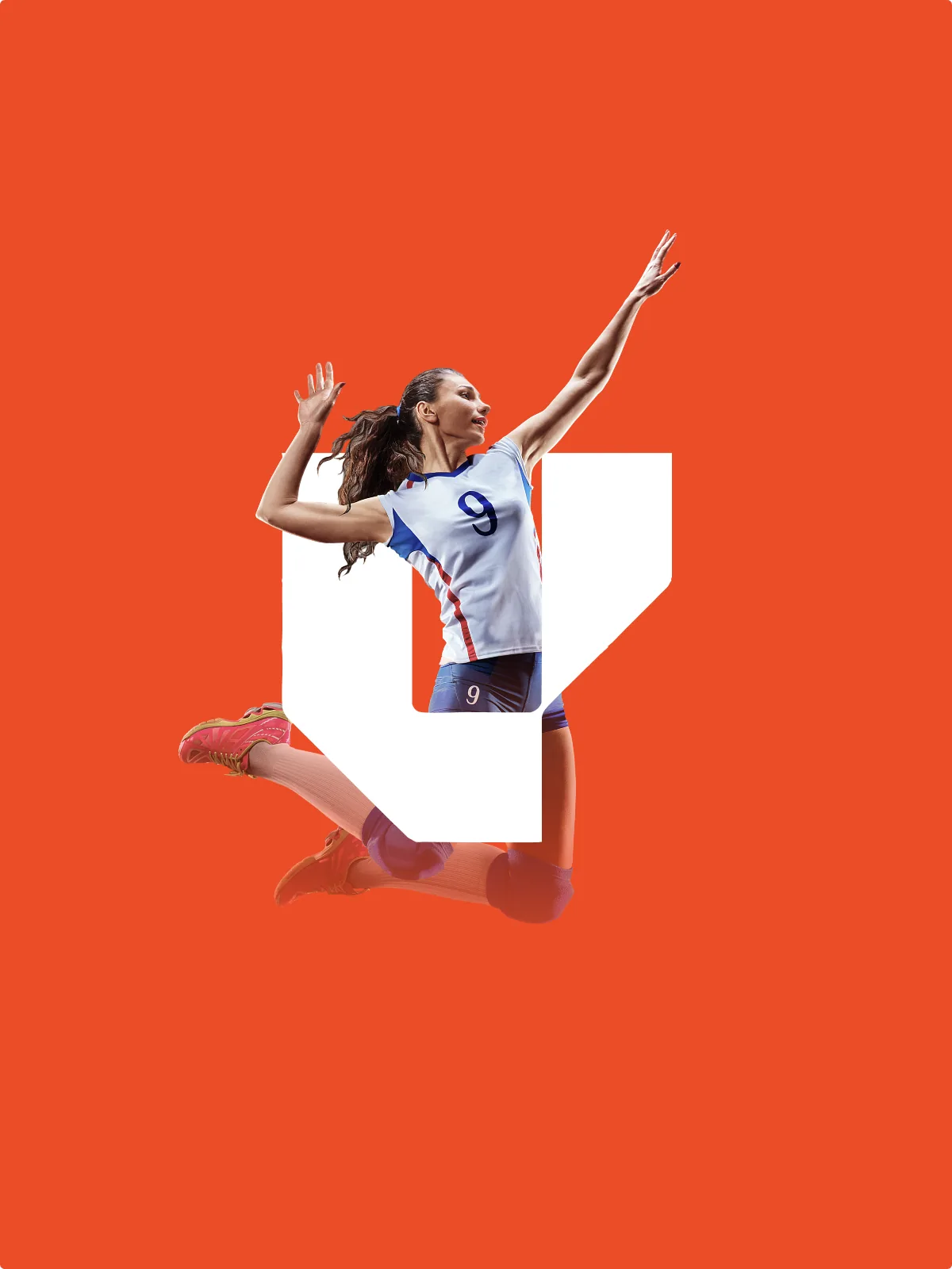
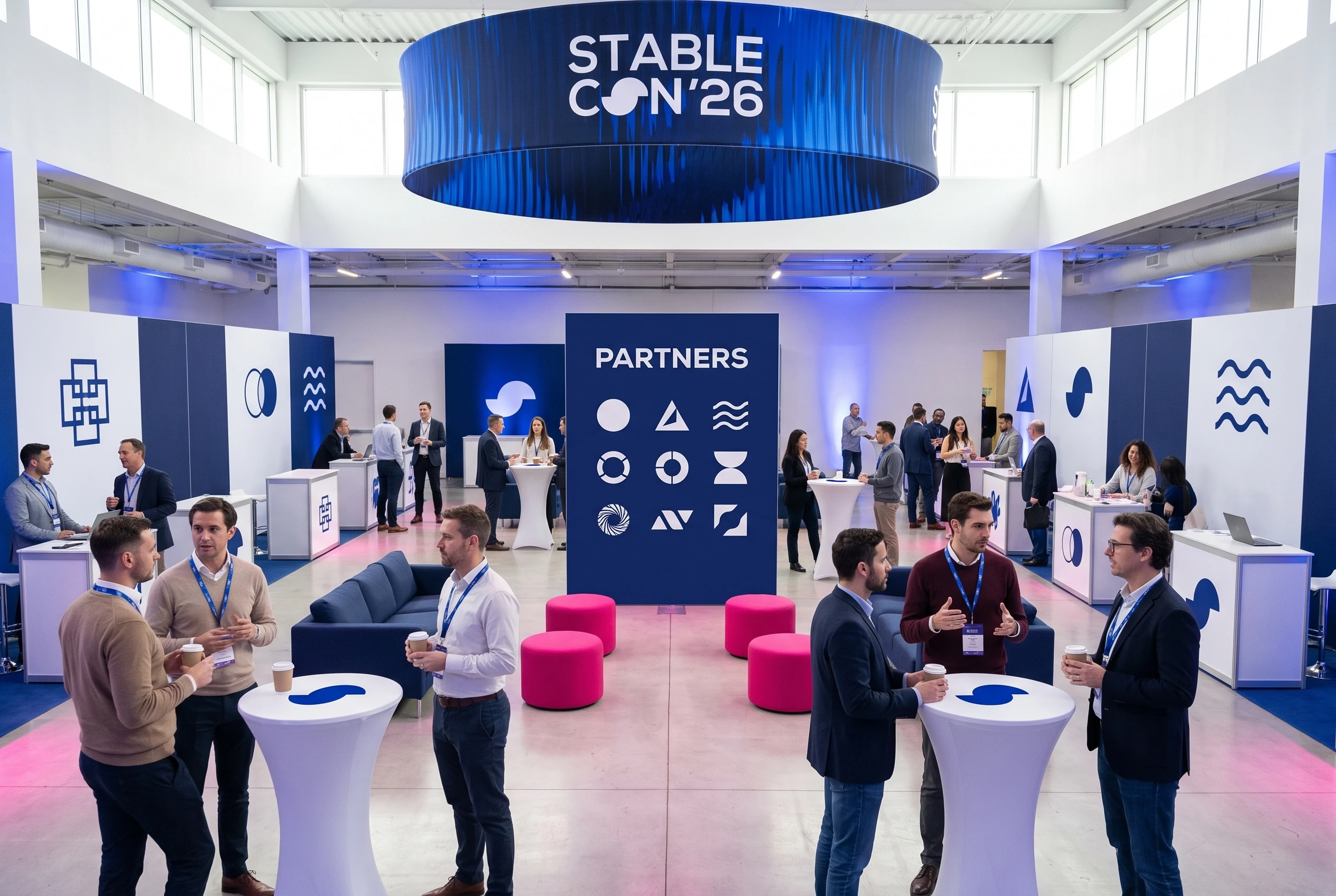
I did not limit the symbol to the signature. It frames content, highlights quotes, points directions and organizes areas of information. That flexibility kept the identity present even in the pieces where the logo had to take up little space.
Nexa had to work in a printed agenda and across an auditorium.
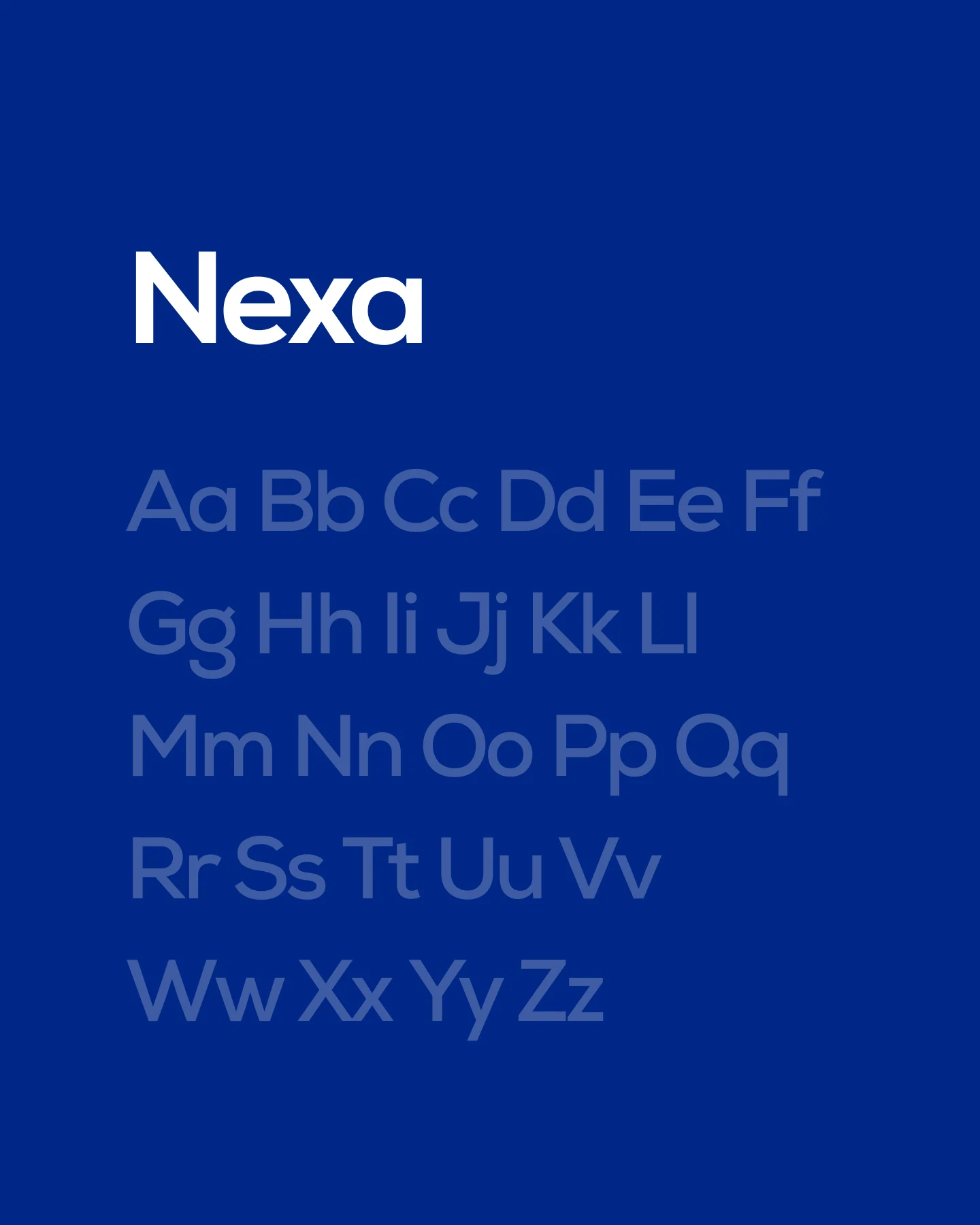
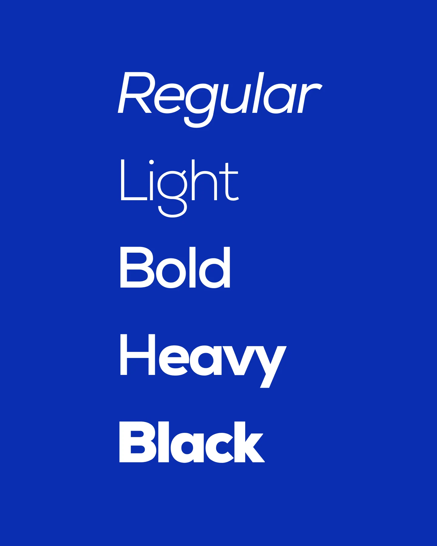
Nexa was chosen as the main family for its range of weights and its legibility across very different scales. It had to work both in a printed agenda and in a headline seen from across an auditorium. The lighter weights organize institutional information. The heavier ones build presence on stage and in promotional pieces.
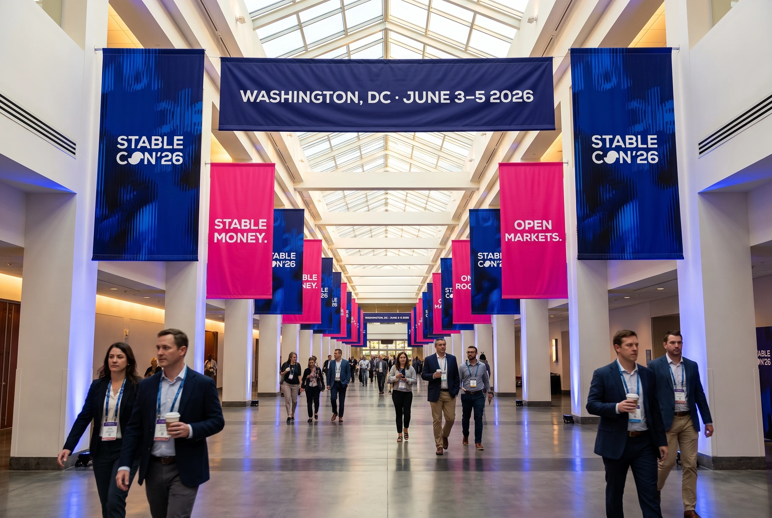
The schedule and the signage were where the system proved itself.
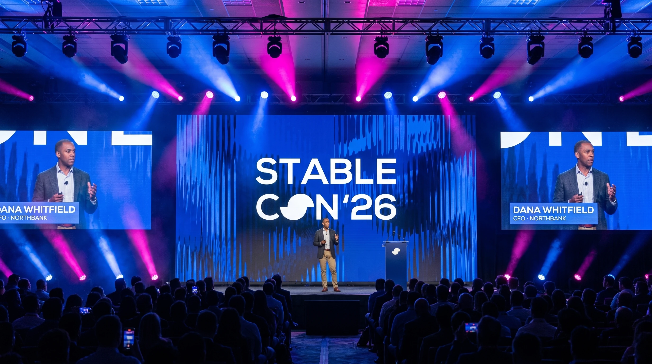
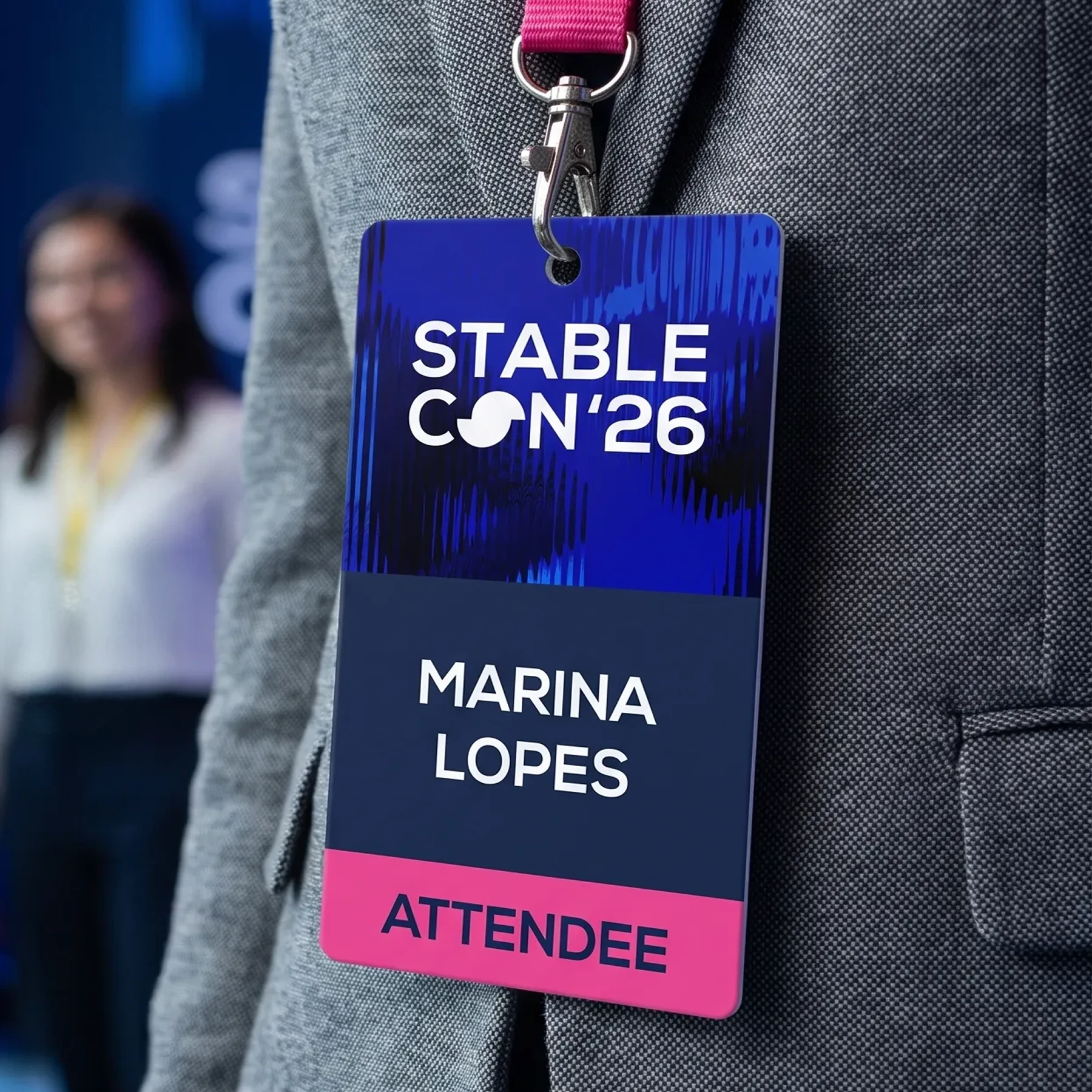
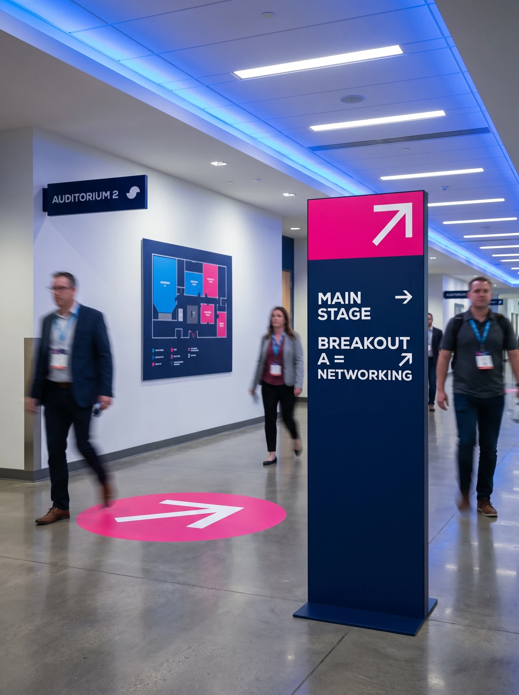
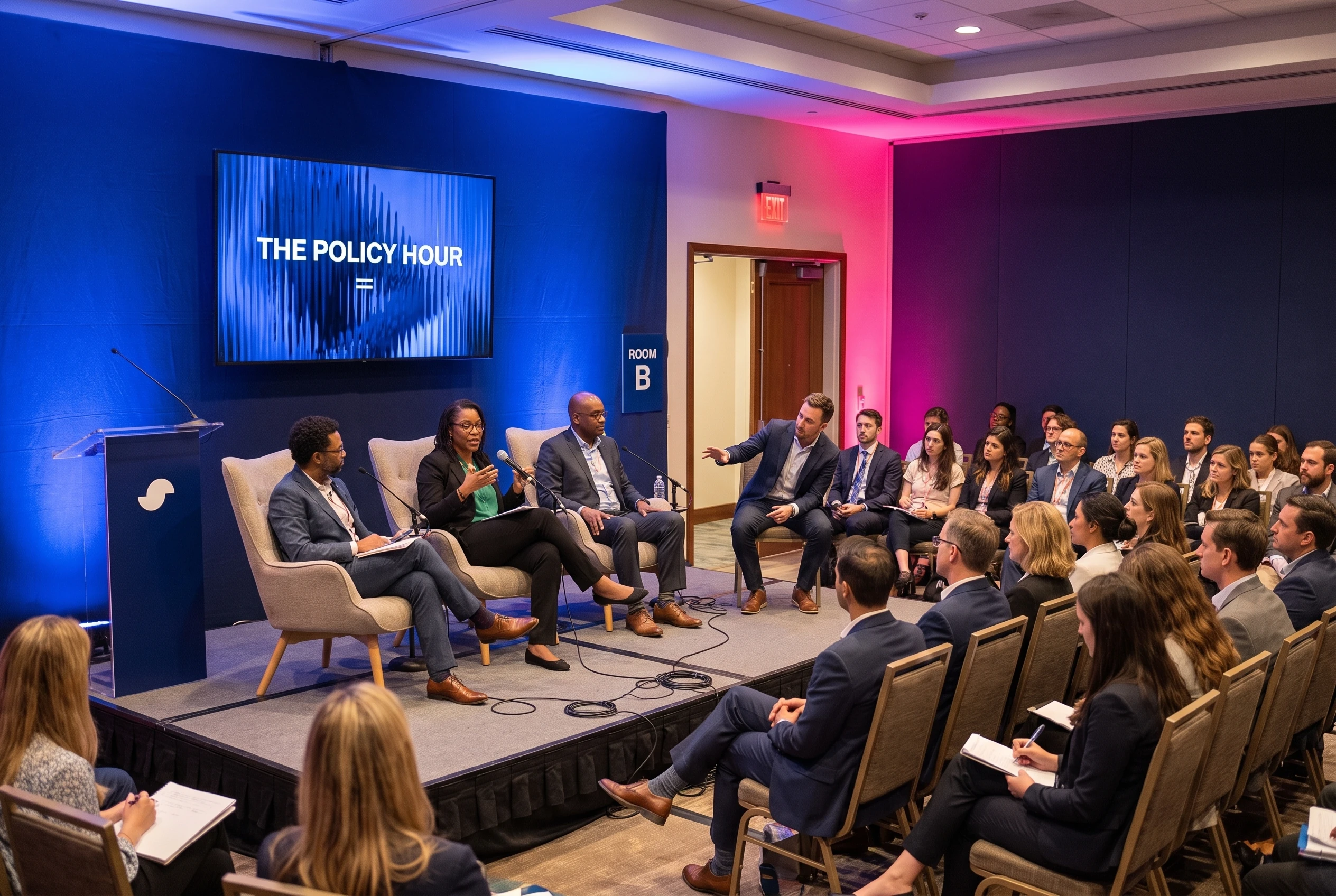
The schedule and the signage were where the system really proved itself. Speakers, times, rooms and sponsors created an amount of information the logo alone could not resolve. I used the symbol as an editorial tool and built clear levels between wayfinding, content and headline. The identity started helping the event work rather than only decorating it.
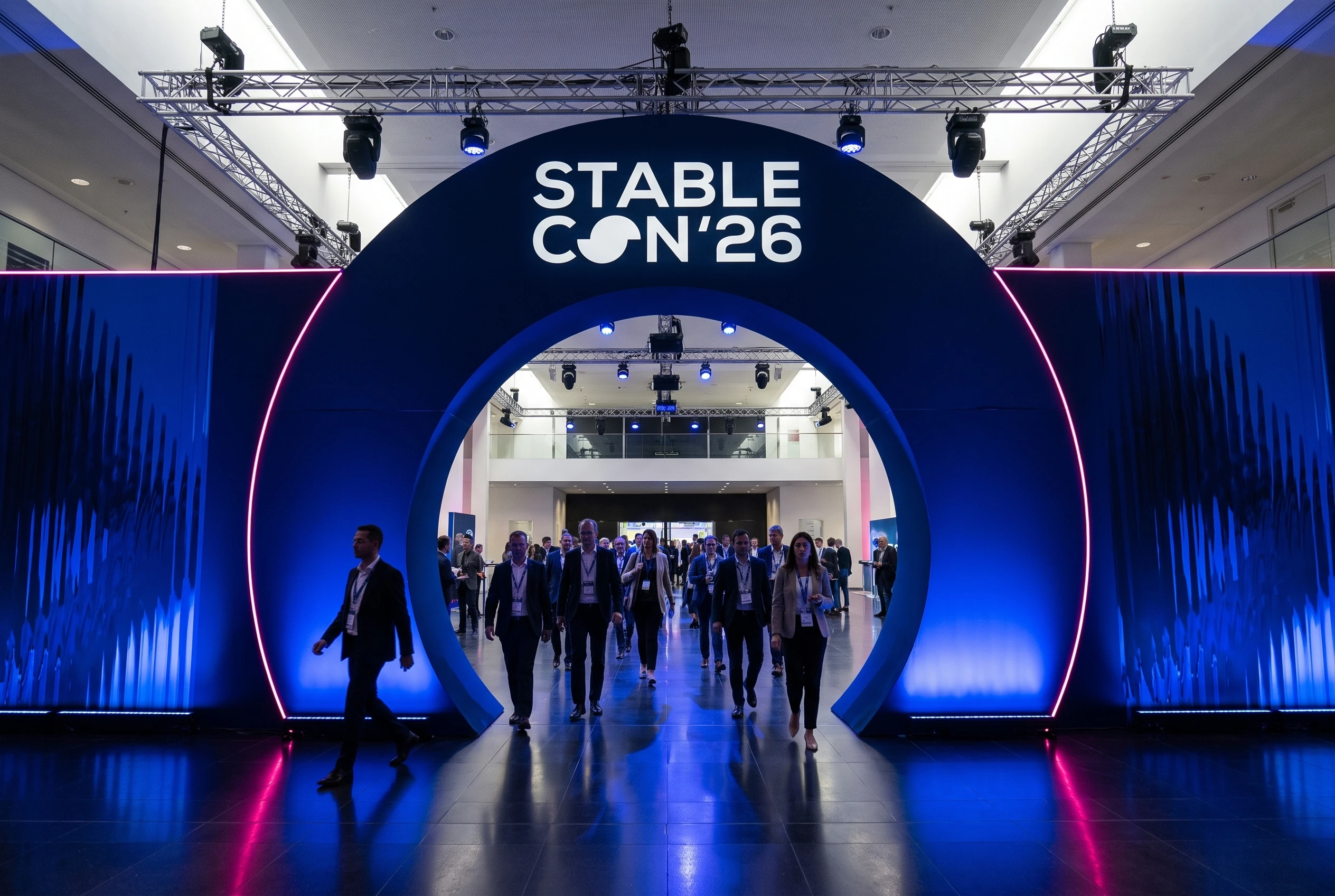
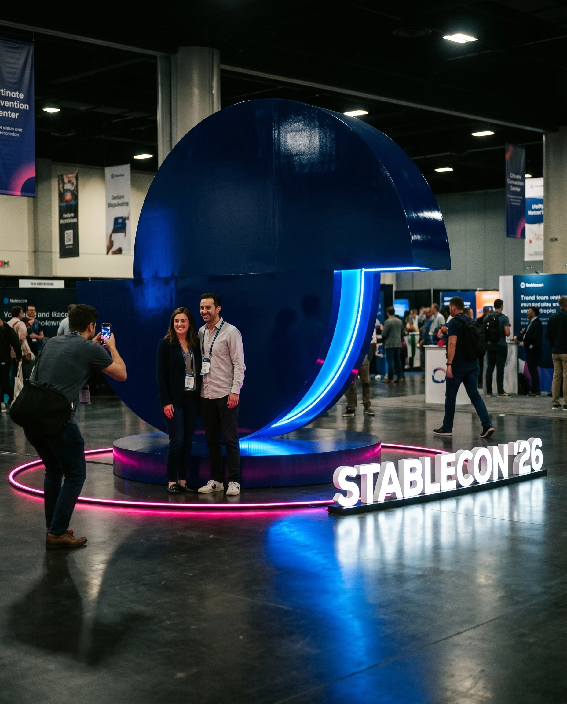
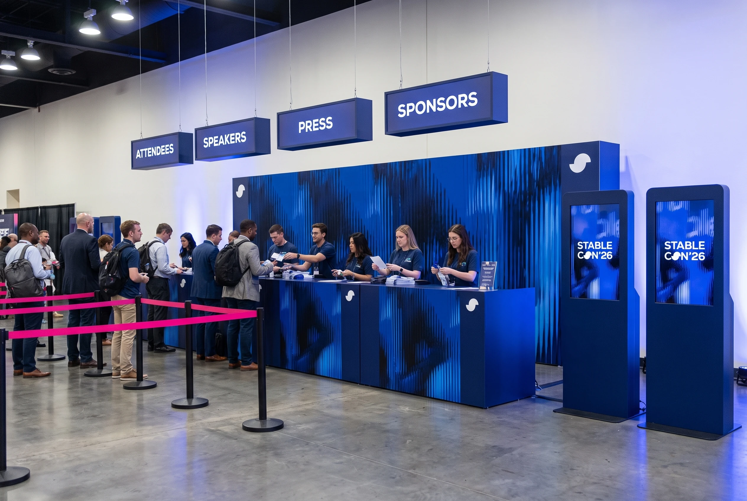
The portals, booths, panels and stage structures shown in the case are visualizations used to study spatial application. They let me test contrast, scale, reading distance and presence before production. Some decisions that worked on screen had to be simplified once seen on a portal or a totem.
On the site, the same split between structure and energy.
On the site, I kept the same split between structure and energy. I defined the visual direction, the information layout and the behavior of the symbol across the speaker and agenda pages. Before the conference, the experience had to present the event and lead to registration. During the event, schedule, attendees and practical information had to surface quickly.
Stablecon shows how I work inside a system with many scales and many internal users. The identity follows the event's journey and offers enough rules for different teams to produce new pieces without diluting the brand.
Created at AGD Group, in collaboration with the AGD team. Art direction and visual system by Vitor Altavista. Digital implementation by the team.
More Projects