Jelly Dog
2026Identity, illustration and line architecture for a dog treat brand.
- Type
- self-initiated identity and packaging project
- Role
- end-to-end concept and direction
- Year
- 2026
- Disciplines
- Brand Identity, Naming, Illustration, Packaging Design, Art Direction, Visual System, Digital Brand Expression
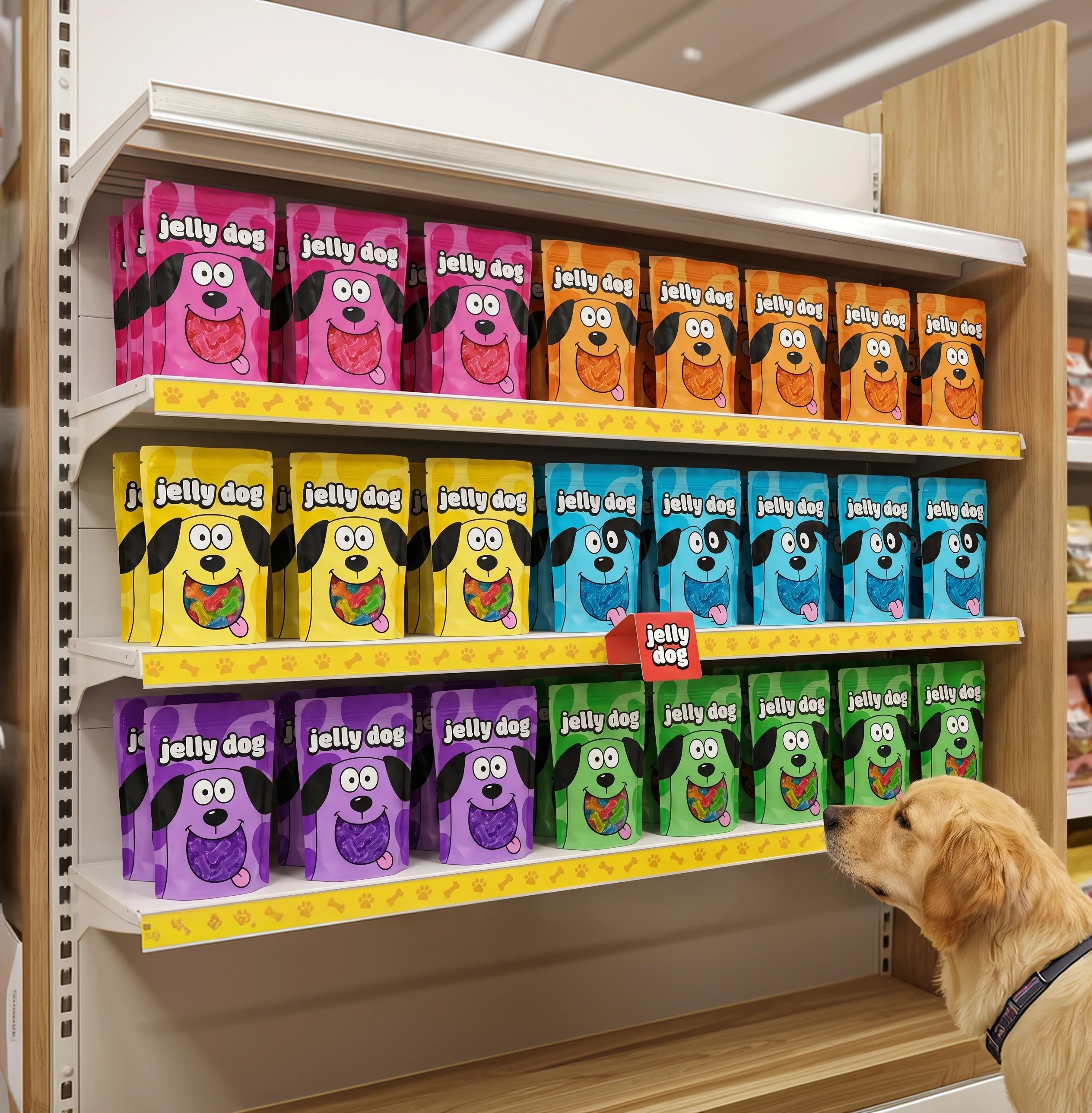
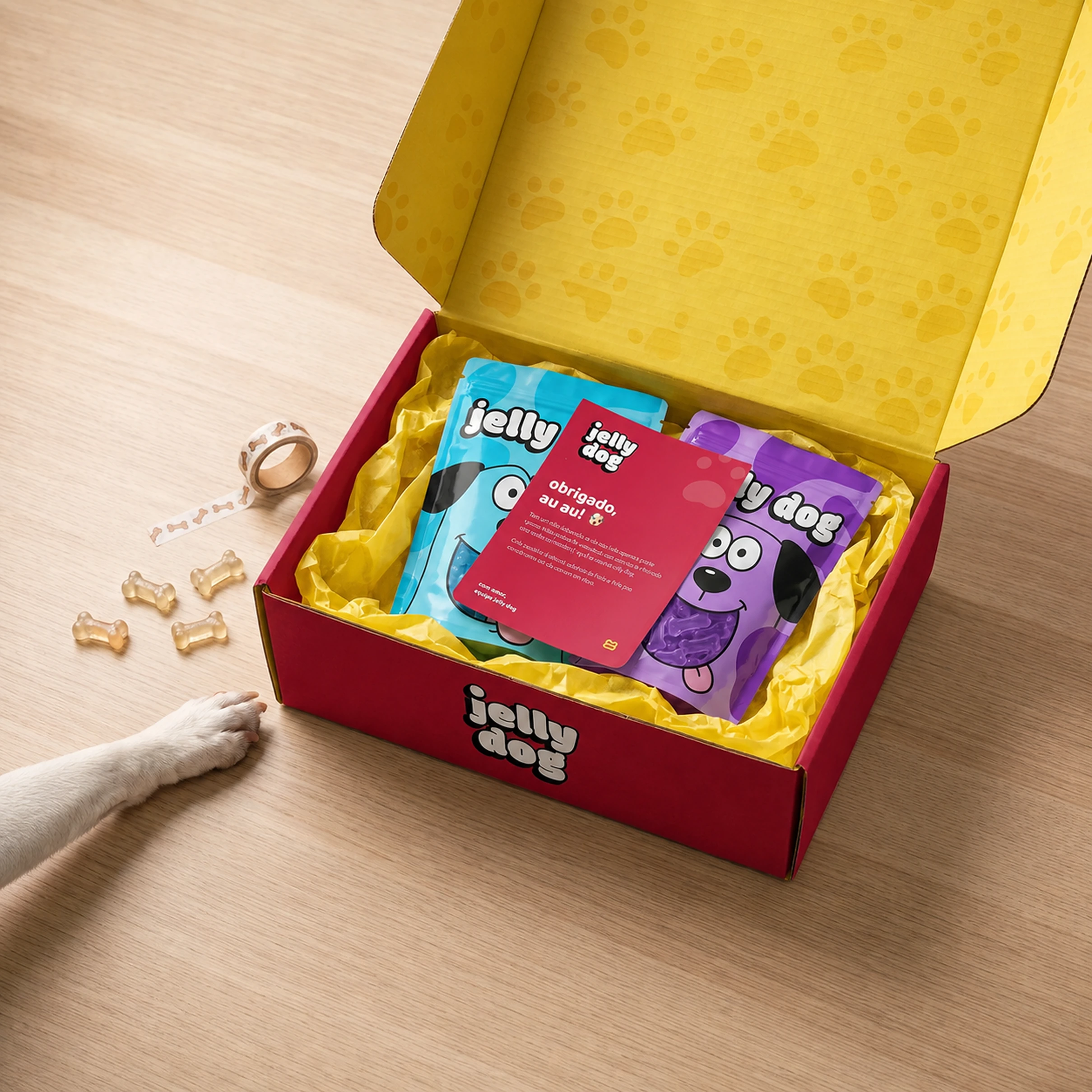
When the six packages were placed side by side for the first time, the system became clear. They had to look different enough to be found quickly and close enough to form a single brand.
Fun before it is even read, without turning the shelf into noise.
Jelly Dog is a self-initiated project of dog treats. I wanted to avoid both the childish language that speaks only to the owner and the functional look of a supplement. The brand had to be fun before it was even read, without turning the shelf into noise.
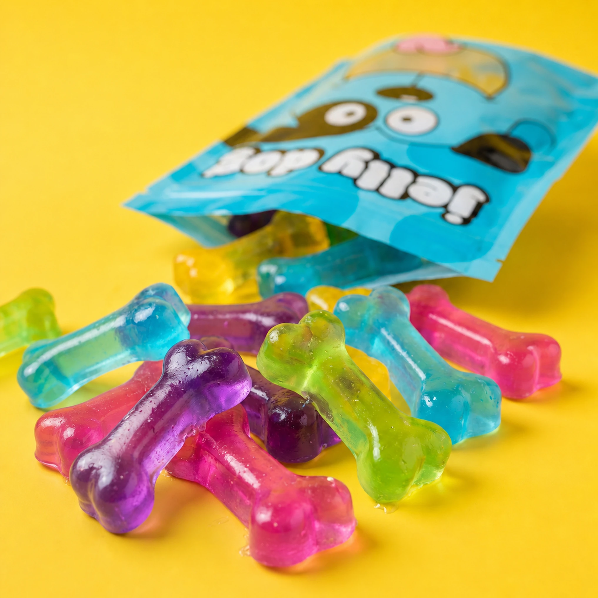
The first character worked alone. The second and the third revealed the system.
The first character worked on its own. The challenge showed up when I drew the second and the third. If each dog followed a different language, the line would lose unity. If they were too alike, they would stop helping with differentiation.
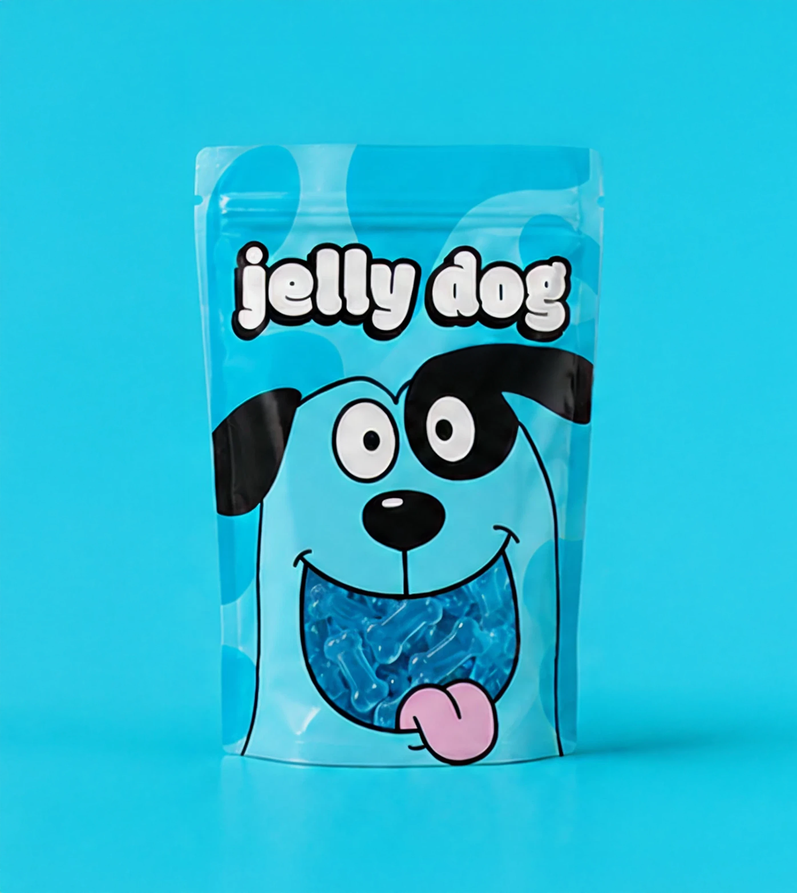
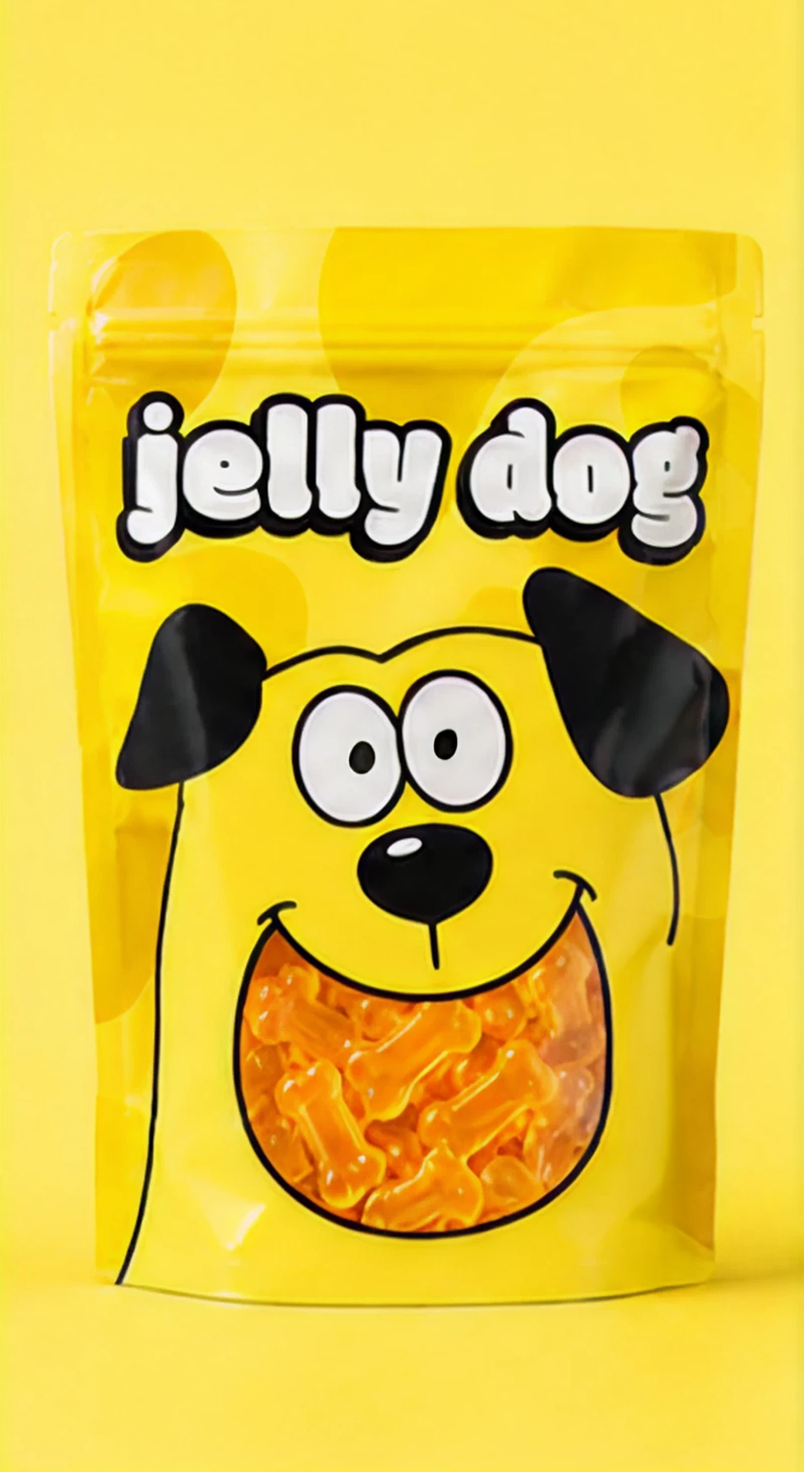
Shared shapes and proportions, with room for six personalities.
So I built a shared set of shapes, outlines and proportions. Within those rules, expression, ears, snout and attitude could change. Each character got a dominant color and came to stand for a variant. Color creates the first level of navigation. The face sets the bond and personality.
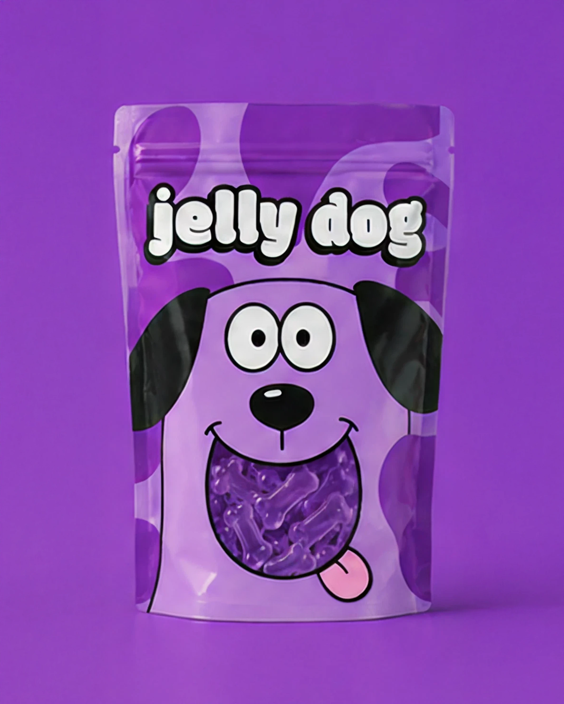
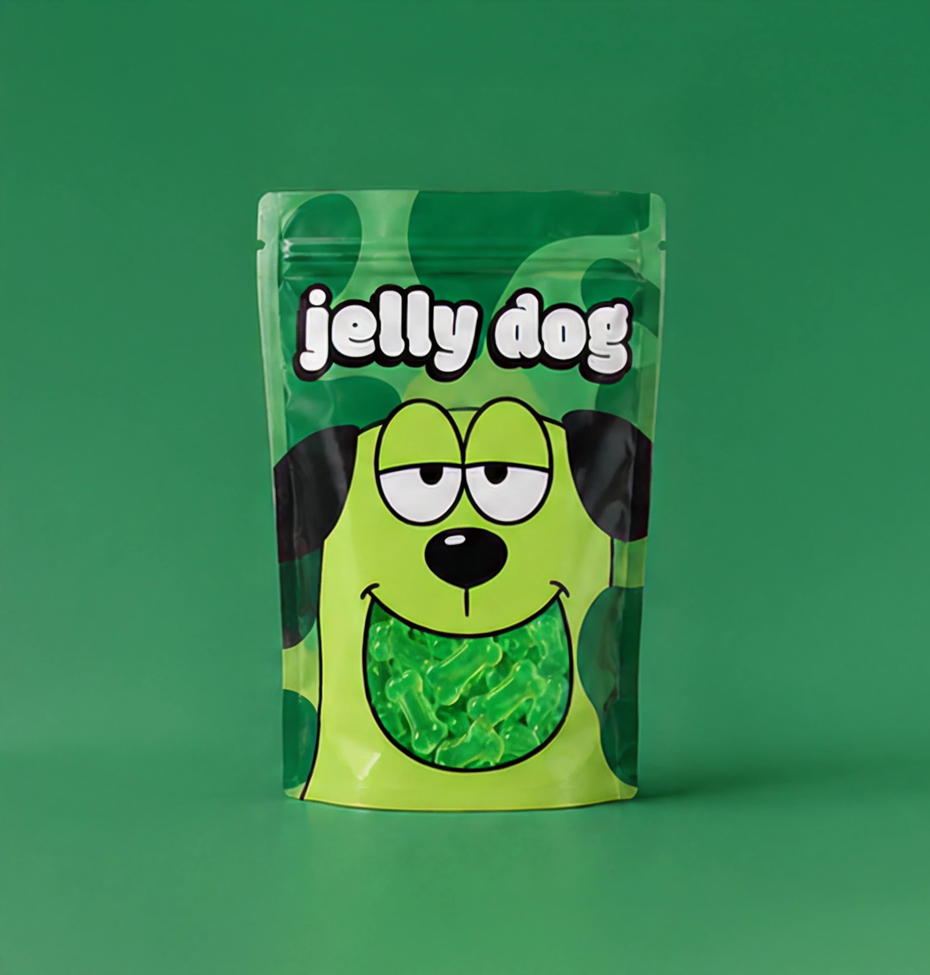
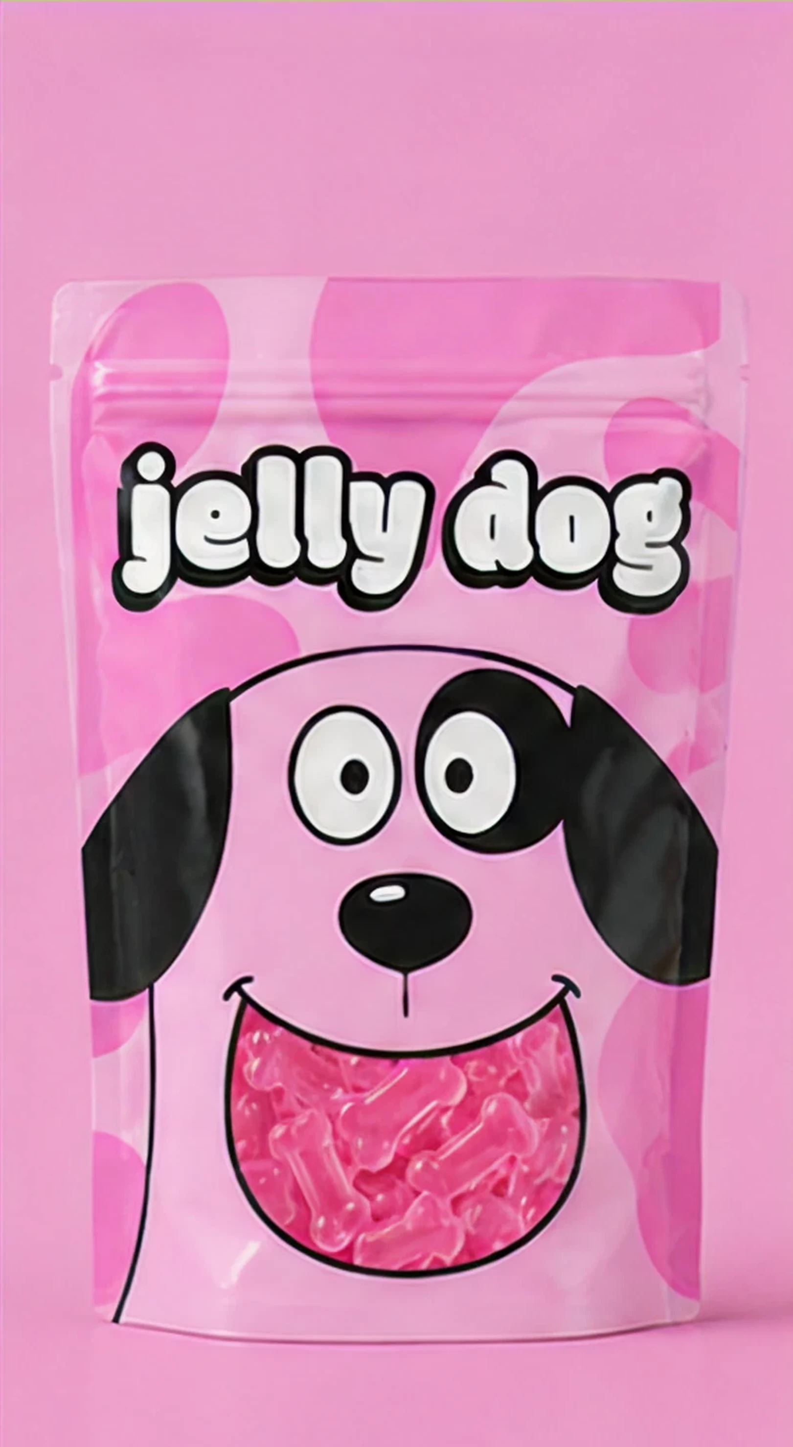
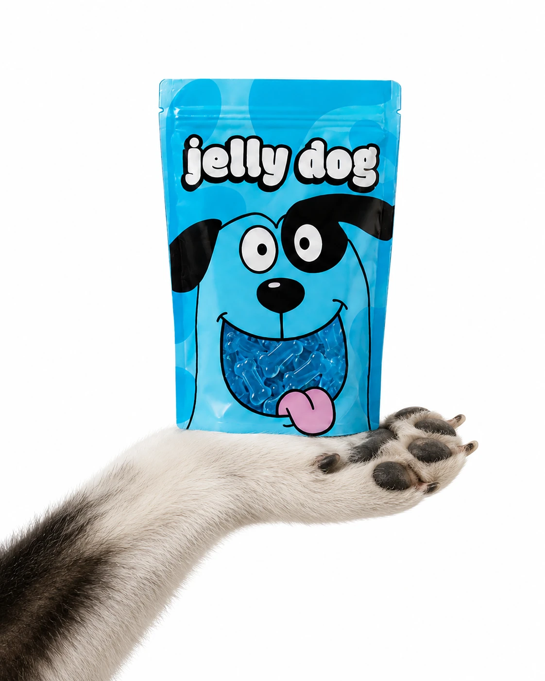
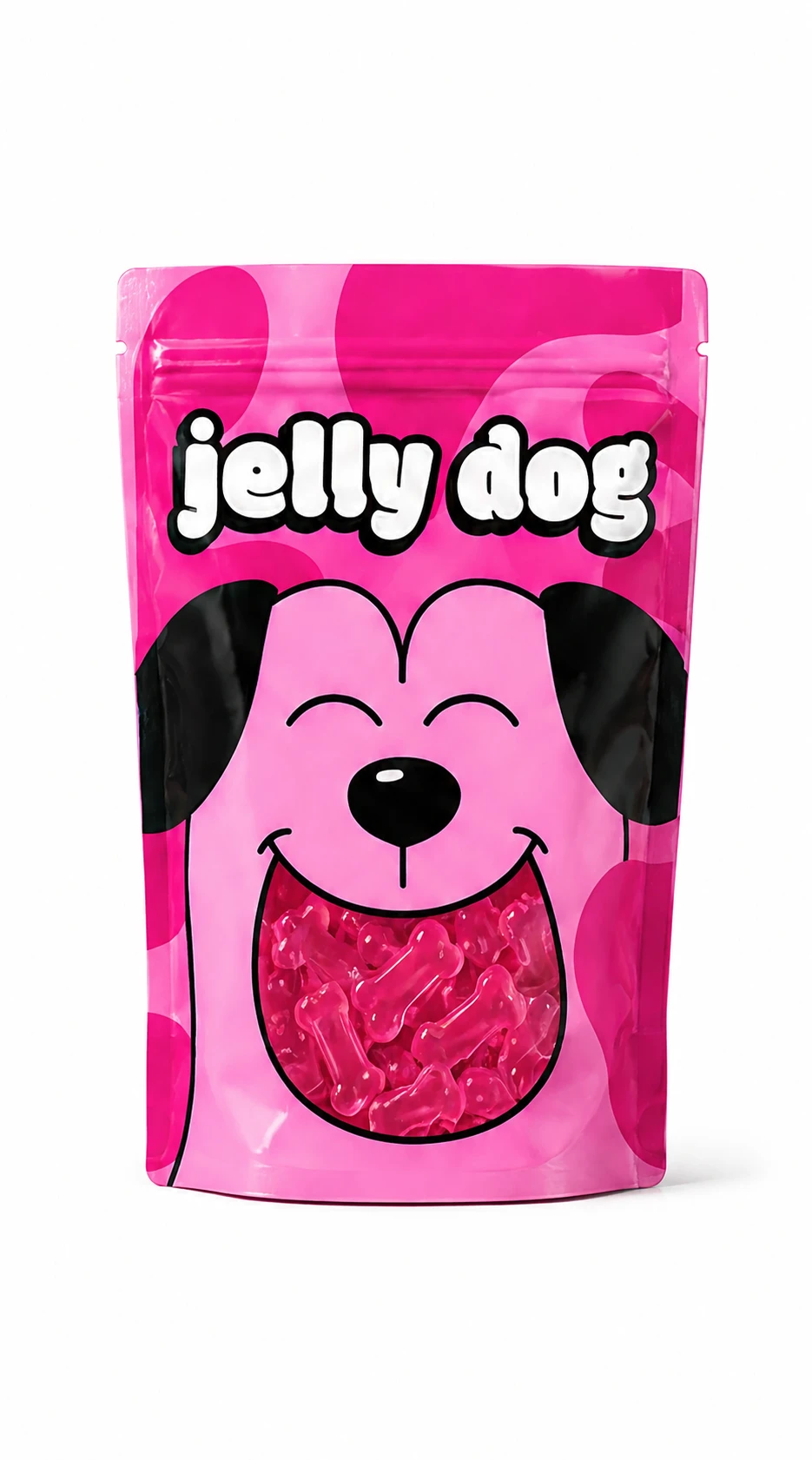
The exaggeration happens inside a controlled architecture.
The packaging structure stays stable. Wordmark, name, information and breathing room hold consistent positions. That repetition lets the characters and colors be more intense. The exaggeration happens inside a controlled architecture.
The wordmark has round shapes and enough weight to live alongside the illustrations. It stays in the same place and works as a point of recognition when everything else changes. New variants can enter the line following the same rules, without asking for a full redesign.
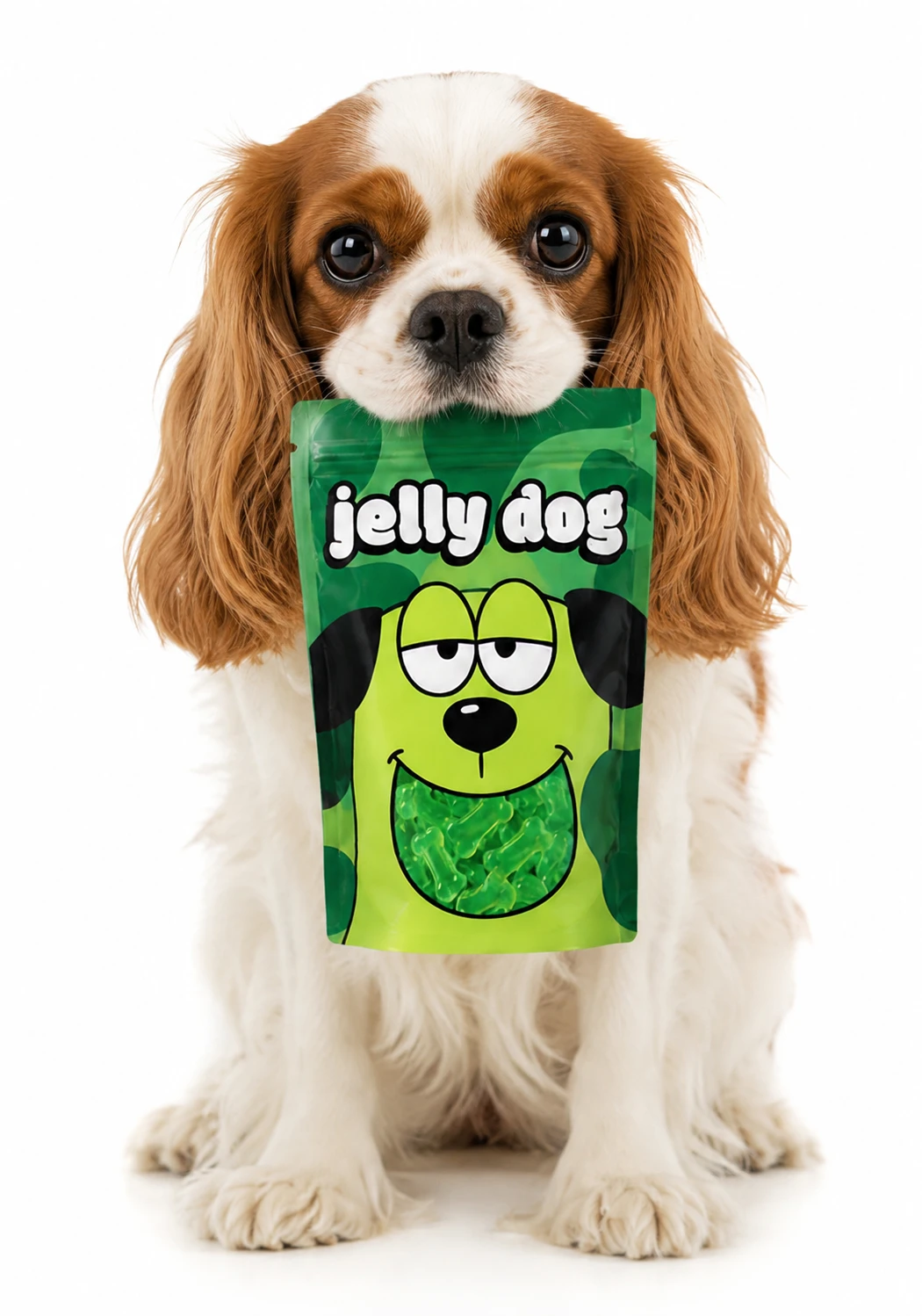
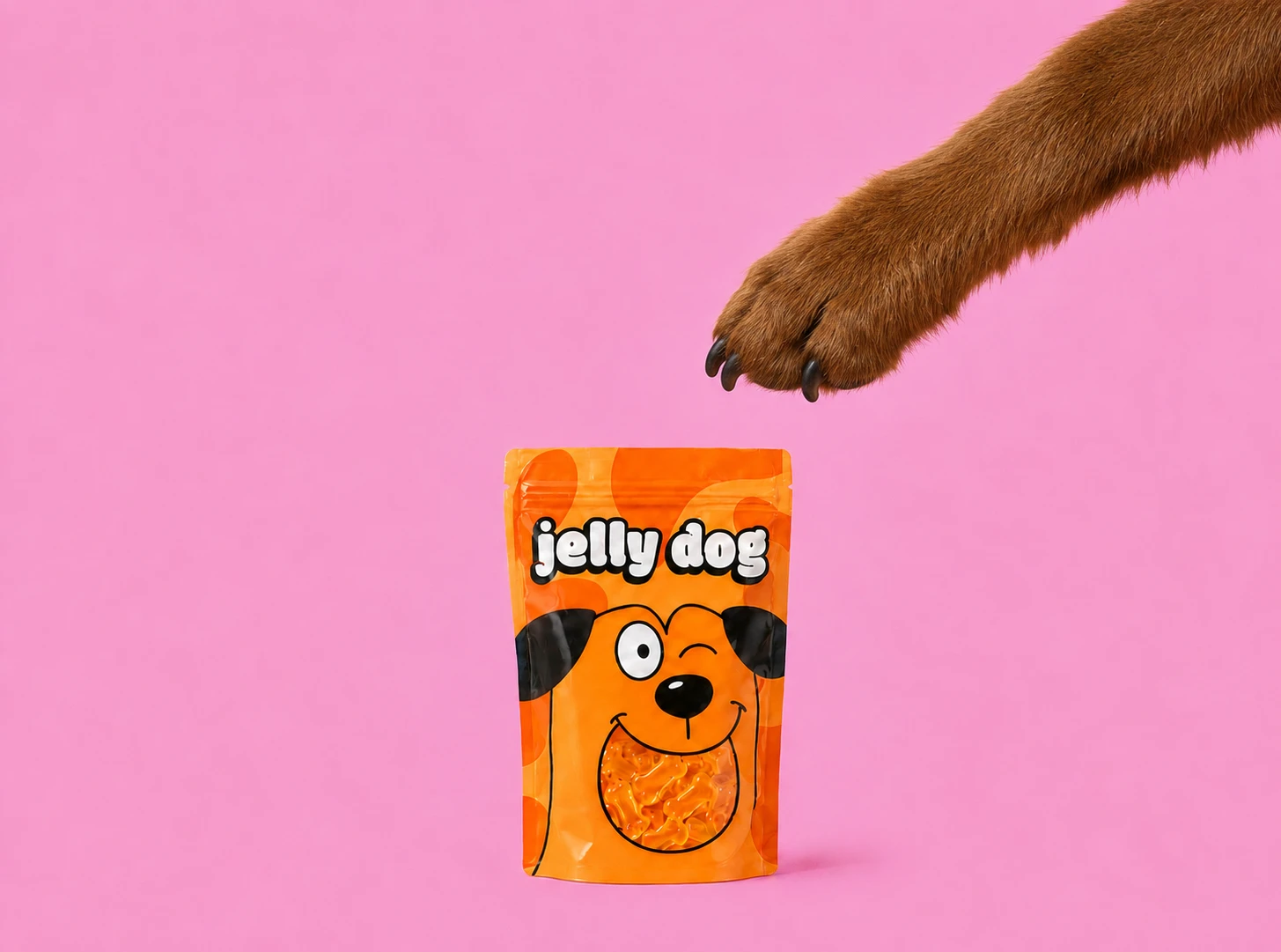
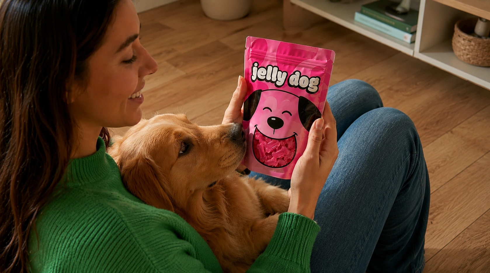
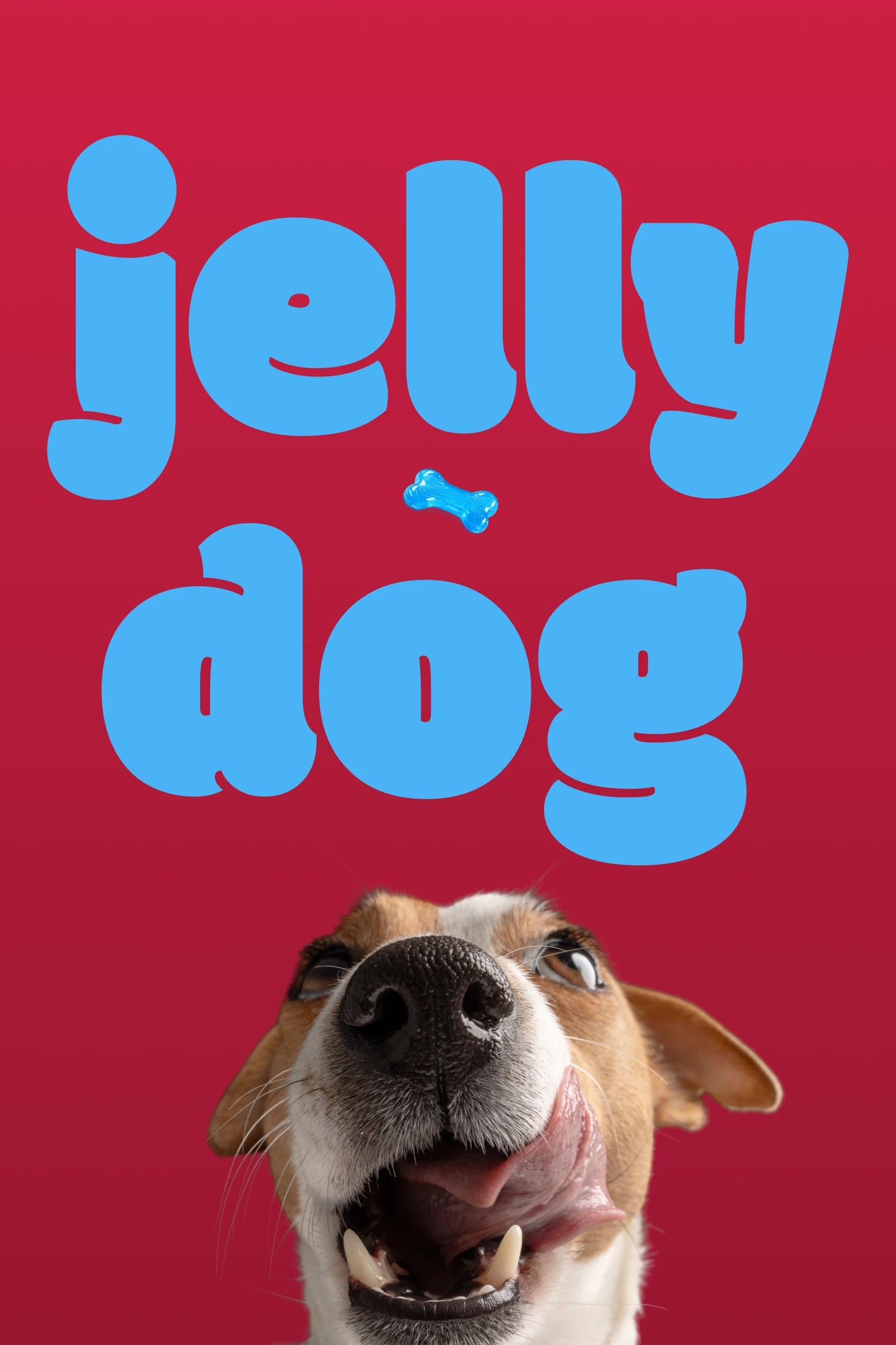
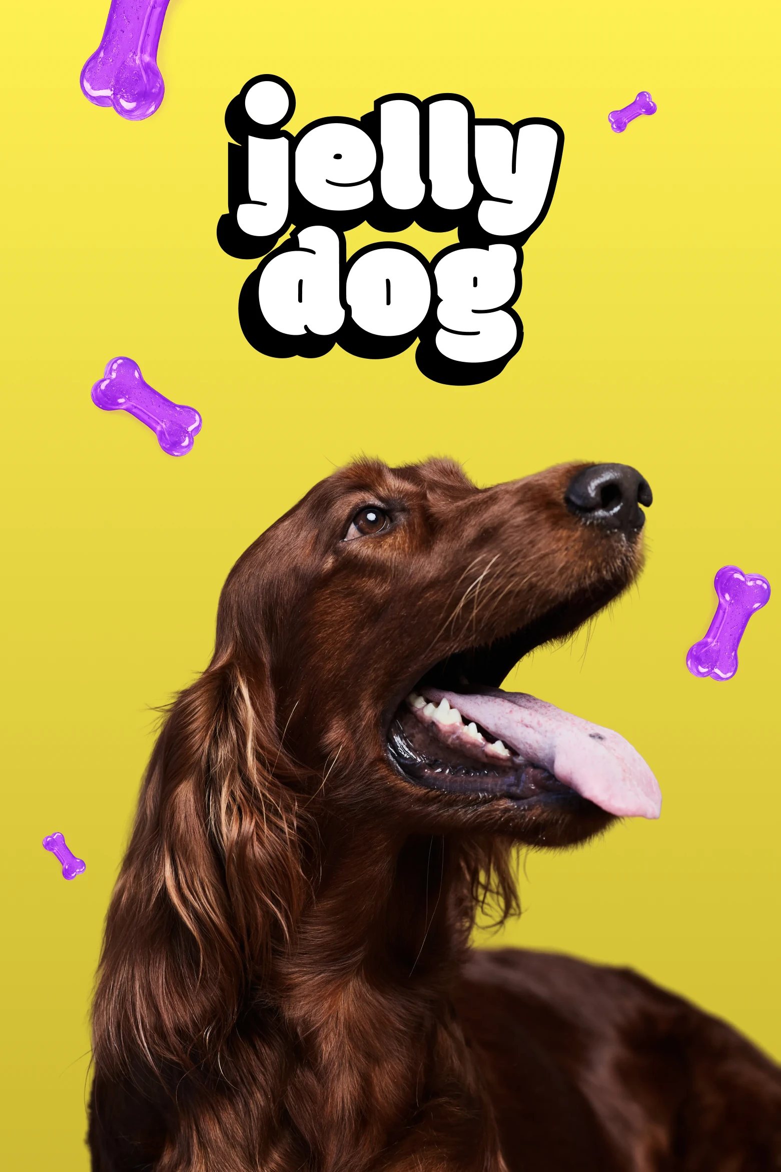
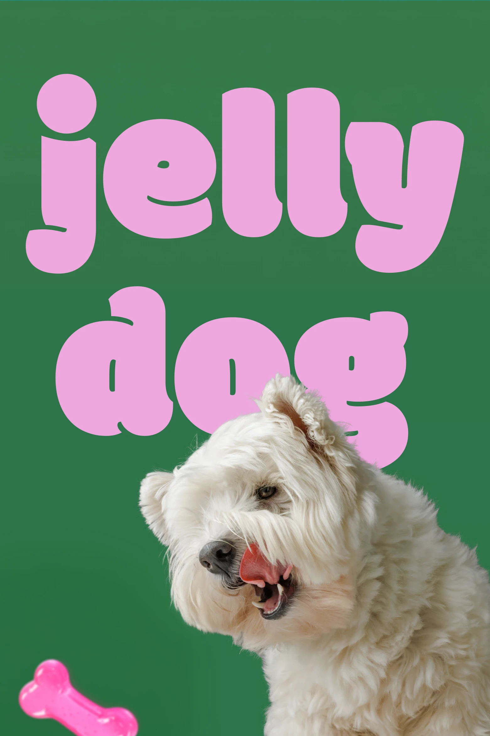
Photography does not soften the identity. It raises its energy.
Directing the images, I looked for dogs with expressions as present as the illustrations. I chose frontal framing, backgrounds tied to the palette and compositions where product and animal seemed to share the same world. Photography does not come in to soften the identity. It raises its energy.
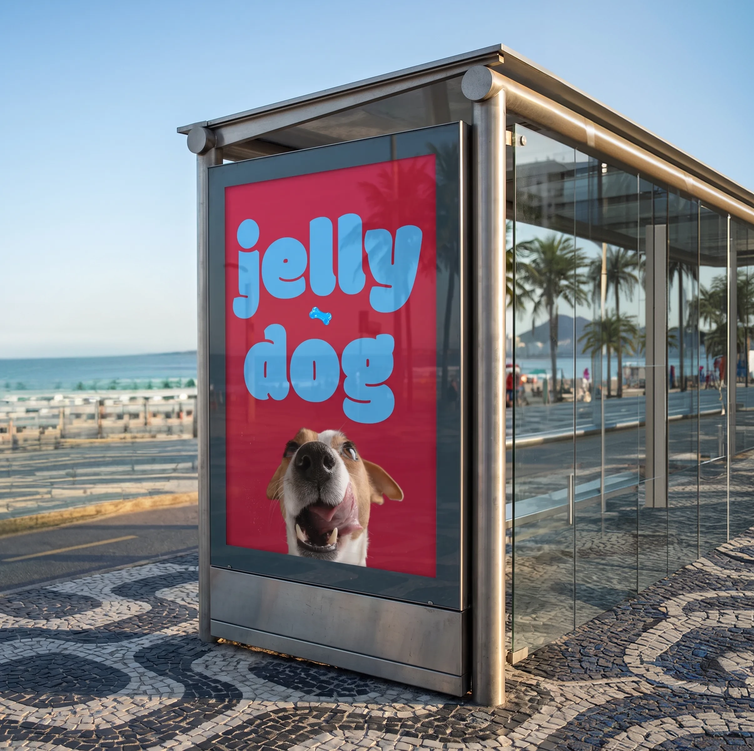
Jelly Dog was imagined as a Brazilian brand. Rio appears as the setting for its relationship with the street, color and outdoor life. The city helps show a brand that is sociable and close to the everyday routine between people and dogs, without turning the project into a collection of tourist references.
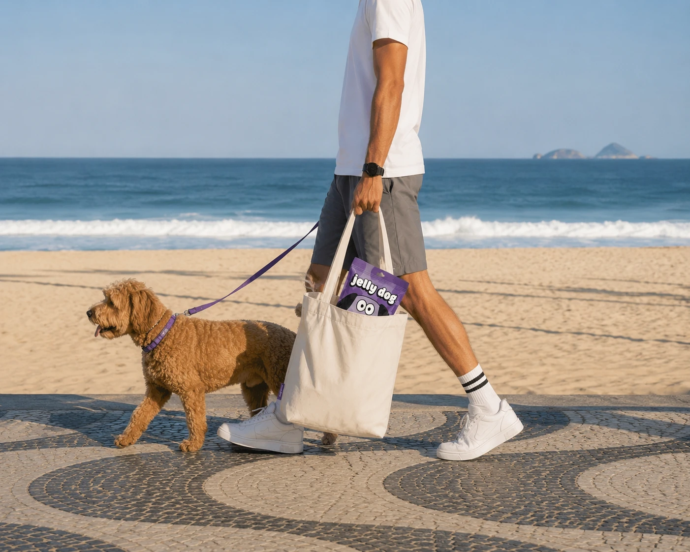
The brand can move without dropping its rules.
In the digital prototype, movement and color stay expressive in the openings. Product information uses a steadier structure. I designed the visual direction, the page layout and the behavior of the characters, and I built the prototype in Framer. The digital experience shows the brand can move without dropping its rules.
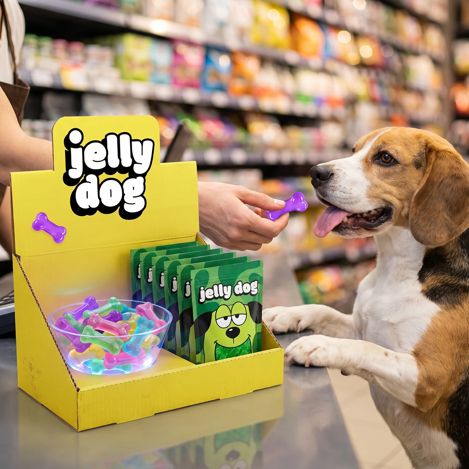
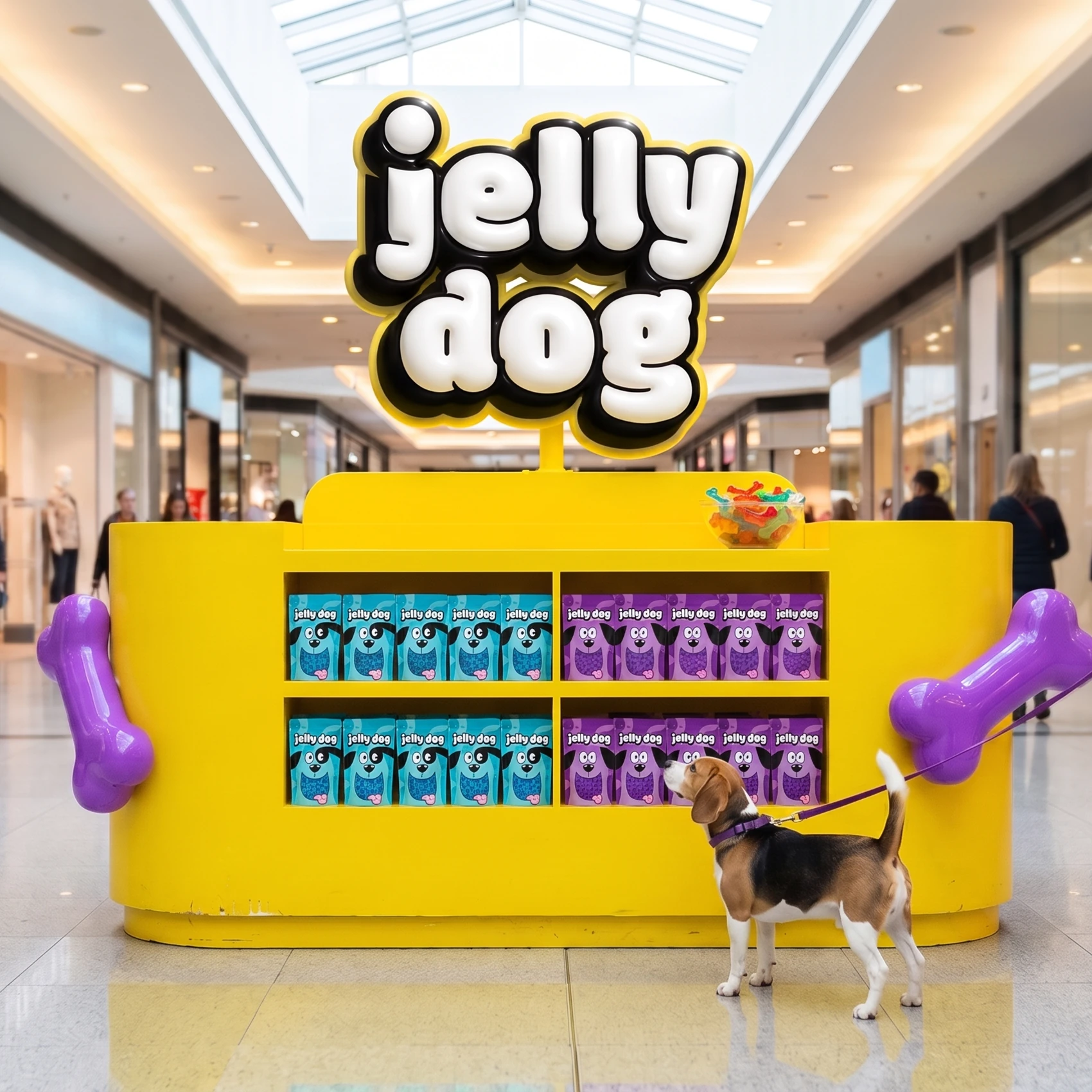
The project had no commercial launch. What it delivers is a system ready for six variants and for use across packaging, retail, media, content and digital. Jelly Dog shows how illustration and color can carry much of the personality when hierarchy and repetition stay consistent.
Design, art direction, illustration, naming and implementation by Vitor Altavista.
More Projects