PeachTree Plates
2026Identity and packaging system for a healthy food brand.
- Type
- self-initiated identity and packaging project
- Role
- end-to-end concept and direction
- Year
- 2026
- Disciplines
- Brand Identity, Naming, Art Direction, Packaging Design, Visual System, Typography, Digital Brand Expression
PeachTree Plates started from a simple feeling: a lot of healthy food brands seem to ask for discipline before they spark any appetite. White backgrounds, lists of benefits and an almost clinical language make the food correct but not very desirable. I wanted to go the other way. The brand had to look healthy because the food was fresh and well presented, not because it repeated the visual signals of the category.
A healthy brand built around appetite, not discipline.
The project is self-initiated, but I built it under the constraints of a real operation. The identity had to organize product information, work across packaging of different formats and stay recognizable in delivery, in the store and on screen. An expressive symbol was not enough. It needed a system that could follow the whole experience.
The name comes from the relationship between Atlanta, Georgia and the peach. I looked for a local reference that would be easy to recognize without reading like a tourist souvenir. PeachTree ties the brand to the city. Plates keeps it connected to everyday food, away from the language of a supplement or a diet program.
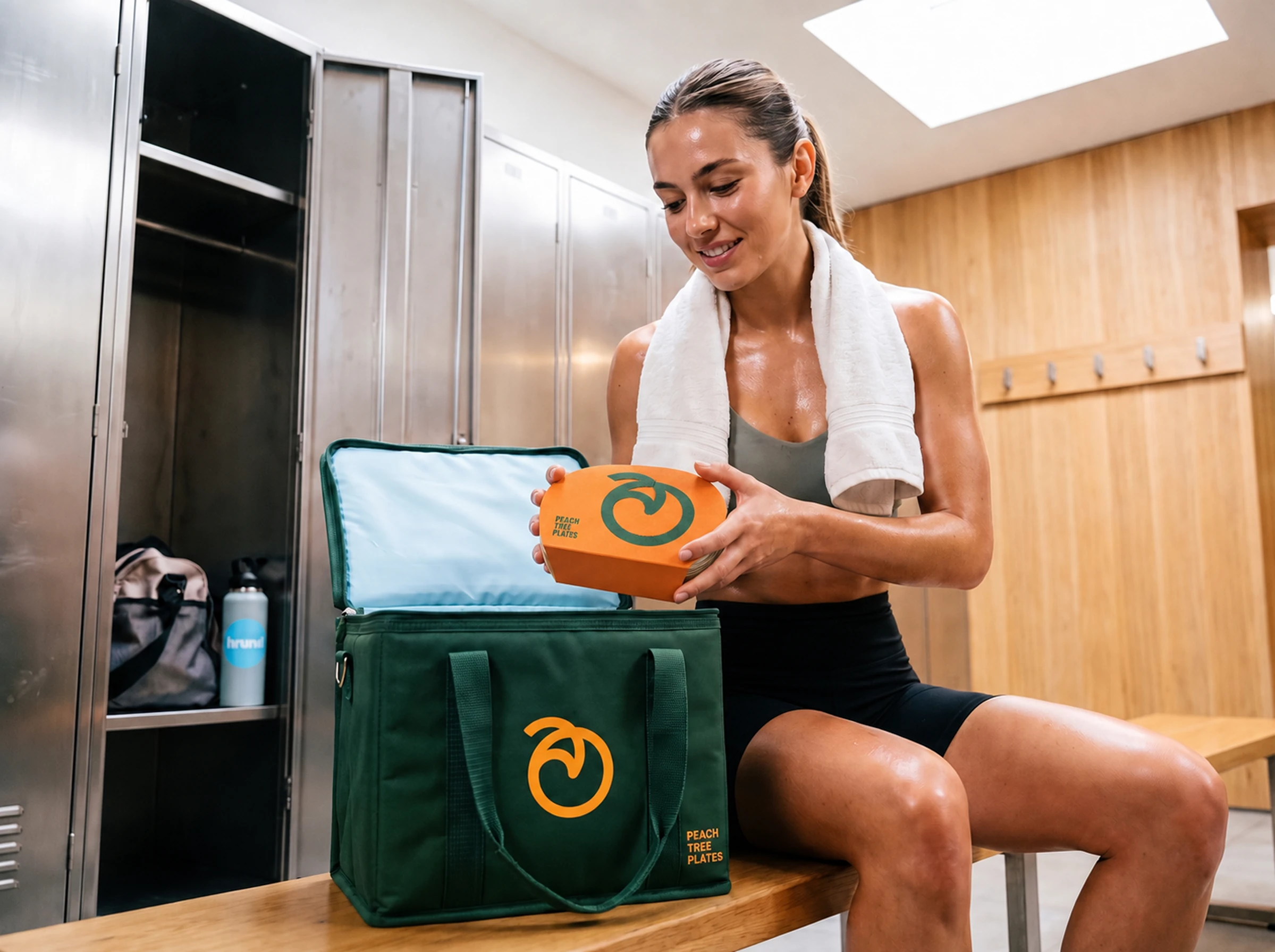
One continuous gesture became the foundation of the system.
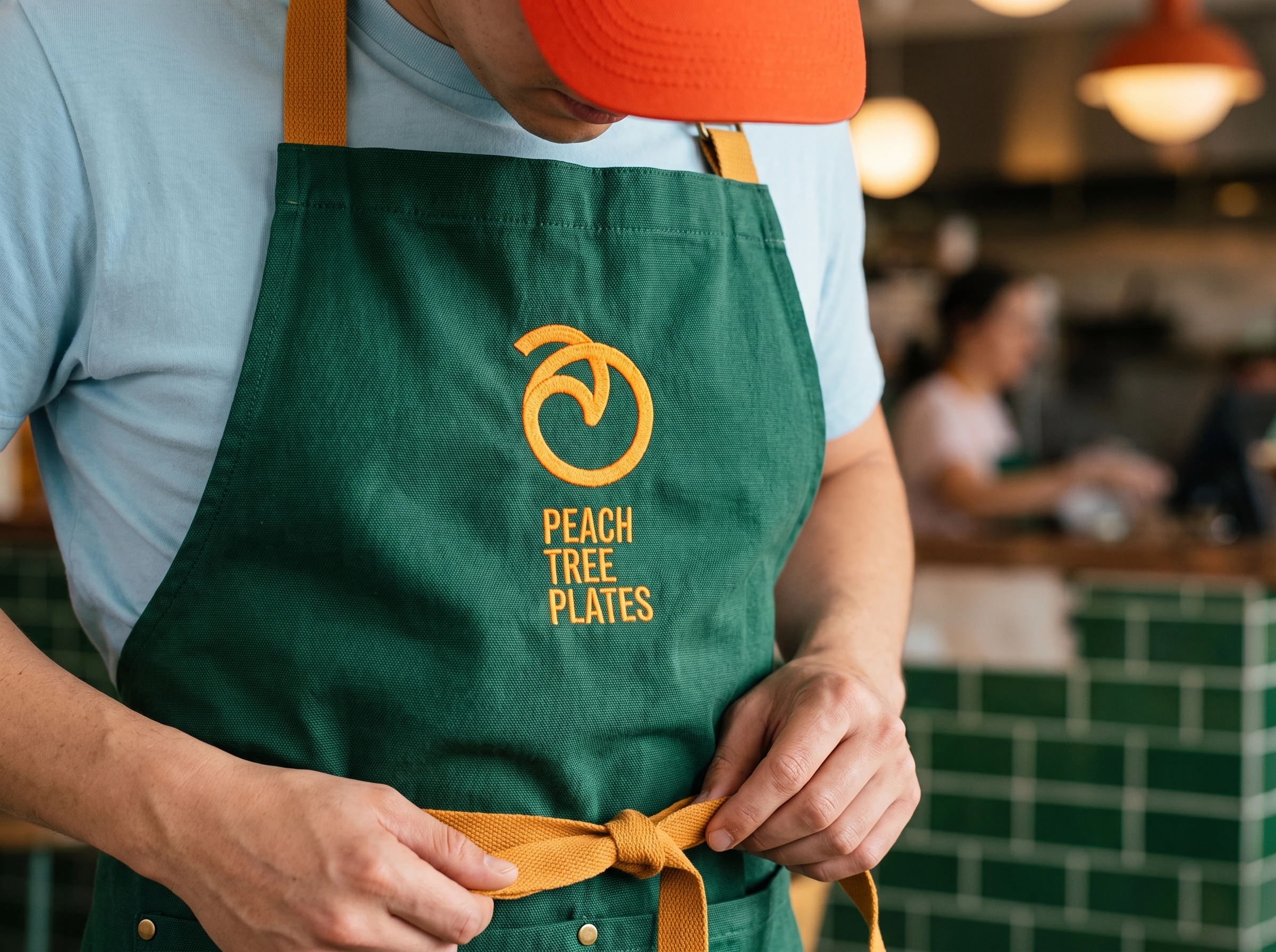
The symbol appeared once I started reducing the peach to a single movement. Instead of illustrating the fruit with volume and detail, I drew a continuous line that forms the outline and ends at the leaf. That simplicity let the brand work in one color, at small sizes and on different materials.
The curve left by that gesture became more important than I expected. It started guiding crops, frames and transitions. It shows up on the packaging, carries the page and gains scale in the storefront window. That was the moment the project stopped depending on the logo and began behaving like an identity.




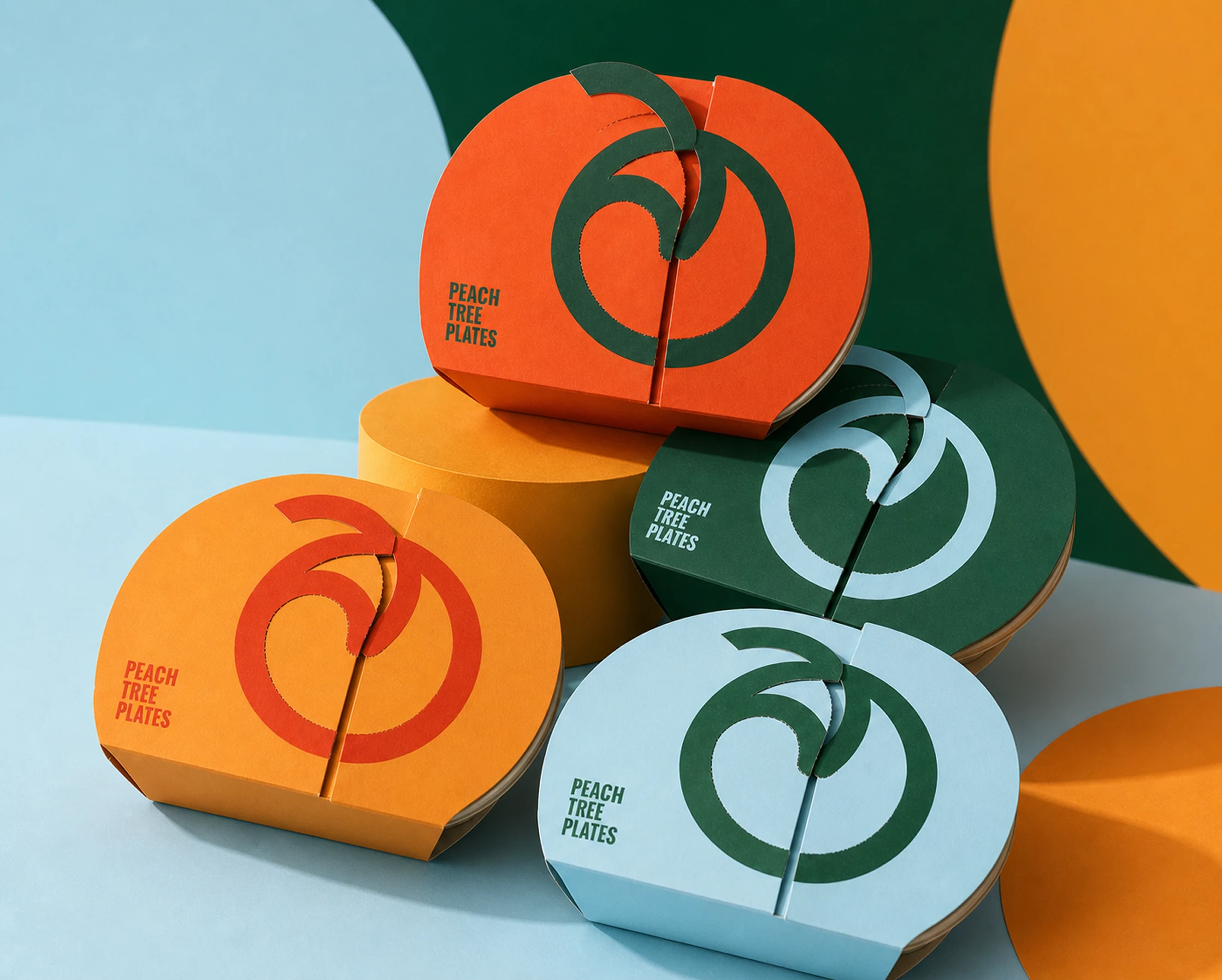
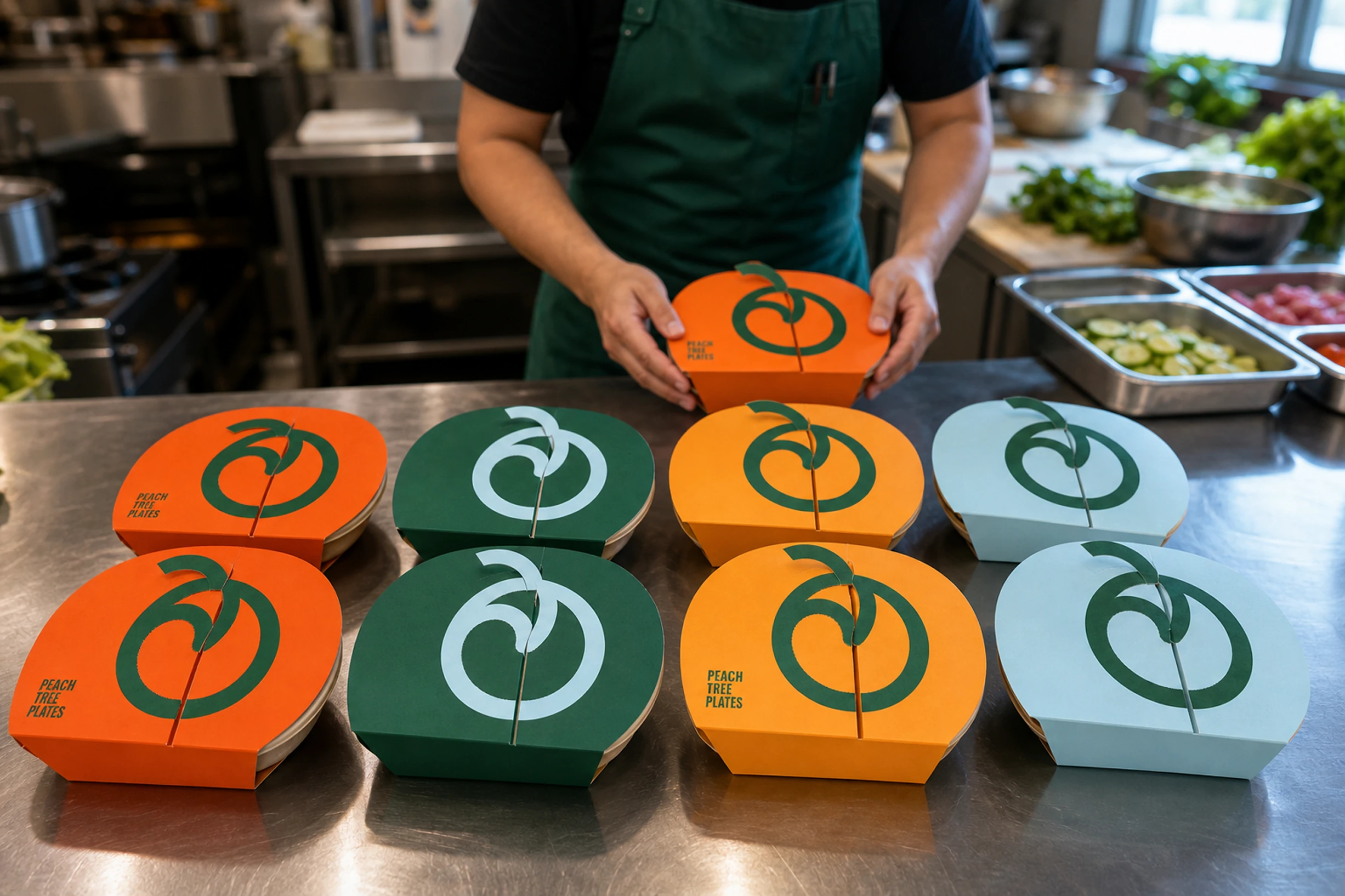
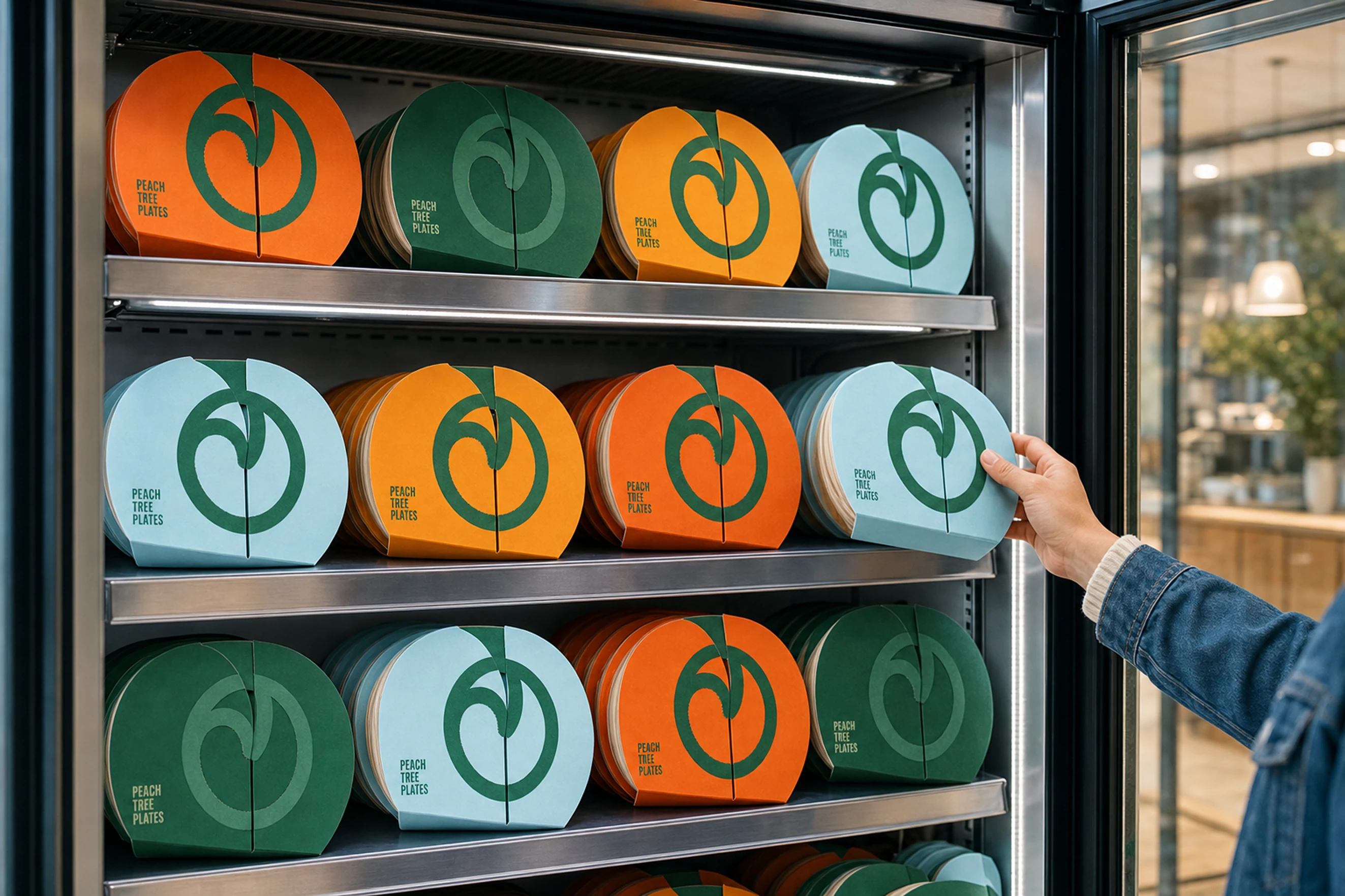
Different formats, one recognizable family.
Orange stayed as the main color for its immediate link to the peach and its way of opening the appetite. Green, yellow and blue come in as support. They organize the line, create contrast and keep every product from sharing the same visual temperature.
I did not use a rigid rule of one color per dish. Differentiation happens through the combination of color, photography, name and hierarchy. That keeps the system flexible and makes room for new items without building a parallel identity for each one.
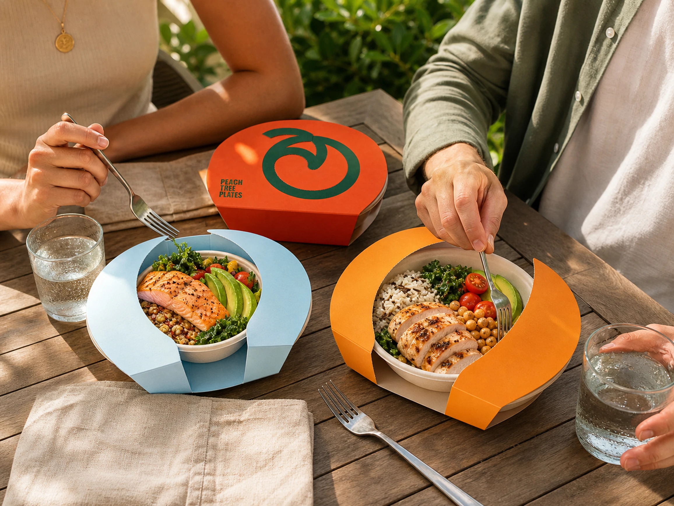
Boxes, bowls, cups, bags and delivery materials change proportion but keep the same principles. The wordmark holds presence, the symbol appears as a signature or a crop, and the information sits in a clear area. Seen together, the packages look like part of the same table without turning into copies of one another.
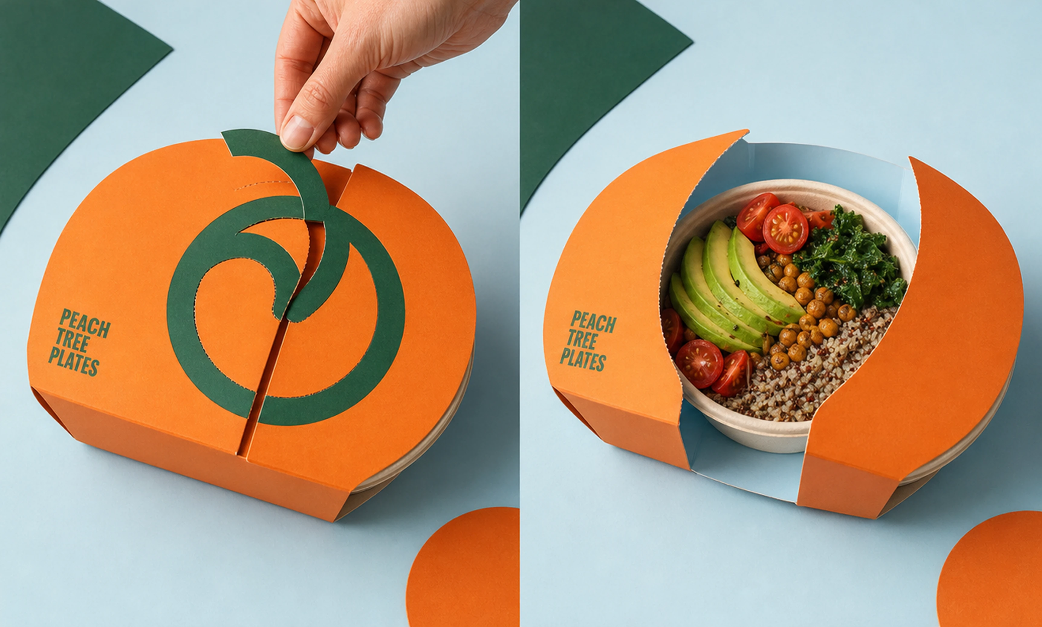
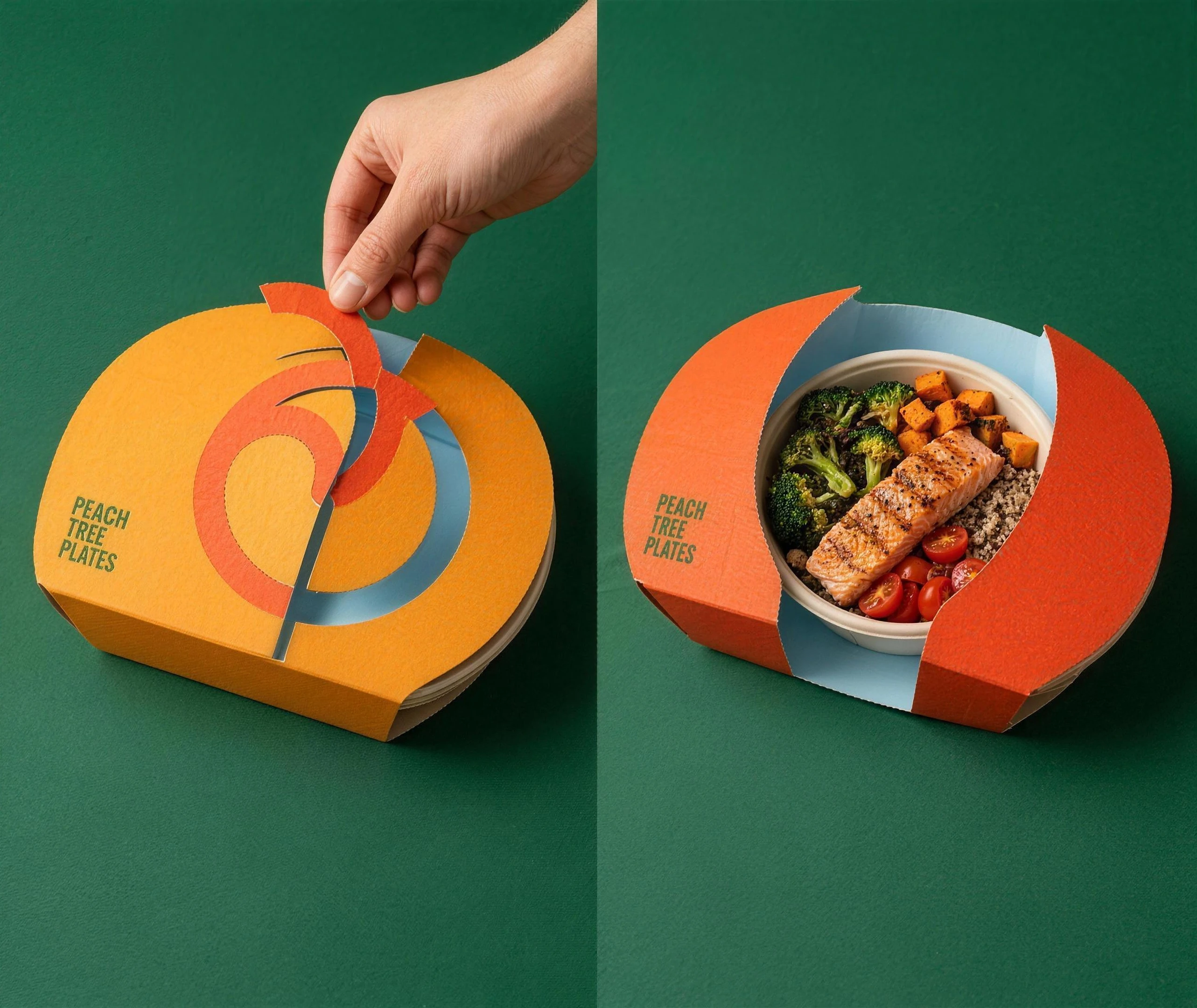
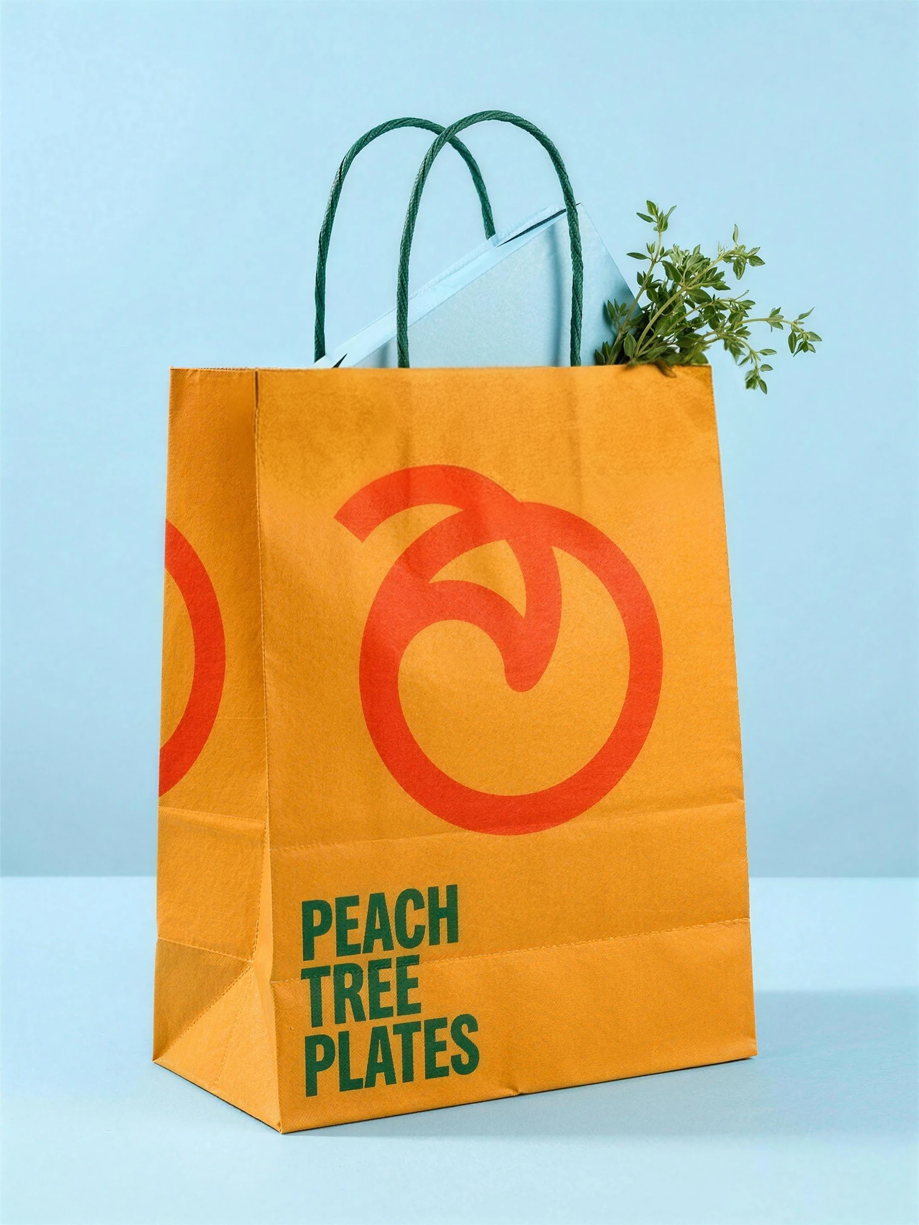
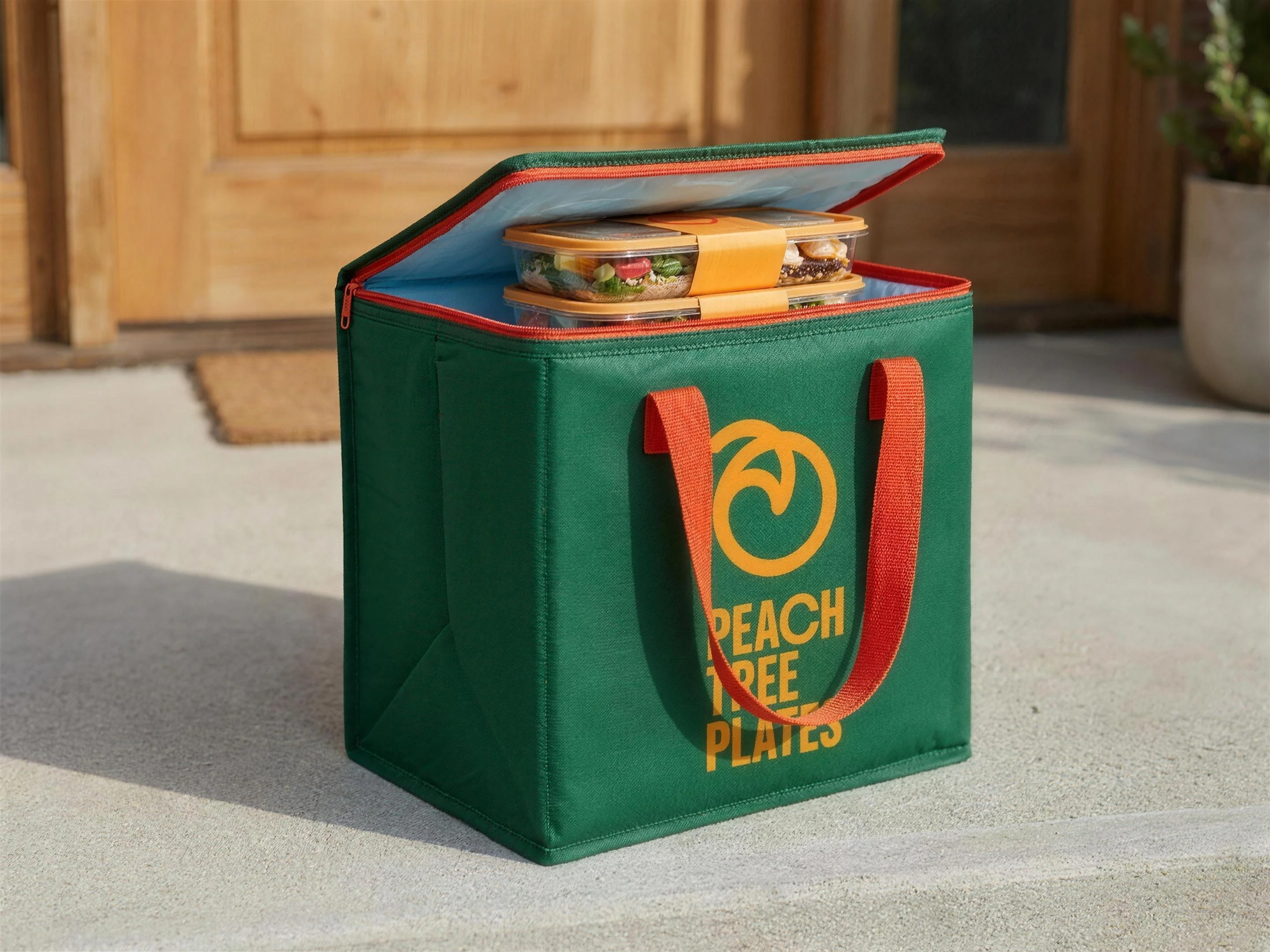

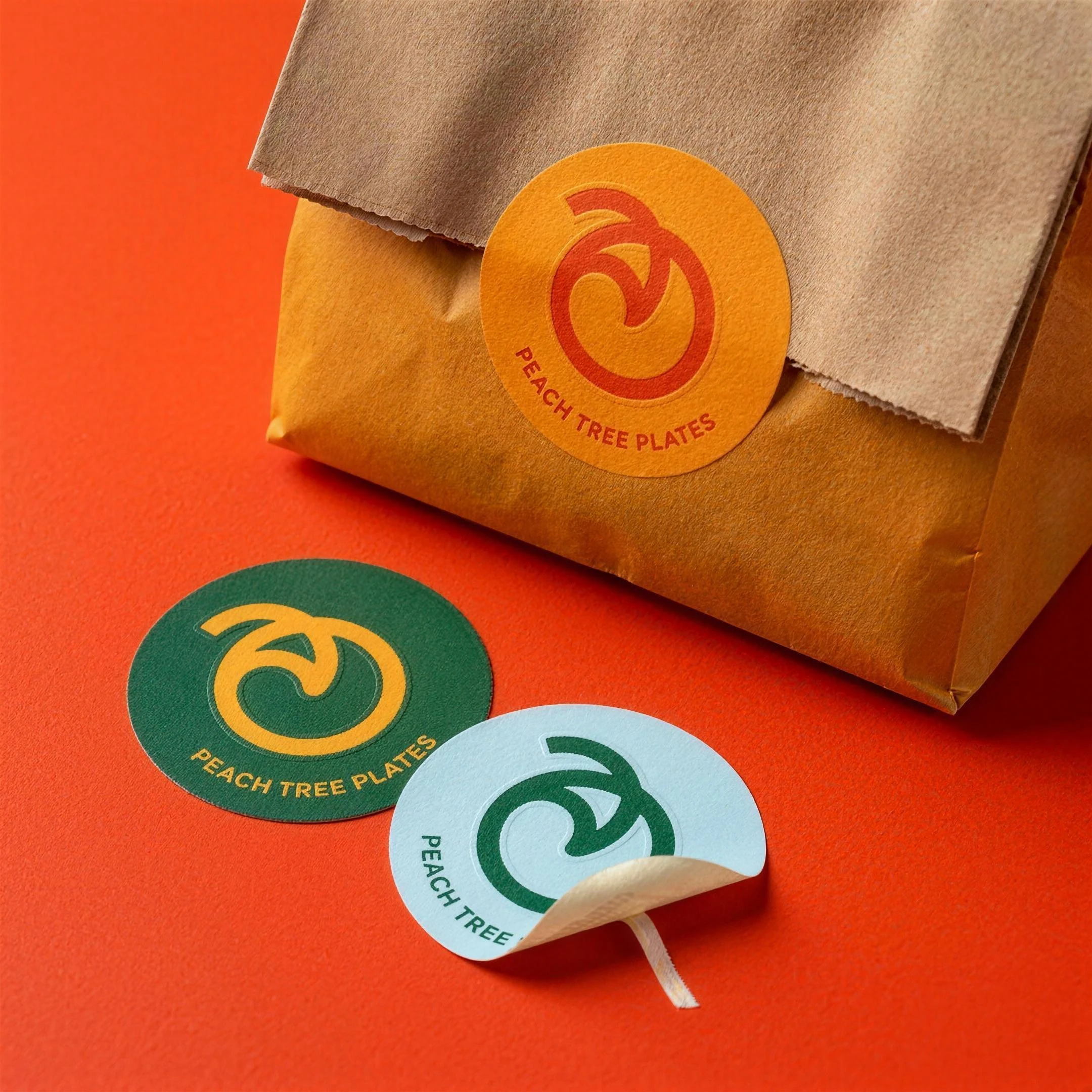
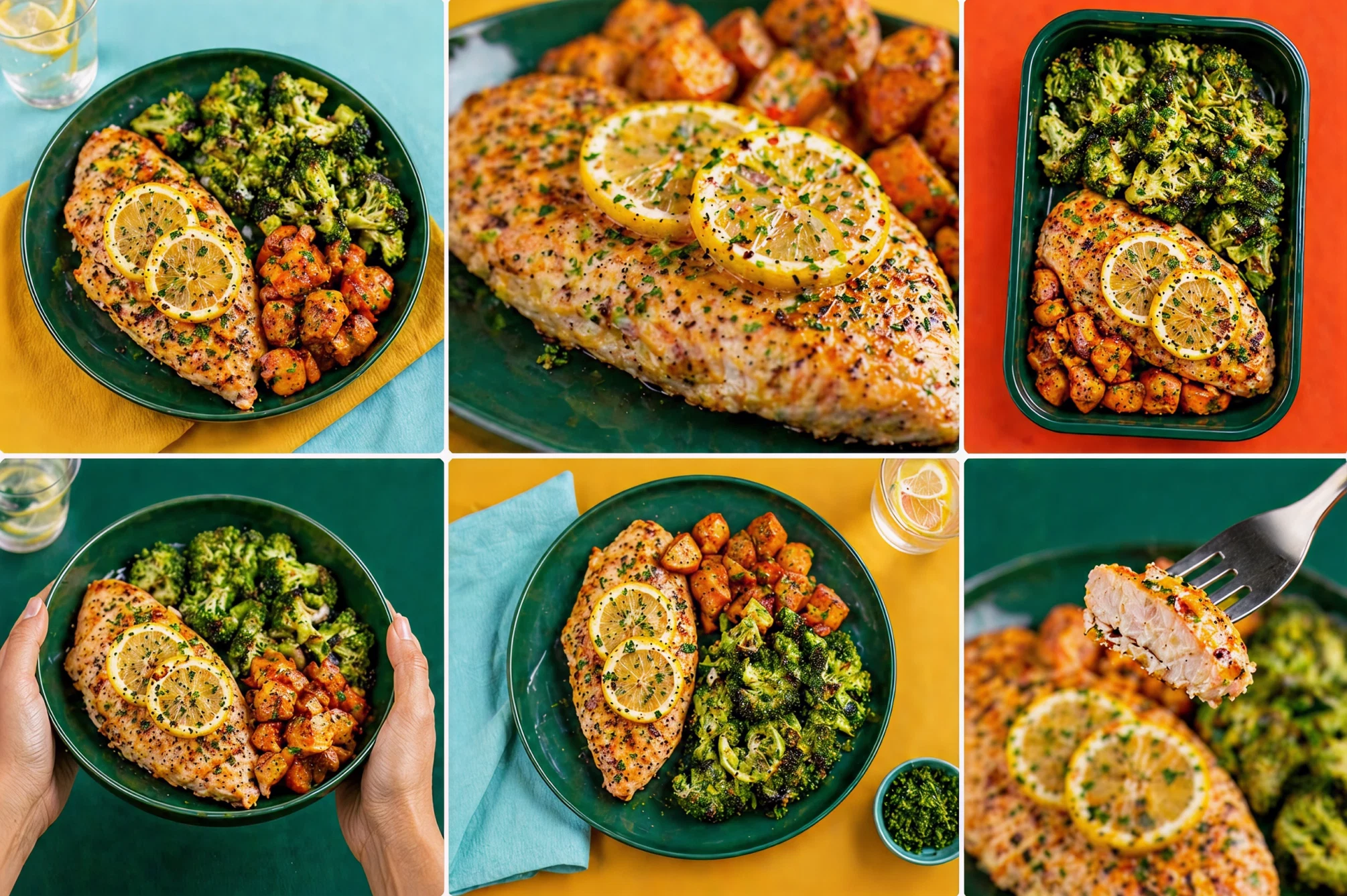
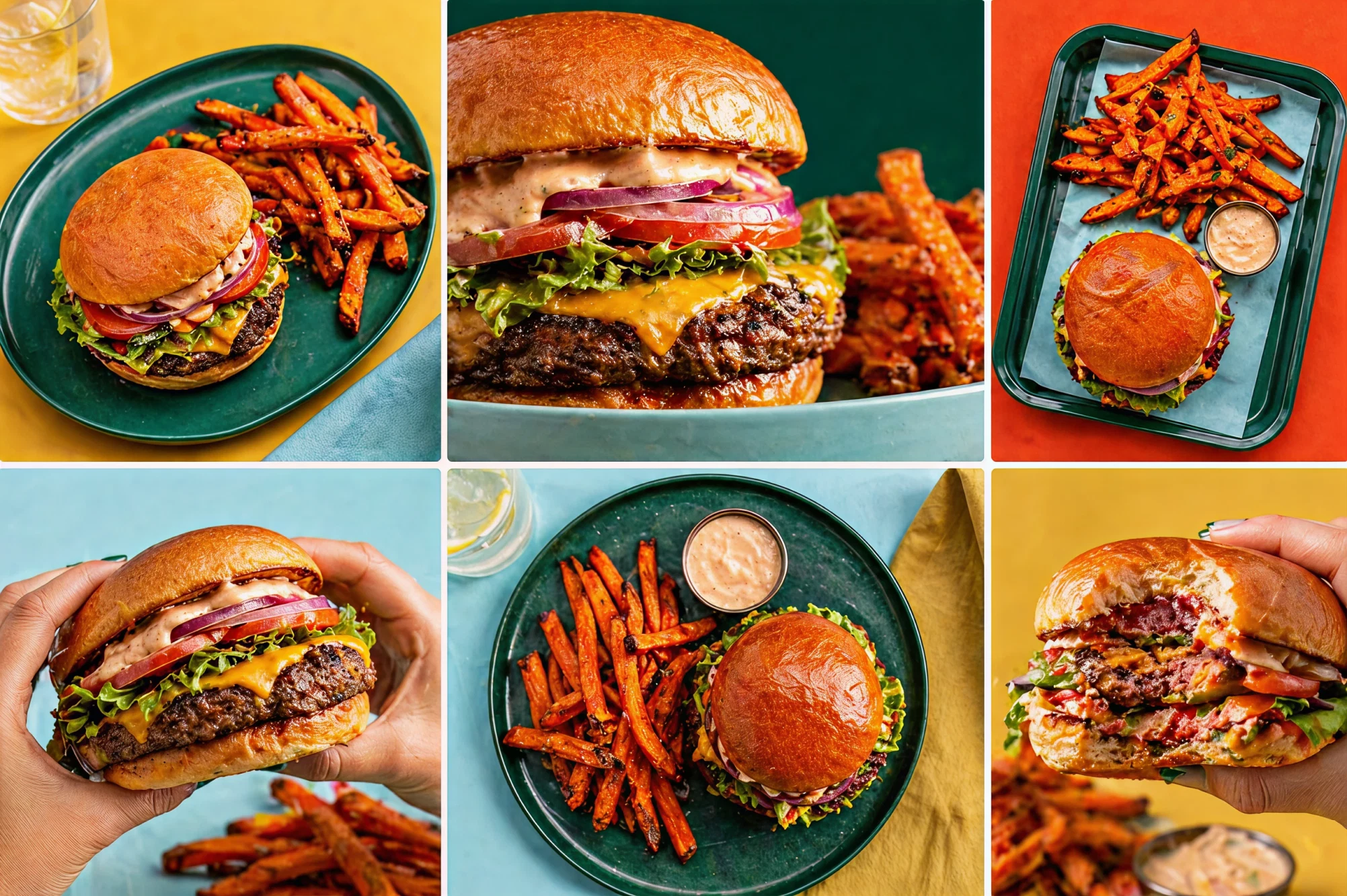
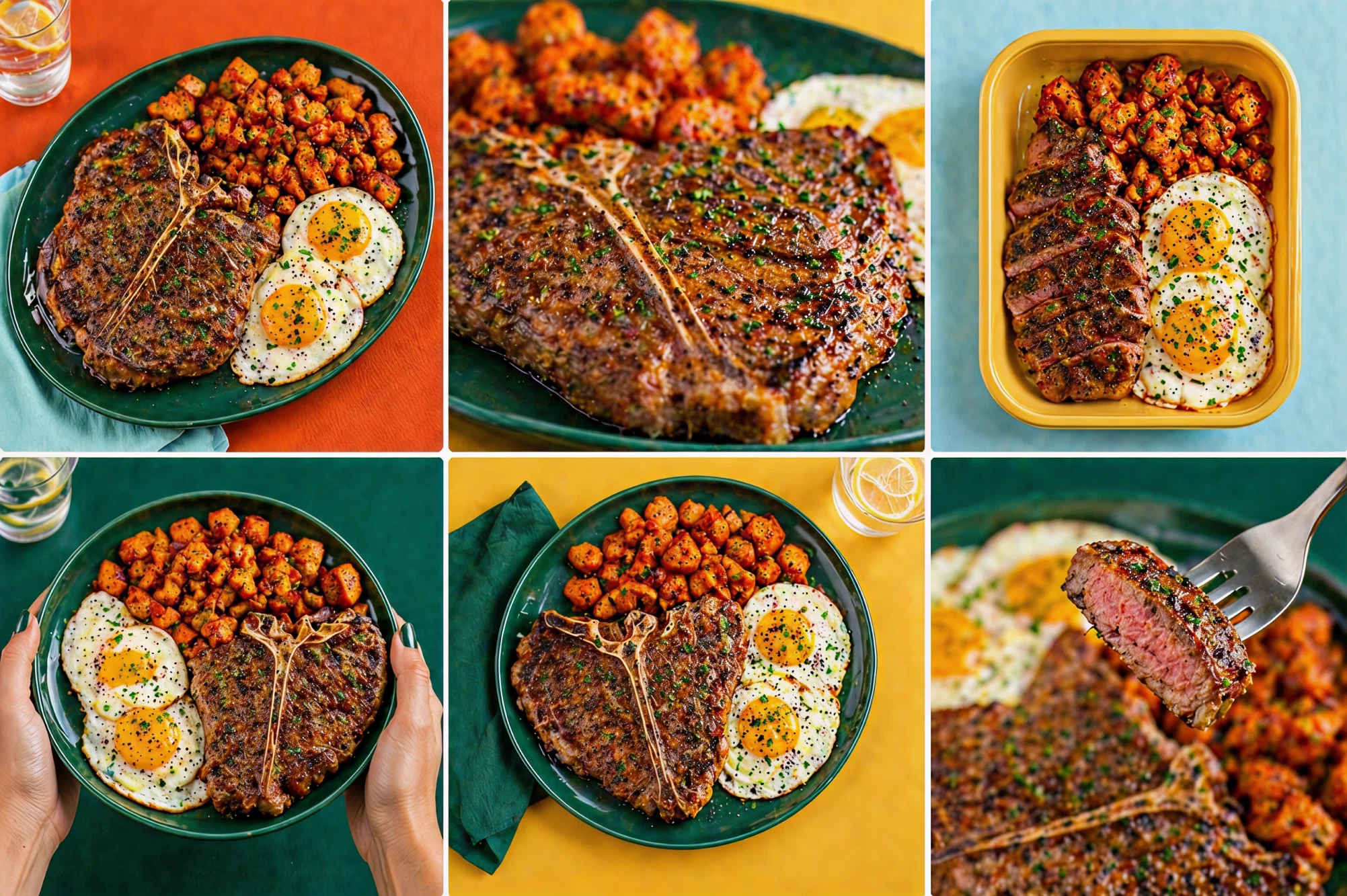
Food had to look like food, not a nutritional demonstration.
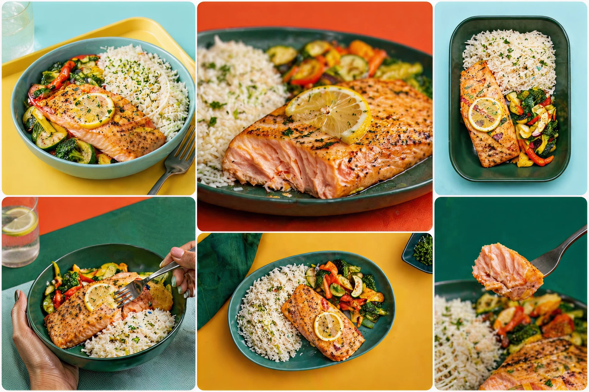
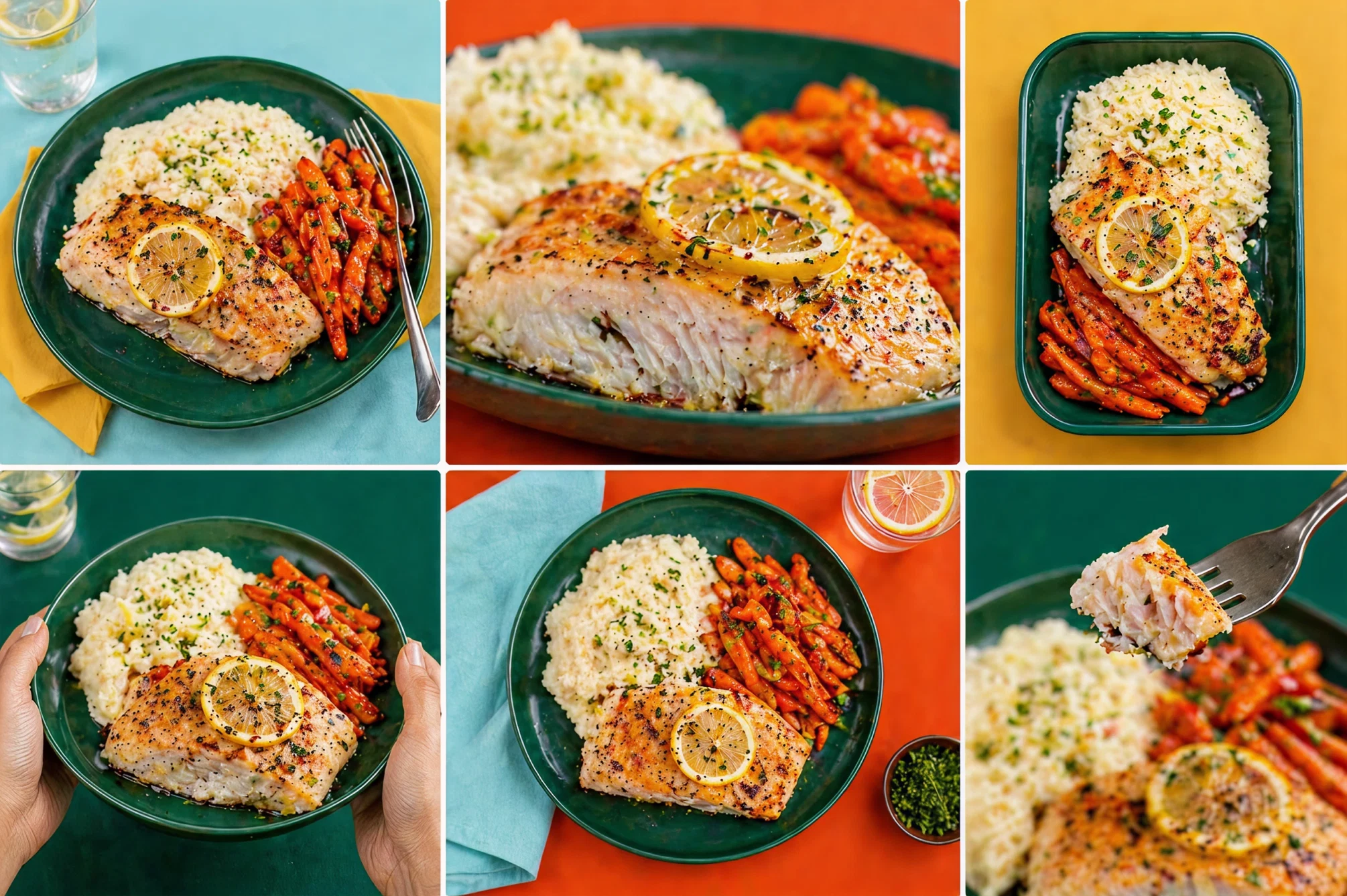
Photography had to continue that logic. I directed the images so the food had texture, color and closeness. The backgrounds use the brand palette but do not compete with the dishes. I avoided the sanitized look common in the category. Food had to look like food, not a demonstration of nutritional benefits.
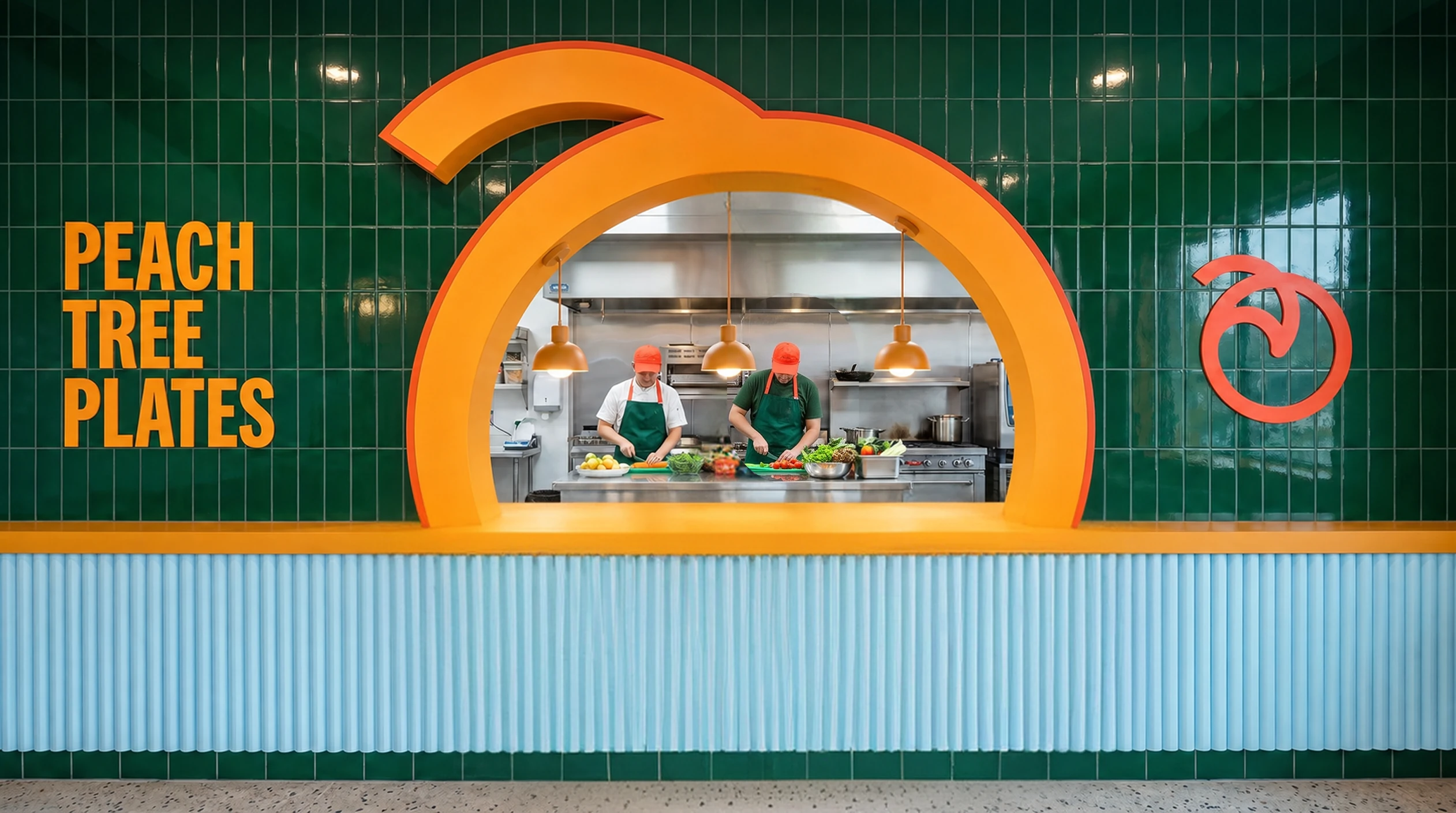
The curve moved from the symbol into the space.
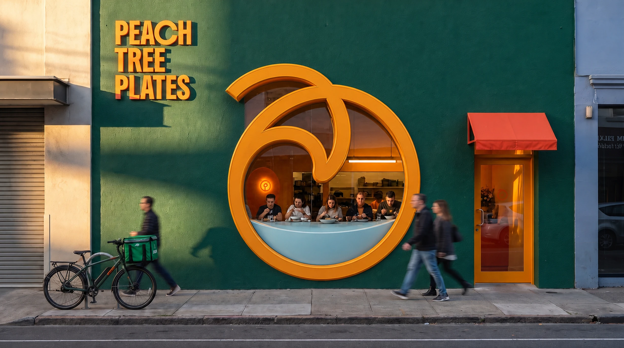
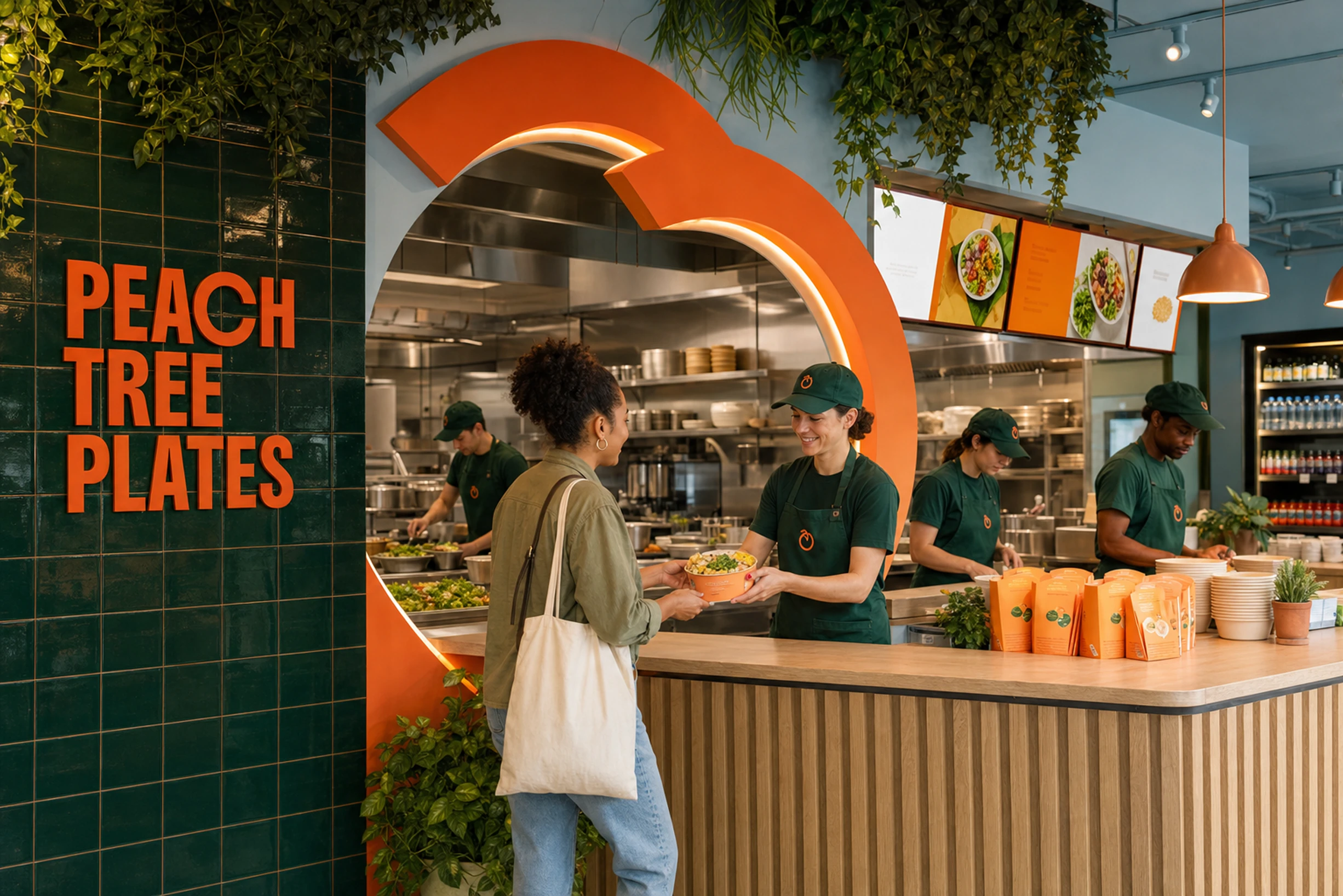
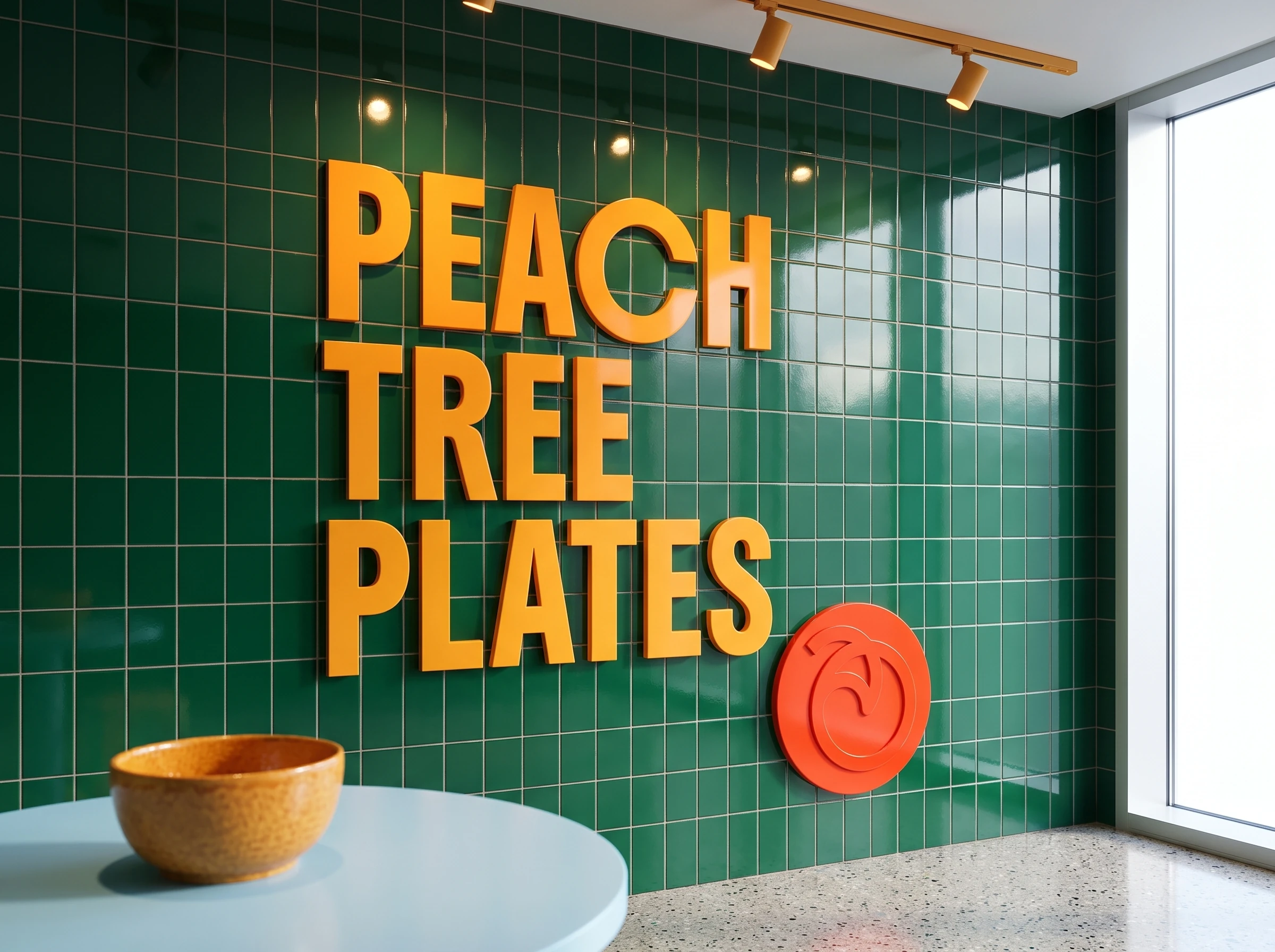
The store and the storefront are concept visualizations made to test the system at physical scale. The entrance arch and the curved elements inside derive from the symbol. The idea was to let someone notice the brand in the space before even reading its name.
The digital experience follows the same rules as the packaging.
The same decisions carried into the landing page. I designed the visual direction, the structure, the image treatment and the navigable prototype. Color splits the content into chapters, the typography keeps the weight of the packaging and the curves help carry the reading. The page presents menu and service without taking on the neutral look of a delivery platform.
I carried the project from concept to digital expression. Since this is self-initiated work, there are no commercial metrics. What it shows is the ability to build a consumer brand as a system, starting from the tension in the category and taking the same idea into packaging, image, space and screen.
- Design and Art Direction
- Vitor Altavista
- Naming
- Vitor Altavista
- Digital Implementation
- Vitor Altavista, Framer
- Project Type
- Self-initiated
More Projects