New Cross
2026Art direction and visual identity for an industrial operation.
- Role
- art direction and development of the visual system
- Year
- 2026
- Disciplines
- Art Direction, Brand Identity, Visual System, Environmental Graphics, Workwear, Digital Brand Expression
An industrial brand has to be seen before it is read. It shows up on helmets, uniforms, equipment, vehicles and structures surrounded by technical information. In that environment, visibility is not only an aesthetic choice. It is part of how the operation orients and recognizes itself.
An industrial brand has to be seen before it is read.
New Cross started with that problem. I wanted an identity that stays strong in movement and at a distance, without falling into the generic look of engineering companies. I also did not want to use safety elements as decoration. The language had to feel natural in that context.
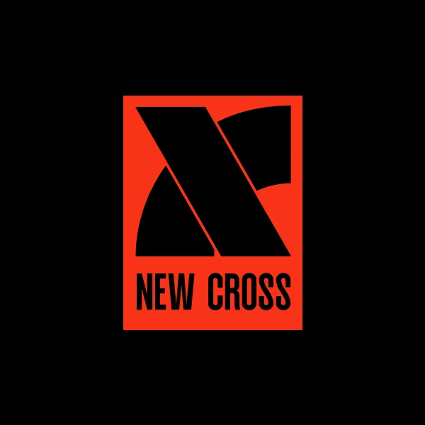
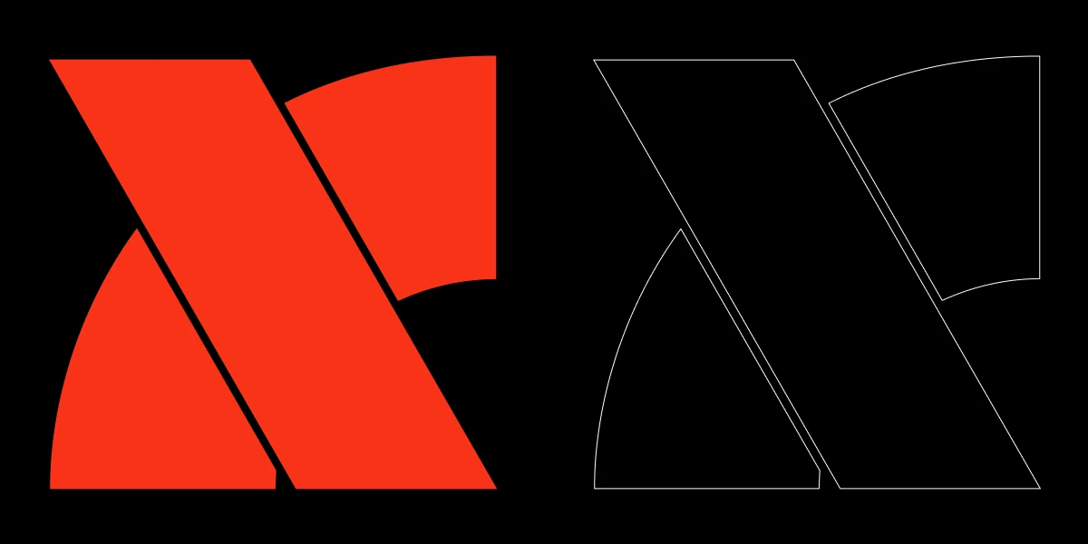
Two diagonals build the N and the bands that come from it.
The symbol came from the meeting of two directions. The diagonals form the N, suggest a crossing and create a continuous sense of moving forward. The cut that builds the mark also gave rise to the bands that run across uniforms, helmets and surfaces. Instead of adding graphics later, I used the logic of the symbol itself to build the system.
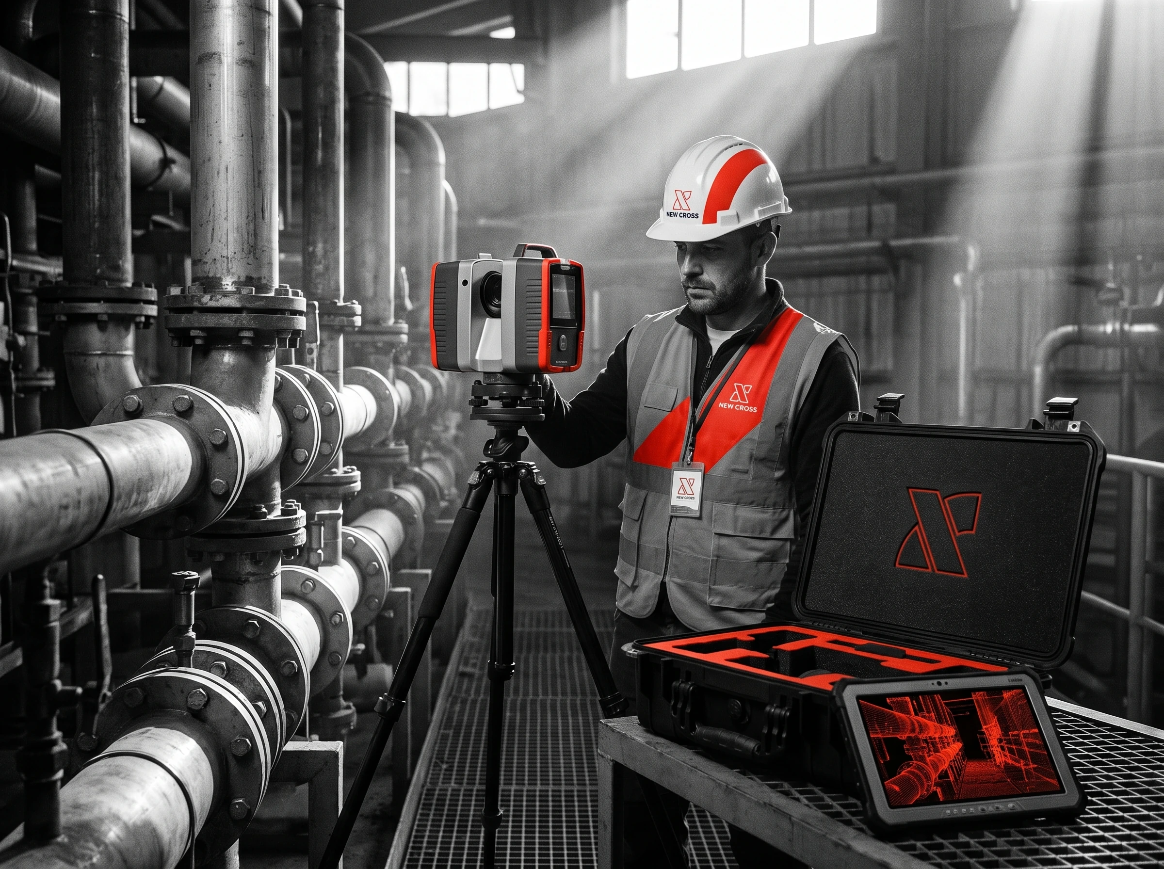
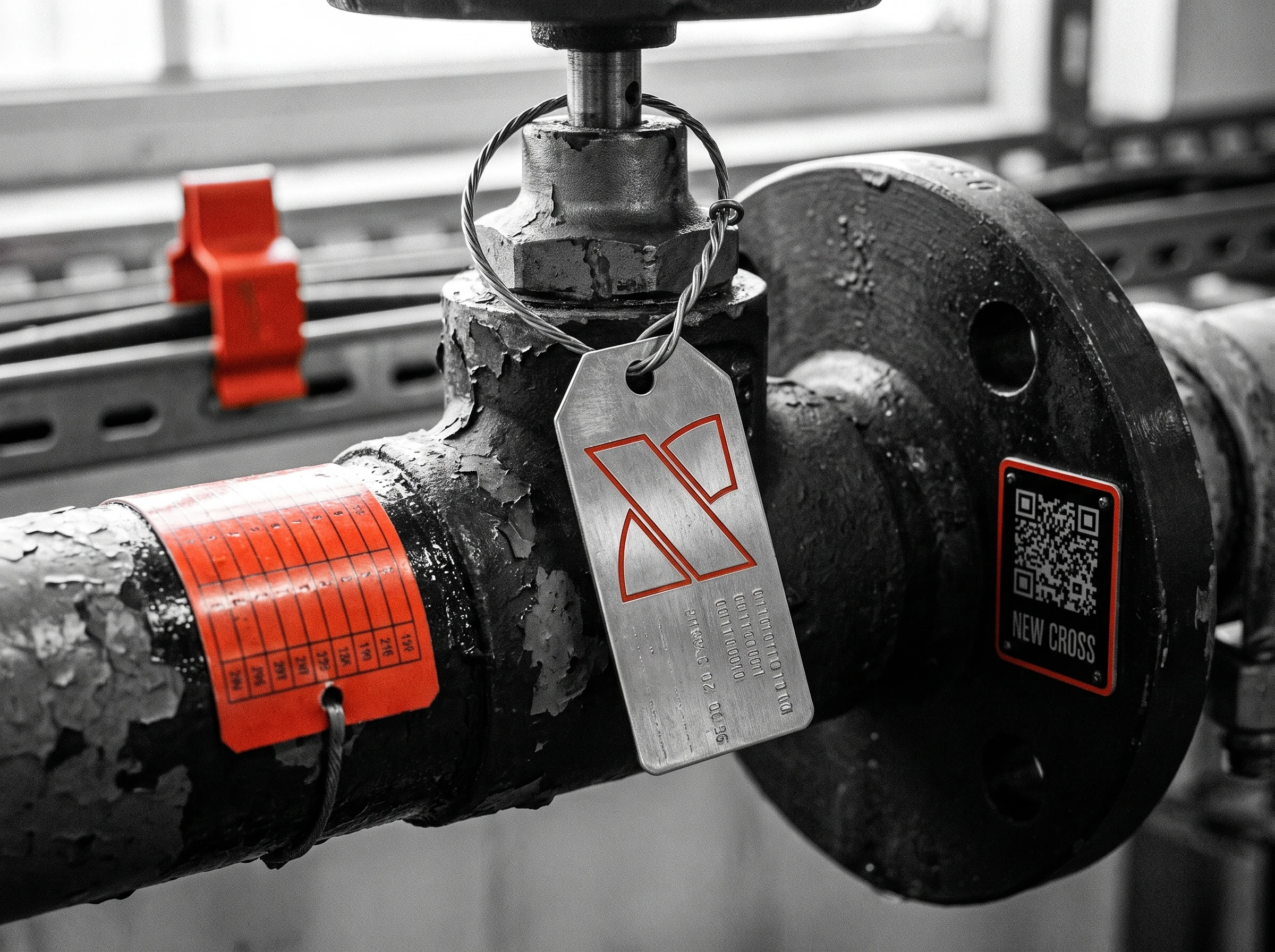
Orange works as a signal. It breaks the black, white and grey of the industrial environment and creates immediate points of recognition. In the photographs, I reduced the presence of other colors so the orange band could connect people, equipment and space. Image direction and identity end up telling the same story.
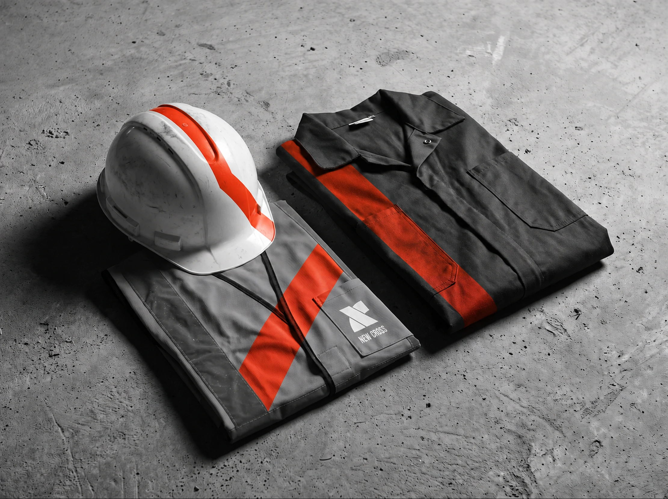

The identity changes scale but keeps direction, contrast and rhythm.
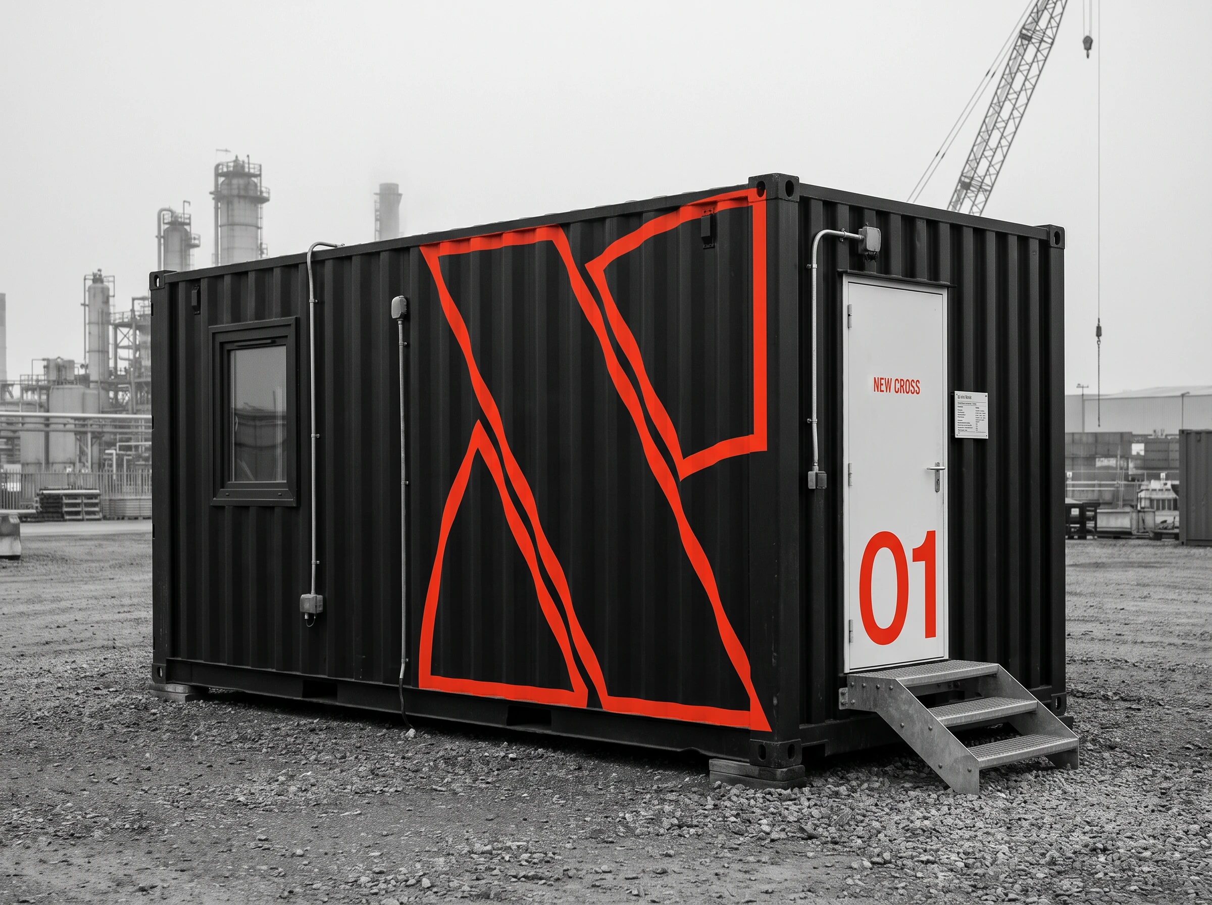
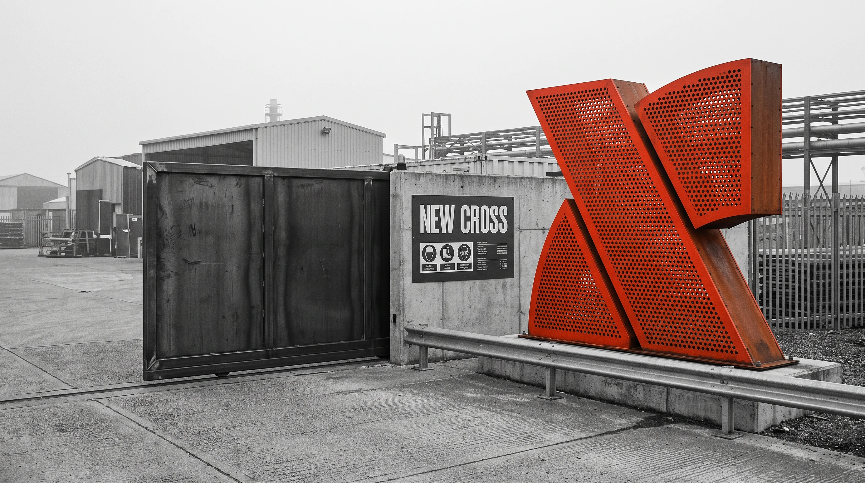
The most important test happened in large scale applications. On the container, the symbol can be enlarged until it almost becomes architecture. On uniforms, it has to stay legible in movement. On a screen, it has to organize content without competing with technical information. The identity changes scale but keeps direction, contrast and rhythm.
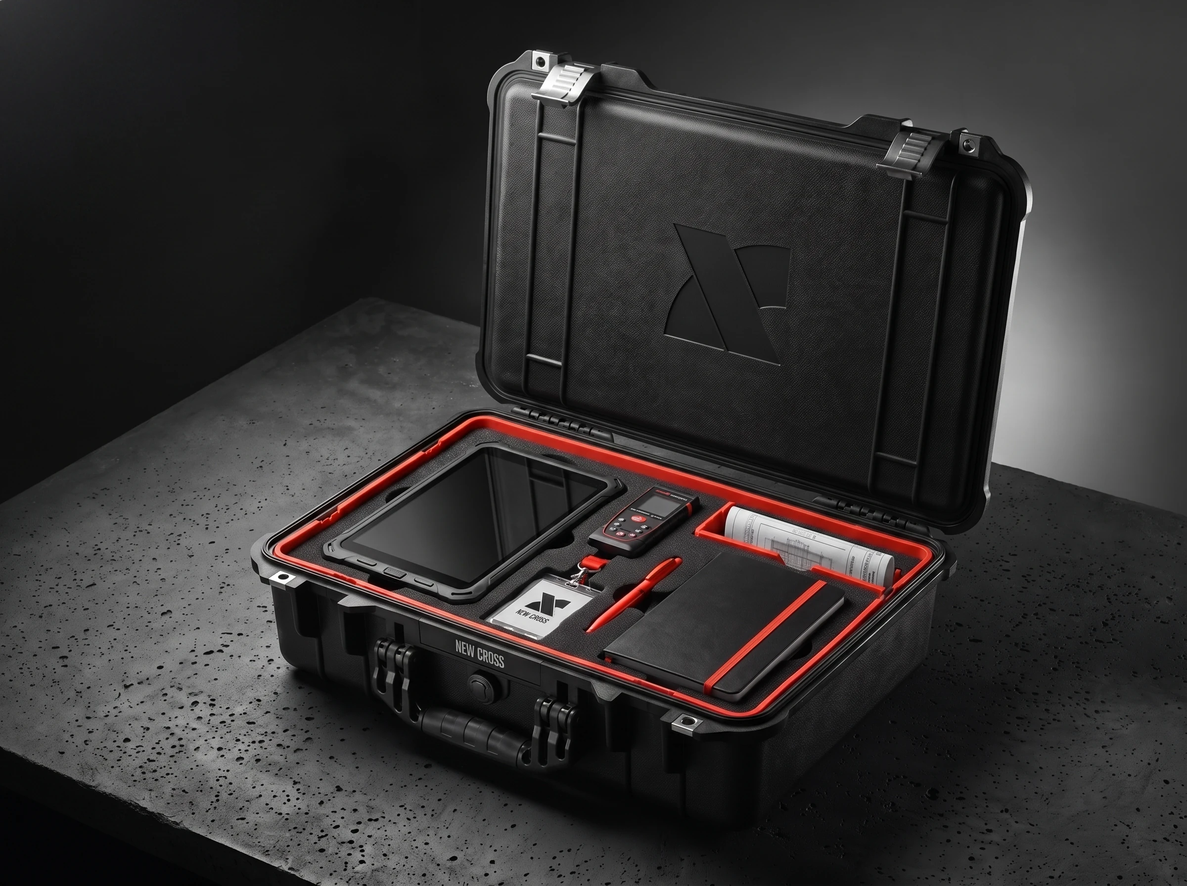
The brand stays alive when it leaves the uniform and enters the screen.
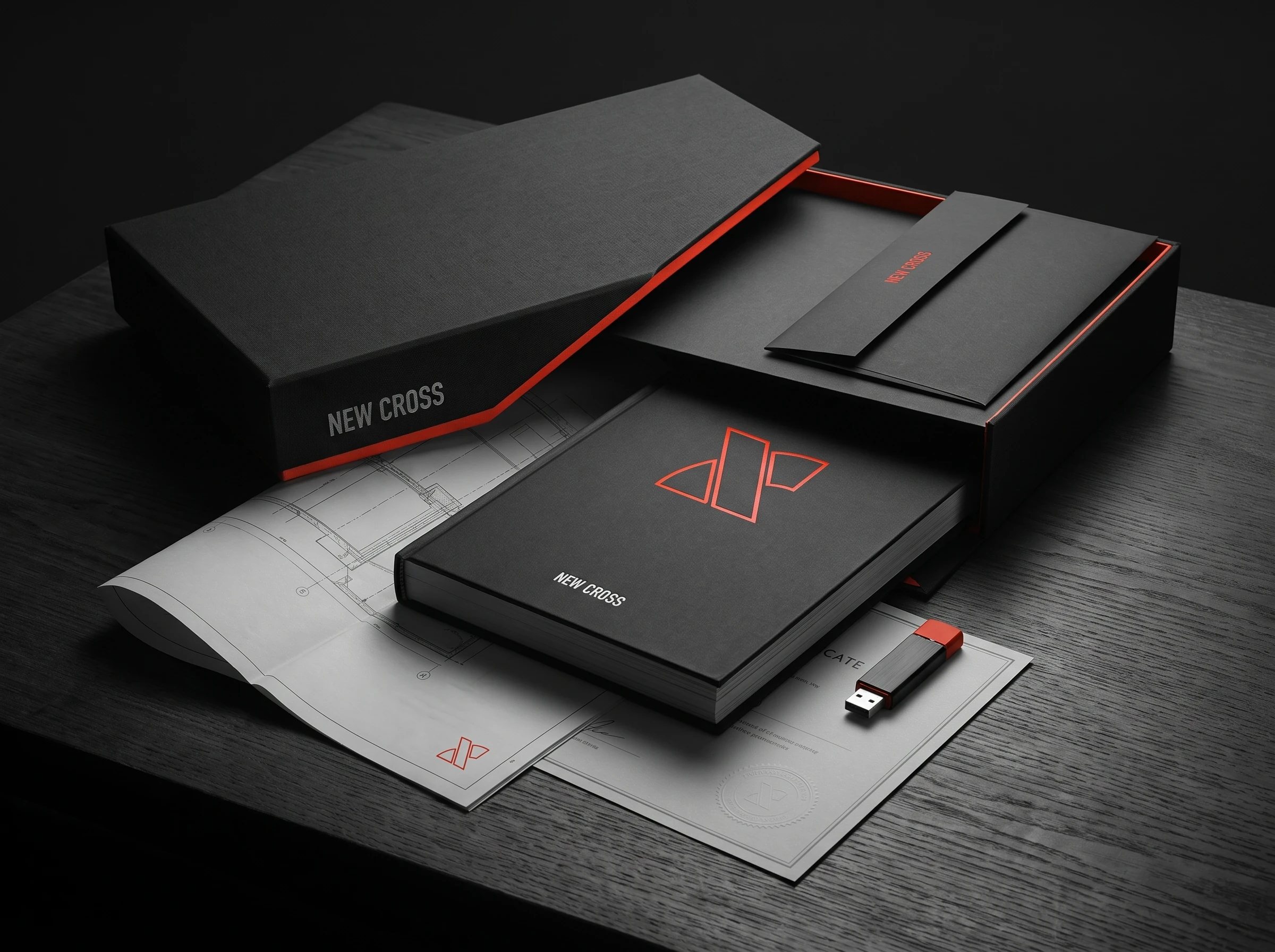
In the digital expression, I kept the same construction. The diagonals create entrances, separate chapters and guide the eye. Orange appears at moments of decision, while the rest of the interface stays clear. The page is not presented as a product design exercise. It shows how the brand stays alive when it leaves the uniform and enters the screen.
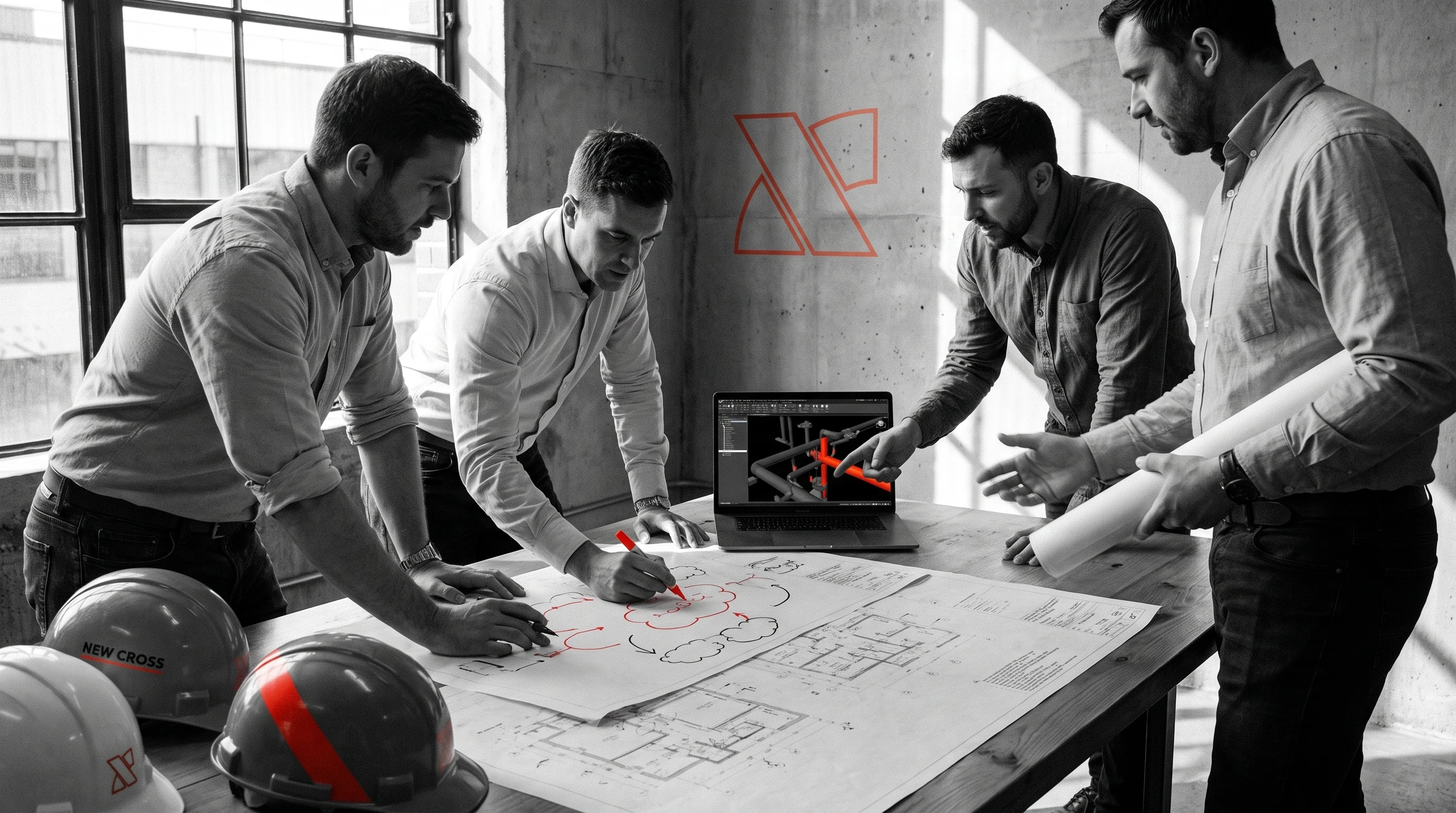
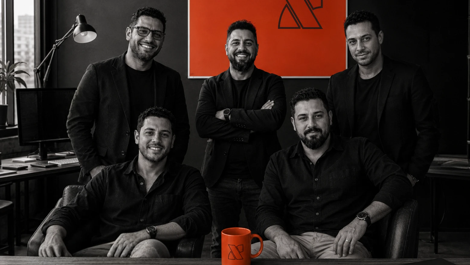

My role was to define the art direction, develop the identity and create the rules that connect symbol, photography, workwear, environment and digital presence. The result is a direct system, built to work inside the operation and not only in a brand presentation.
Art direction and visual system by Vitor Altavista.
More Projects